The network for creativity
Join 1.25M professional creatives like you
Connect with clients, get discovered, and run your business 100% commission-free
Creatives on Contra have earned over $150M and we are just getting started
Back to feedPost
NEXORA | Premium B2B SaaS Social Media Design
A self-initiated portfolio concept created for NEXORA, a fictional software company focused on modern, professional B2B communication.
This project explores how clean layouts, structured typography, clear hierarchy, and consistent brand visuals can help a software brand appear more credible, polished, and visually engaging.
The design system was developed to present product messaging, promotional communication, and business-focused content in a way that feels clear, premium, and suitable for an international SaaS audience.
The project includes:
Branded social media post concepts
Clear and professional content layouts
Cohesive visual direction for digital marketing
Modern typography and balanced composition
Business-oriented design with a polished brand feel
The overall creative direction focuses on minimalism, readability, trust, and modern digital branding.
Services showcased: Social Media Design • Graphic Design • Brand Visuals • B2B Marketing Creatives
Project type: Independent fictional portfolio concept created to demonstrate professional design capabilities.


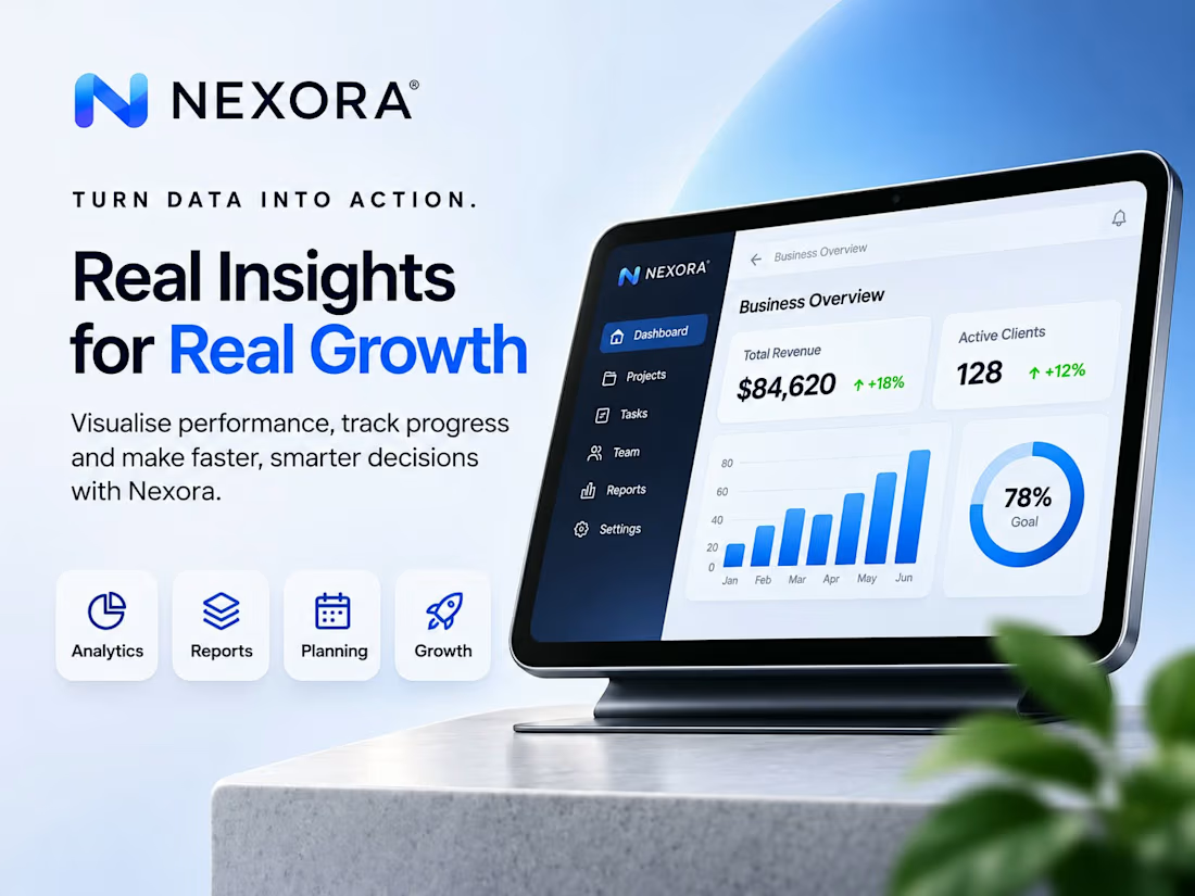
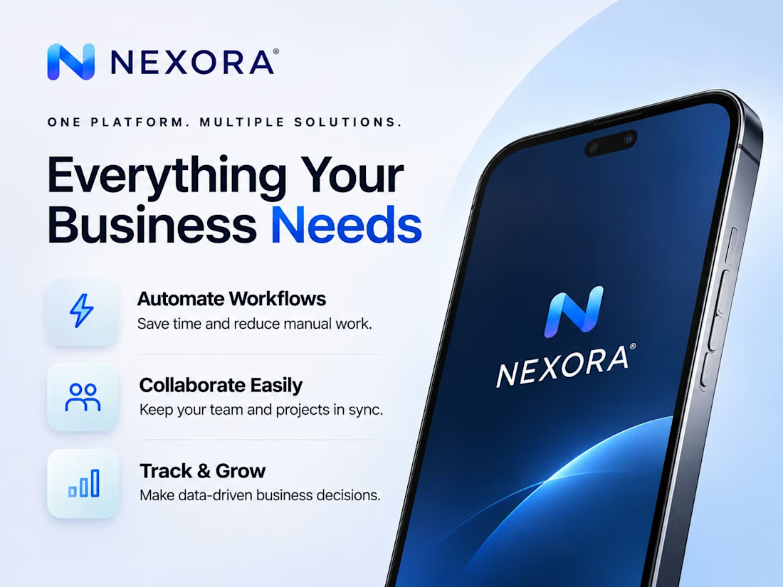
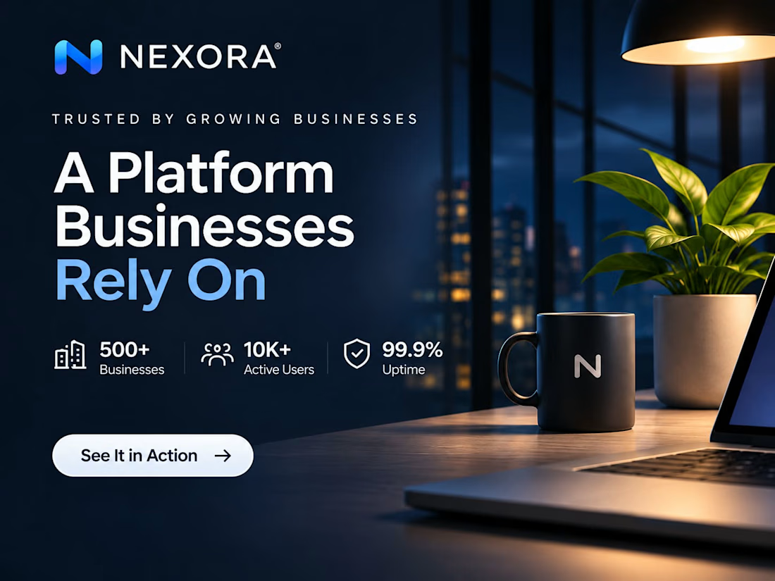
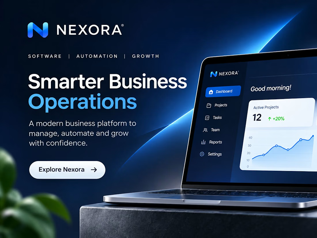

The headlines with the second half in bright blue read fast, and the dark night-desk one breaks the grid nicely. If you ran these as ads, which of the four would you test first?

Thanks, Ivan! Really appreciate your perspective. I'd test the bottom-right design first. The strong headline hierarchy, blue contrast, and product preview communicate the value quickly. I'd also A/B test it against the bottom-left version to compare engagement and click-through rates. Curious which direction you'd lean toward!
The network for creativity
Join 1.25M professional creatives like you
Connect with clients, get discovered, and run your business 100% commission-free
Creatives on Contra have earned over $150M and we are just getting started



Related posts

Does a brand system need more rules or fewer?
Norr & Co. taught me fewer, but unbreakable ones. Two things never change. Everything else is allowed to get weird.
How fast can you tell a brand idea is weak?
Mine went flat the moment I tried it on a bakery and a late-night bar at the same time. Test your idea on your two most different cases first.
The press is running hot.
The press is not the problem.
Sneak peek of MODULO. A dashboard that skips the symptom and points straight at the cause.
Oil +6.4 °C. The culprit is a chiller on the other side of the floor.

LOGO vs. BRANDING — What's your take? 🍵
I'm curious...
Which one makes a stronger first impression?
Do you prefer the simplicity of the logo or the personality of the complete branding?
I'd love to hear your thoughts! 💚
0 voted
0%
7 voted
100%
7 votes
Closed

makes me want a matcha haha, cool