The network for creativity
Join 1.25M professional creatives like you
Connect with clients, get discovered, and run your business 100% commission-free
Creatives on Contra have earned over $150M and we are just getting started
Back to feedPost

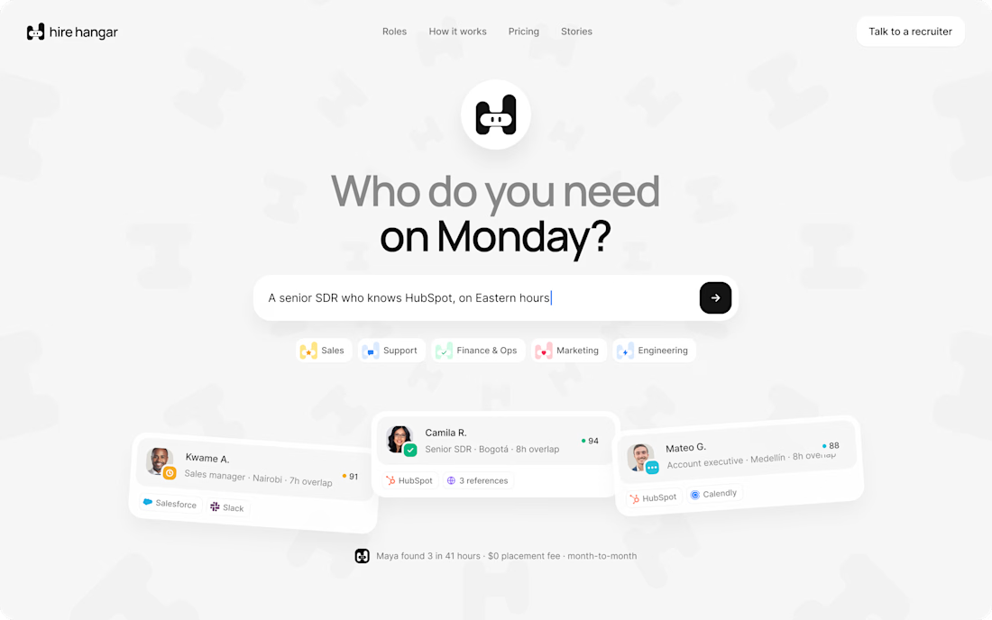
A good landing page shouldn’t make you work to understand it.
Been working on a new project where the goal was simple:
Make a complex product feel simple, clear, and easy to explore.
Less explaining.
Less clutter.
More visual hierarchy.
A clearer path to the next step.
Still working through the details, but this one is coming together nicely.
Full case study soon.
This pairs well with the Hire Hangar screenshot because the design itself demonstrates the point—you don't need to reveal the whole project yet.



The clearer the message, the easier the decision.

Good design should make the next step obvious.


This is where thoughtful UX makes a real difference.

Simple always wins when the product is complex.

This is such an important part of good product design.

The catch with "less explaining" on a complex product is that the explanation doesn't vanish, it relocates - usually to the sales call, where the design team never sees what it costs. Did you get to hear what questions people still showed up with after the rewrite?

Great work, looks awesome!🔥

Nice bro!!

Really inspiring work.

Nice work 🔥

Appreciated @Mehdi Hassan
keep on rocking
The network for creativity
Join 1.25M professional creatives like you
Connect with clients, get discovered, and run your business 100% commission-free
Creatives on Contra have earned over $150M and we are just getting started











Related posts


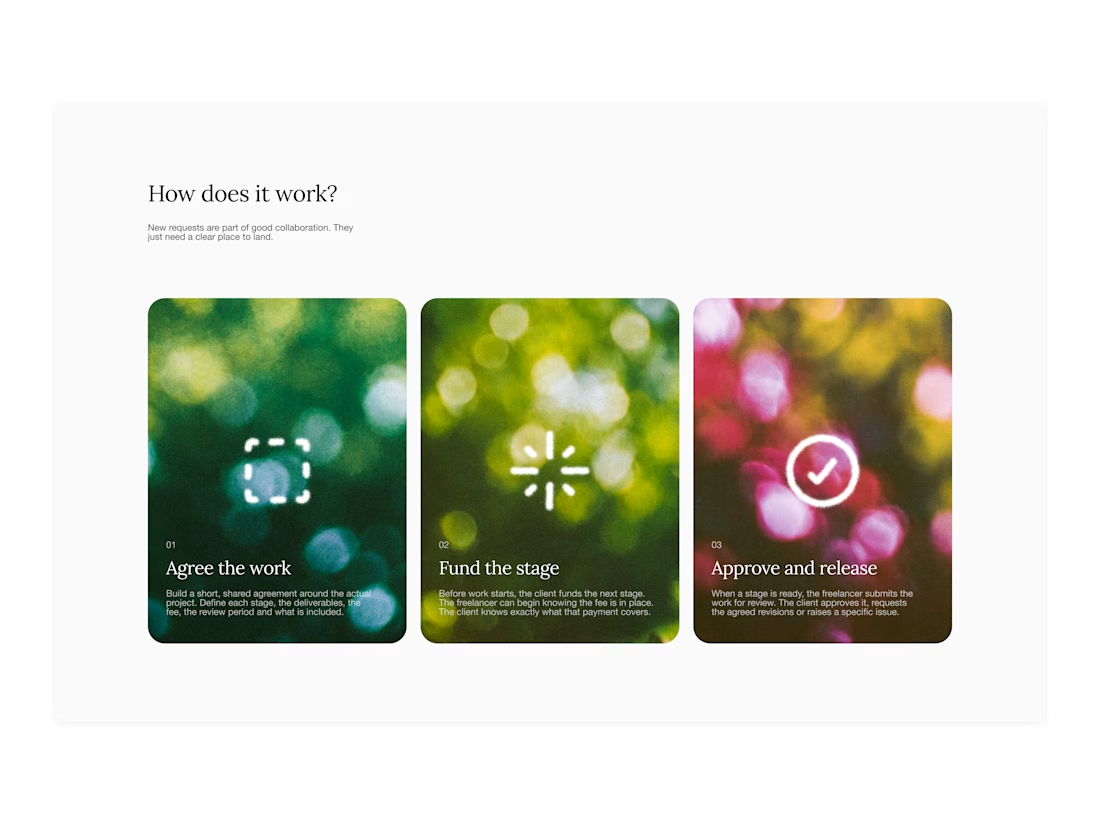

Your web sections always have such strong art direction. Great to see the brand carried right into the layout.


A little excerpt from the brand guidelines for a recent project


The APS mark built from the four small symbols reads like a map legend, which suits a psychology service. Nice that the guidelines page shows it on the dark teal, most would have played it safe on white.

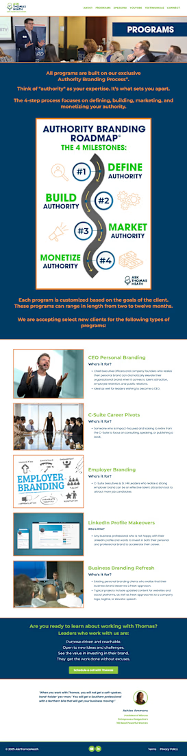
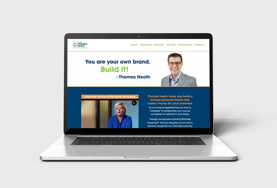
Kajabi website design and development for personal branding coaches, consultants, speakers, and business professionals who want to establish authority, showcase their expertise, and attract potential clients. This website features a professional layout with a strong personal brand message, video content, client testimonials, media features, trusted partner logos, and a clear call to action to encourage visitors to schedule consultations.
Designed to build credibility and communicate value, the website includes a structured service presentation, authority-building content, a featured branding roadmap, responsive layouts, and strategic conversion sections that guide visitors toward taking action.
Features & Functionality:
Custom Kajabi website design and customization
Responsive desktop, tablet, and mobile layouts
Personal branding and service presentation
Video content integration
Client testimonials and social proof
Media features and trusted partner logos
Consultation booking call-to-action
Authority branding roadmap presentation
Strategic content sections for lead generation
Clear navigation and user-friendly structure
Social media integration
Conversion-focused page layout