The network for creativity
Join 1.25M professional creatives like you
Connect with clients, get discovered, and run your business 100% commission-free
Creatives on Contra have earned over $150M and we are just getting started

The network for creativity
Join 1.25M professional creatives like you
Connect with clients, get discovered, and run your business 100% commission-free
Creatives on Contra have earned over $150M and we are just getting started





Related posts

Would you survive 1 day in this jungle? 😱 Plain thumbnail vs the pro version, tell me which one you'd click. Open for thumbnail orders. Message me!


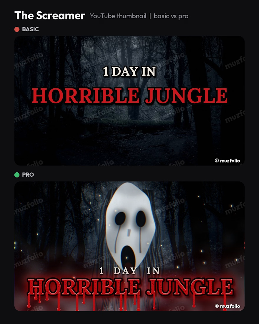
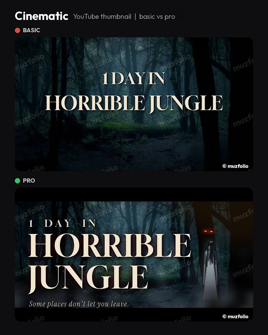
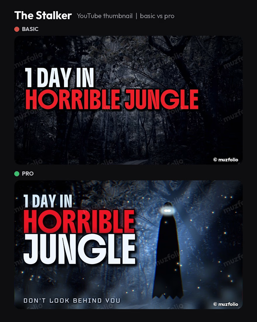

The side by side comparison really highlights how specific typography choices can make or break a thumbnail for a survival challenge. That visual clarity is often the deciding factor for whether a viewer pauses their scroll to click through.

Made a launch film for @unfair.so with zero After Effects. 🎬
40 seconds. No cuts. Every pixel is code.
→ Headlines that sharpen out of pixel blocks
→ A blue dither that turns day into night
→ 12 creators firing at the same minute, 1.6K → 238K views
→ Calm music with the bass stripped out
Built with Claude Opus 5.5 + teaserkit.com. Self-initiated concept, not a paid client job (yet 👀).
Which moment would you keep if I cut it to 15 seconds? 👇


High-CTR thumbnail concept designed for tech and video editing tutors. Focused on spatial depth, premium 3D masked layers, and vibrant color blending to maximize mobile watch-rate.