The network for creativity
Join 1.25M professional creatives like you
Connect with clients, get discovered, and run your business 100% commission-free
Creatives on Contra have earned over $150M and we are just getting started
Back to feedPost
Taste Test


Version 2. The stronger emphasis on the highlighted plan creates a clearer visual hierarchy and makes the intended choice immediately obvious. In pricing sections, reducing decision friction is often more important than maintaining perfect visual balance.

eye catching
thanks :)
The network for creativity
Join 1.25M professional creatives like you
Connect with clients, get discovered, and run your business 100% commission-free
Creatives on Contra have earned over $150M and we are just getting started
Related posts


Same course. Same content.
But two completely different feelings ✨
Which version would you choose?

18 voted
31%
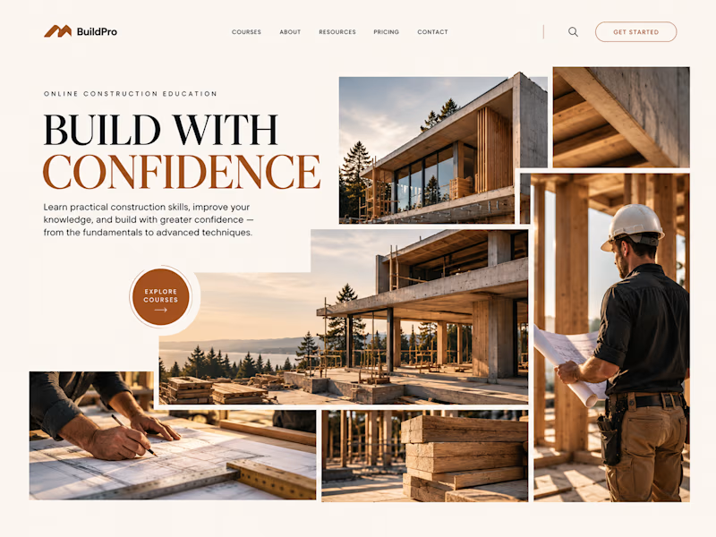
40 voted
69%
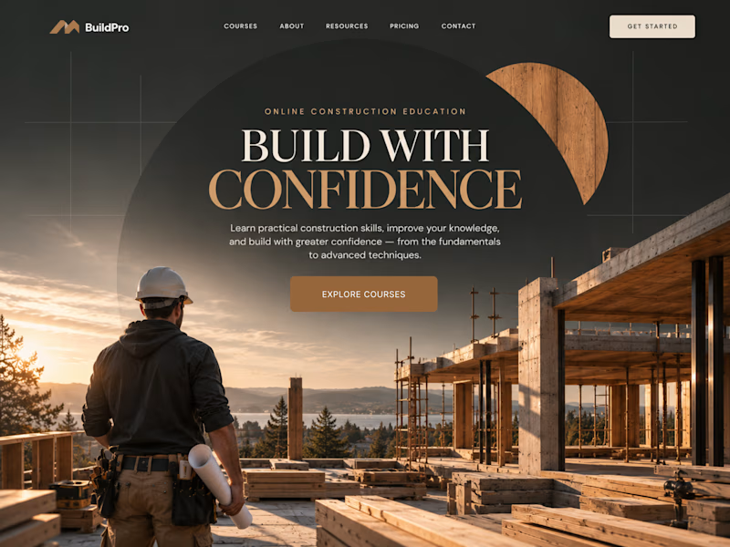
58 votes
Closed

option 2 feels a bit more cinematic, the confident feeling is embedded into the layout!

Two warm ups today, both might become full case studies:
Parlata: an audio-postcard service that records and archives local dialects. Every recording becomes a small printed card with a QR link.
MODULO: an Industrial IoT brand. Olive, navy, one wobbly blob.
One is warm and human. One is technical and playful. Which would you want to see go all the way?
31 voted
63%
18 voted
37%
49 votes
Closed

Love it

Your crypto landing page has 3 seconds to earn trust. Which direction gets it right?
One crypto homepage feels built for serious traders. The other makes crypto feel effortless.
Which one would make you click “Start Trading” without hesitation: #1 or #2?


10 voted
37%
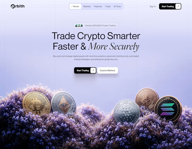
17 voted
63%
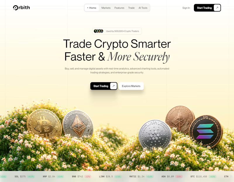
27 votes
Closed

Option 2 feels more inviting, but for crypto, does 'effortless' actually build more trust than looking serious? Curious how you balance security feel with clean UI.