The network for creativity
Join 1.25M professional creatives like you
Connect with clients, get discovered, and run your business 100% commission-free
Creatives on Contra have earned over $150M and we are just getting started
Back to feedPost

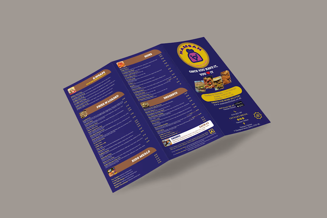
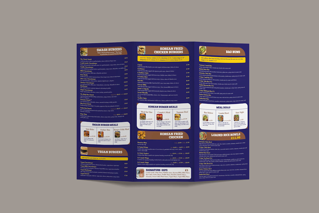
Restaurant Menu Design | Print


The network for creativity
Join 1.25M professional creatives like you
Connect with clients, get discovered, and run your business 100% commission-free
Creatives on Contra have earned over $150M and we are just getting started
Related posts

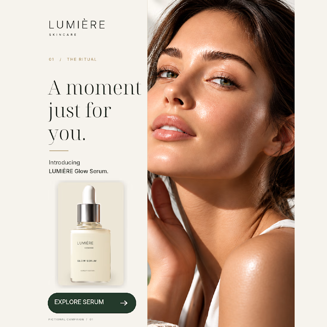
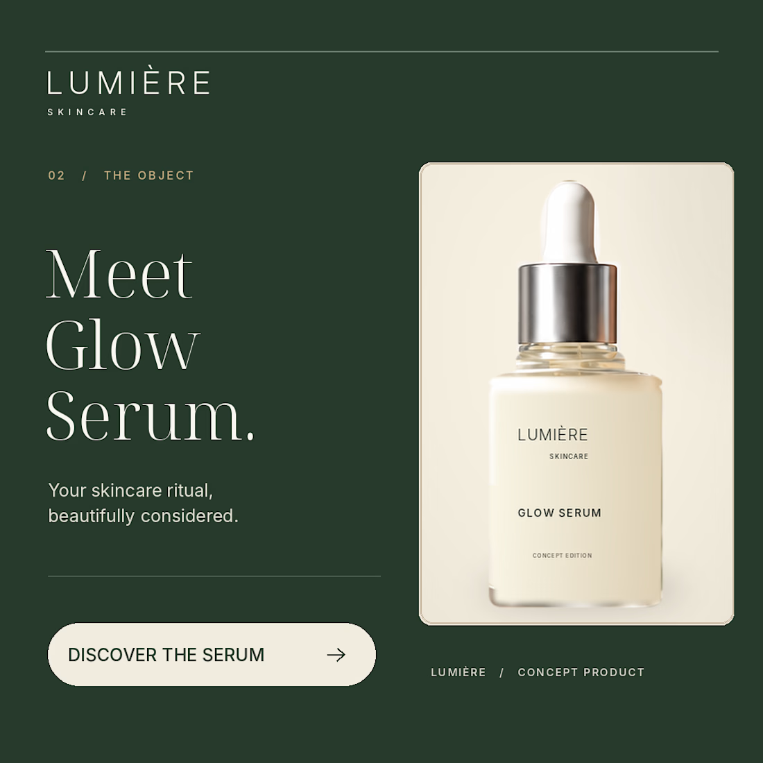
Same skincare brand. Two very different first impressions.
For my latest NeuroDNA project, LUMIÈRE, I explored two creative directions:
01 — the face and the skincare ritual.
02 — the bottle as the main focus.
Warm ivory, deep green and consistent packaging connect both designs. The imagery is AI-assisted, with layout and typography composed separately.
LUMIÈRE is a self-initiated concept for a fictional brand.
For a skincare brand you’ve never heard of, which would make you pause — 01 or 02, and why?


Great job bro 🎉🎉

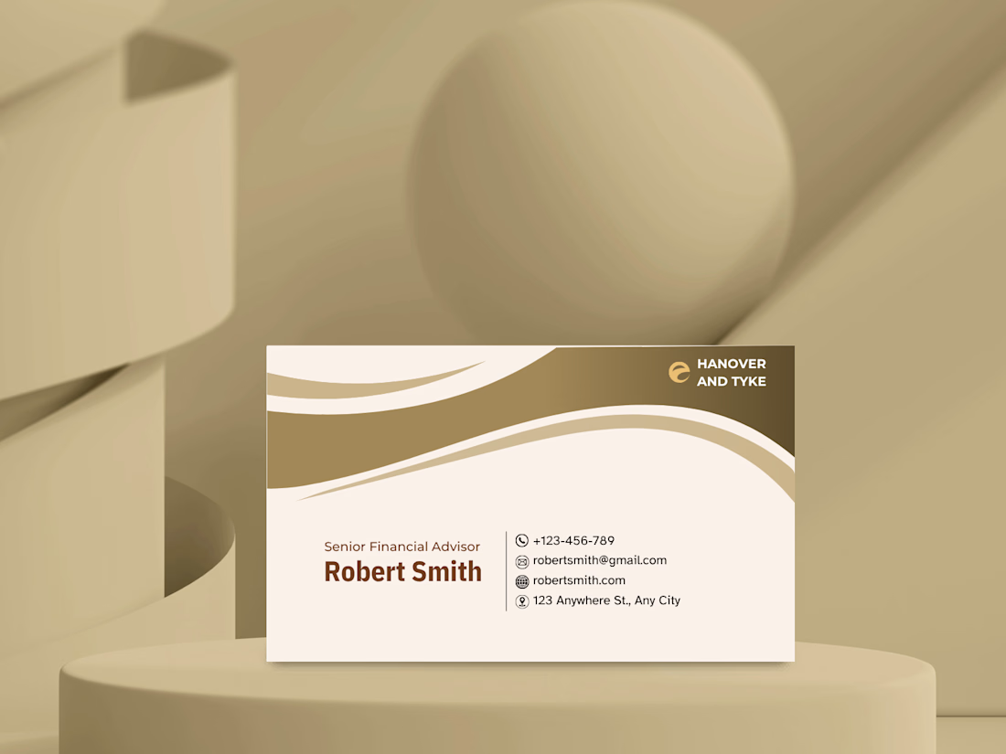
A business card concept for a financial advisory brand.
For finance, I wanted the card to feel trustworthy and calm rather than flashy. A warm gold and cream palette, flowing curves at the top to add movement, and a clean contact block with simple icons so the details are easy to scan.
Gold and cream for a finance brand: classic and trustworthy, or too soft? Tell me what you think. 👇


Masterpiece

GOOD ENERGY FITNESS — From Brand Identity to Digital Experience 🩵
Strong in type. Soft in tone.
For this week's design brief by @the.brief.booth, I explored a women’s-only fitness brand that combines bold typography, soft colours and playful hand-drawn elements.
Alongside the visual identity, I wanted to take the project one step further by building a functional web app with Base44.
The experience includes membership registration, a digital ENERGY PLAN pass and class booking — bringing the brand beyond its visual identity and into everyday interactions.
A small experiment in connecting branding, UI design and functionality.
💻 Explore the live app:
https://good-energy-flow.base44.app
#BrandIdentity #DigitalExperience #UIDesign #Base44 #FitnessBranding #BrandDesign


Great idea for the fitness industry! Many fitness apps use dark mode, and I think your colour palette works really well here.