The network for creativity
Join 1.25M professional creatives like you
Connect with clients, get discovered, and run your business 100% commission-free
Creatives on Contra have earned over $150M and we are just getting started
Back to feedPost
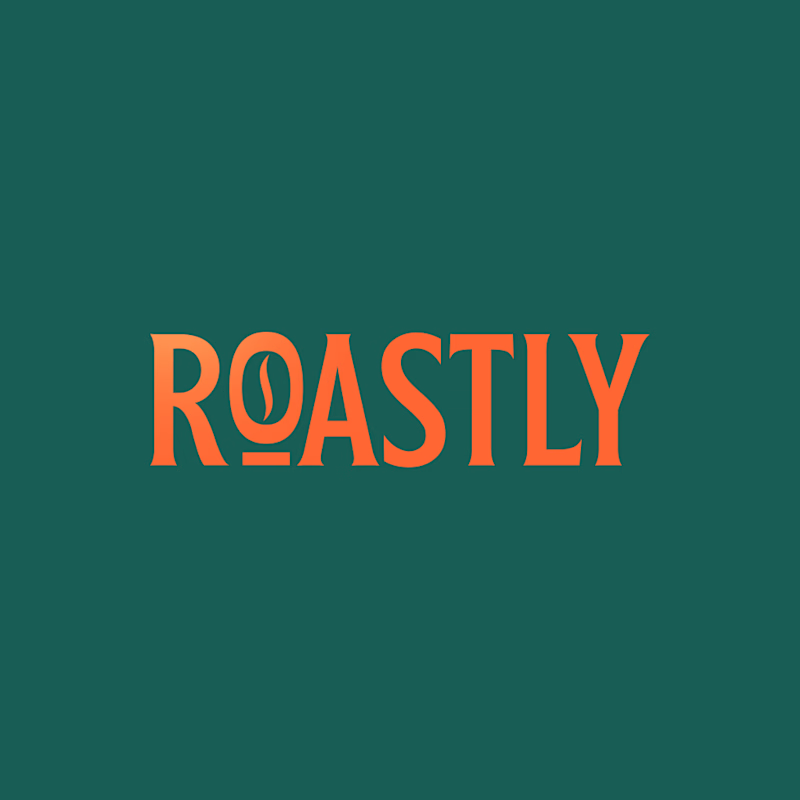
Taste Test

Which logo feels stronger for a coffee brand?
4 voted
57%
3 voted
43%

7 votes
Closed

The coffee bean is much more recognizable in the clean one.


clean one speaks more to me

Clean & Premium feels stronger for a coffee brand.
The typography gives it more longevity and flexibility across packaging and signage.
The network for creativity
Join 1.25M professional creatives like you
Connect with clients, get discovered, and run your business 100% commission-free
Creatives on Contra have earned over $150M and we are just getting started
Related posts


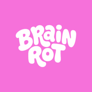
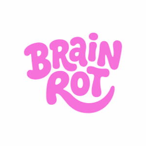
Kaiborgdesigns.com logo concepts, thoughts?
5 voted
36%

9 voted
64%

14 votes
Closed


I'm rocking with the one on the right!


Trending
maxearnings
The next frontier of payments is live on Contra. How are you maximizing revenue?
freelancerlife
Freelancer life is wins, pivots, and everything in between. What’s yours right now?
aidesignflow
AI tools are redefining how designer work. What does your workflow look like?
micrographics
Micrographics started as utility - barcodes, packaging, instruction labels. How would you use them?
aivideo
AI video tools are moving at warp speed. What tools are you using?