The network for creativity
Join 1.25M professional creatives like you
Connect with clients, get discovered, and run your business 100% commission-free
Creatives on Contra have earned over $150M and we are just getting started
Back to feedPost
I wanted to create something that practical designers could use for the #FigmaMakeathon.
Meet Depth, a new design tool that reimagines the "zoom” (pinch to zoom/Ctrl+scroll to zoom) as a progressive design inspection tool.
Each level reveals a different layer of your design. Structure. System. Intent. Three levels. One gesture.
Seeing the “why” behind each design has never been easier, even for stakeholders.
Inspect, copy tokens directly, and leave annotations anywhere.
View the live site here: https://zebra-chat-30501410.figma.site/
Support my on LinkedIn post here: https://tinyurl.com/42npc256
View in the Figma Community here: https://www.figma.com/community/file/1609710921120524425
P.S. You can also use hot keys:
“D” for toggling zoom or depth mode
“1”, “2”, and “3” for changing each separate depth mode.


thank you!

Clean, Simple, Elegant. 🔥
Thank you sm! 🤩

Appreciate it 🙌

😚 let’s hope things turn in my favor

Turning Zoom into a progressive inspection tool is such a smart idea. Reimagining Zoom as a layered understanding is smart.
Thank you so much!

Such an interesting concept!
I appreciate it.🙂🙌

The idea behind this is pretty great and practical for sure. Love this
Thank you!

🎉 thank you I appreciate it

phrase of the year for me has been: progressive disclosure. this is a sick visualization of just that!!
☺️☺️ in my personal work, I’m designing a dashboard. A huge thing is dealing with cognitive load. I’ve been playing with progressive disclosure a lot. I guess it rubbed off on this project too 😭

upgoated , I came at it from the entirely other direction, the user experience to control design fidelity with pinch-zoom .
As I was credit limited so had to constrain things alot and dev tooling comes with a complexity cost that can burn budgets like crazy.
For some of the...
great minds think alike, your link is broken, could u reply again?
https://contra.com/community/vHJKBYGK-everyones-waving-their-arms-around-and
I guess I don't understand contra well enough lol.
Like now I'm noticing your post has like a custom title/slug that's not just the the first words of the post 😲
contra.com
Everyone’s waving their arms around and wiggling our fingers trying to find the next great
Connect with next-gen talent and tools to get work underway. Hire more independents. Start more projects. Get more creative.
ha, all good. Still figuring out Contra, too. It's a really cool concept you did!


Fantastic!
thank you!

So practical! I love the execution of this idea :)
Thank you so much!
The network for creativity
Join 1.25M professional creatives like you
Connect with clients, get discovered, and run your business 100% commission-free
Creatives on Contra have earned over $150M and we are just getting started





Related posts

Illustration: Creativity beyond the brief



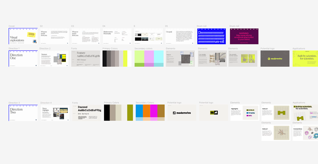
after presenting more brand directions than I can count, one thing I’ve learned: I never jump straight into showing the visuals.
first I want to establish what we're actually trying to solve.
what we heard from the client. what they want to be known for. where they sit in the market. what needs to feel different.
then the big idea, and how it translates into type, colour, imagery and graphic elements.
only then the designs.
context changes how you judge the work.

Created a high quality 3D toothbrush model with realistic texturing and a short animation to showcase product design. Optimized for product visualization and marketing use.


the round button near the top is a nice detail. did you model the bristles too?