The network for creativity
Join 1.25M professional creatives like you
Connect with clients, get discovered, and run your business 100% commission-free
Creatives on Contra have earned over $150M and we are just getting started
Back to feedPost

Wellness Center Branding, Web Design/Development, SEO Optimization


The network for creativity
Join 1.25M professional creatives like you
Connect with clients, get discovered, and run your business 100% commission-free
Creatives on Contra have earned over $150M and we are just getting started



Related posts


What makes a website feel cohesive?
It’s not just the colors.
It’s not just the typography.
And it’s definitely not about making every section look the same.
A cohesive website is built when every visual decision feels like part of the same story, from typography and imagery to spacing, buttons, cards, and even the smallest details.
The goal isn’t repetition.
It’s creating a visual language that people recognize and remember.
That’s when a website starts to feel like a brand, not just a collection of sections.
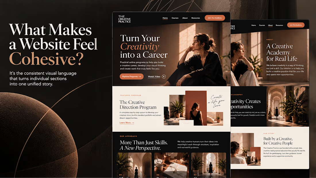

Well put, Serge. Consistent spacing, buttons and cards do more for that feeling than making sections match, and they are usually the first things to drift as a site grows.

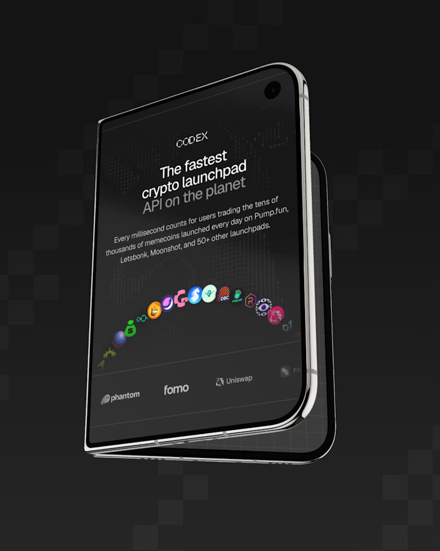
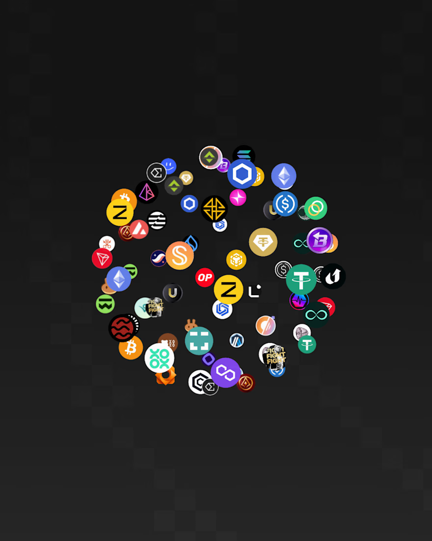
Excited to share the latest web redesign projects for Codex⚡
The goal was to pair technical credibility with a more approachable, modern financial aesthetic while preserving the depth and complexity that make Codex a high-profile data provider.
The result is a visual direction designed to resonate across the spectrum, from crypto builders and neofinance founders to enterprise-scale exchanges like Coinbase. 💻



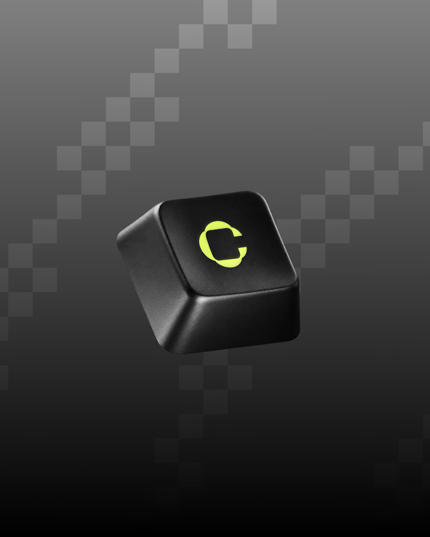

Love the logo on the keyboard key

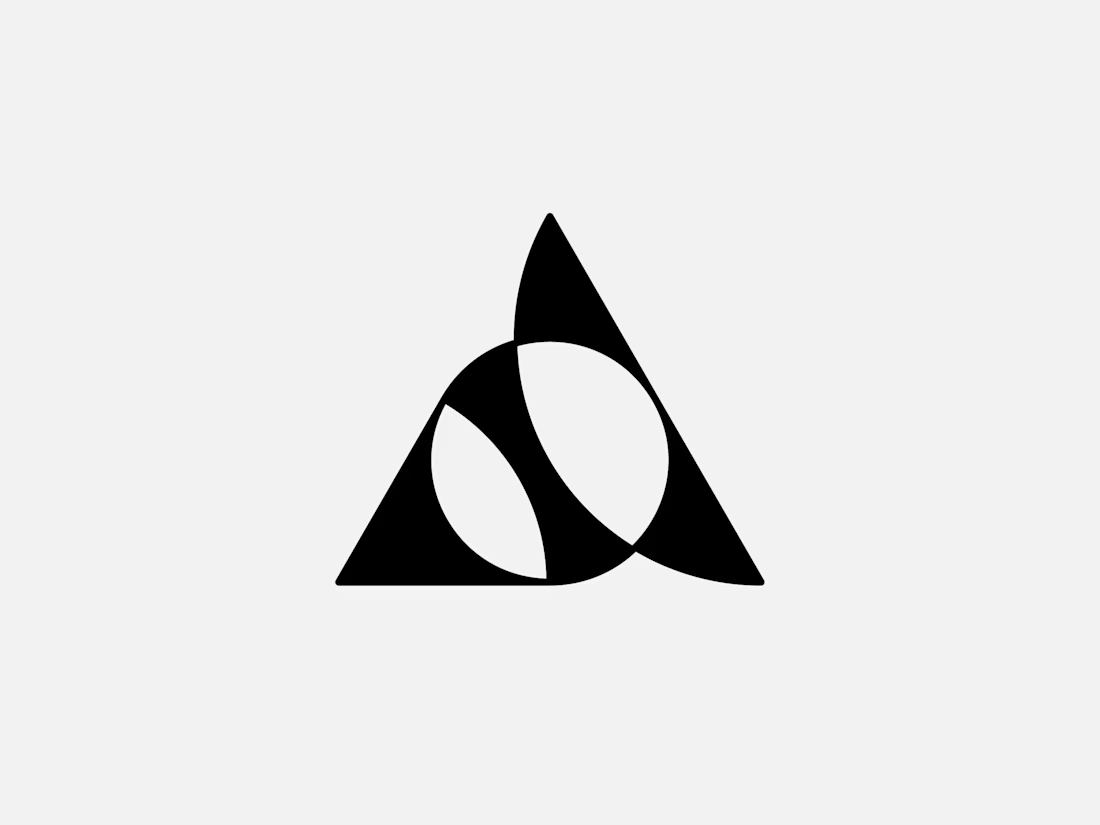
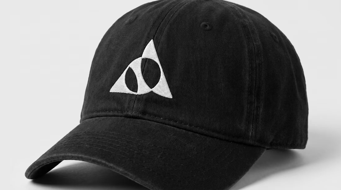
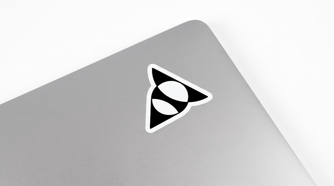
Exclusive premade abstract triangle A logo.
One buyer, full copyright transfer.
A triangle, a circle, and one sweeping curve forming a stylized letter A with two leaf-like shapes in negative space. Built for AI companies, tech startups, fintech platforms, and architecture studios.
Available now: https://brandforma.com/work/abstract-triangle-a-logo-for-sale
Design by Bohdan Harbaruk // Brandforma Studio


TOP!!