The network for creativity
Join 1.25M professional creatives like you
Connect with clients, get discovered, and run your business 100% commission-free
Creatives on Contra have earned over $150M and we are just getting started
Back to feedPost

Hey people! Presenting to you one of the client works that has been going on for me on September. Introducing Kaya, a traditional yet modern "Kopitiam".
Kopitiam - Traditional Cultural Restaurant
The concept of these work is to showcase the passion of the kitchen. How every orders produced with heart & soul. The ambience of the restaurant, how every day is like.
Presenting to you Kaya Kopitiam
The network for creativity
Join 1.25M professional creatives like you
Connect with clients, get discovered, and run your business 100% commission-free
Creatives on Contra have earned over $150M and we are just getting started



Related posts

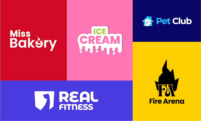
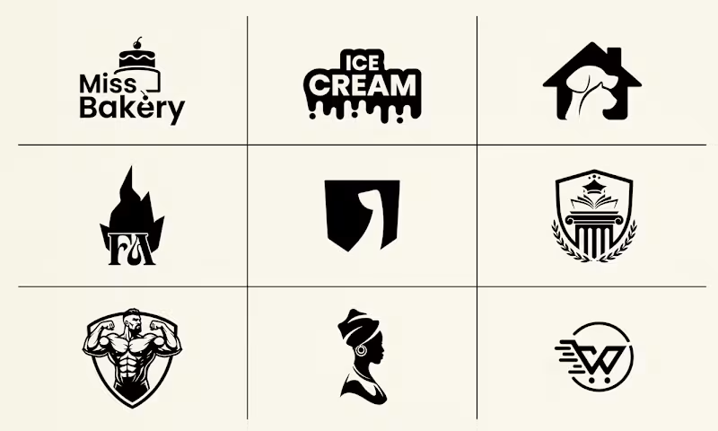
Which branding style is more effective: vibrant multi-colored identity presentations or clean minimalist monochrome grid sheets?
4 voted
80%
1 voted
20%
5 votes
Closed

Nothing better than Multi color


🎉 It’s live! I’ve finally updated my design portfolio:
👉
This space has been a long time coming, a reflection of the stories, systems, and identities I’ve been lucky to shape across wellness, healthcare, community & events!
It’s still evolving (aren’t we all?), and I’ll be adding more projects soon, but I’m excited to finally share a fresh look at my work and creative direction!

Congratulations on the new portfolio, Kajal! The grid of bold reds, magenta and cobalt mockups, with that confident serif G repeating throughout, makes the whole identity feel energetic yet cohesive. What guided the way you sequenced your wellness and healthcare projects?

What makes a candy brand recognizable across every pack?
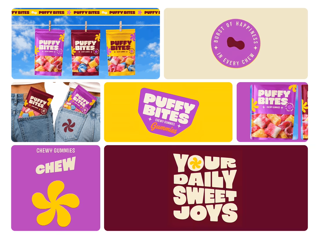
For Puffy Bites, I built the identity around rounded lettering, expressive symbols, and a palette of burgundy, purple, yellow, and cream.
The same visual language carries through pouch packaging, smaller wrappers, campaign imagery, and an animated brand showcase.
One design decision that ties it together: the packaging color changes, while the logo placement, product descriptor, and supporting graphics maintain a consistent structure.
I handled the full client project, from logo and visual identity to packaging and campaign applications.
Which colorway would catch your eye first—purple, burgundy, or yellow?
Explore the full Puffy Bites case study. If you’re developing a candy or snack brand, I’m available for branding and packaging projects.

Love it,
Great work