The network for creativity
Join 1.25M professional creatives like you
Connect with clients, get discovered, and run your business 100% commission-free
Creatives on Contra have earned over $150M and we are just getting started
Back to feedPost

Day 26/90
$672 → $5,000
Neue Journal© for @framer — coming soon!
#framerchallenge

The network for creativity
Join 1.25M professional creatives like you
Connect with clients, get discovered, and run your business 100% commission-free
Creatives on Contra have earned over $150M and we are just getting started







Related posts


Every element feels perfectly placed! 👏

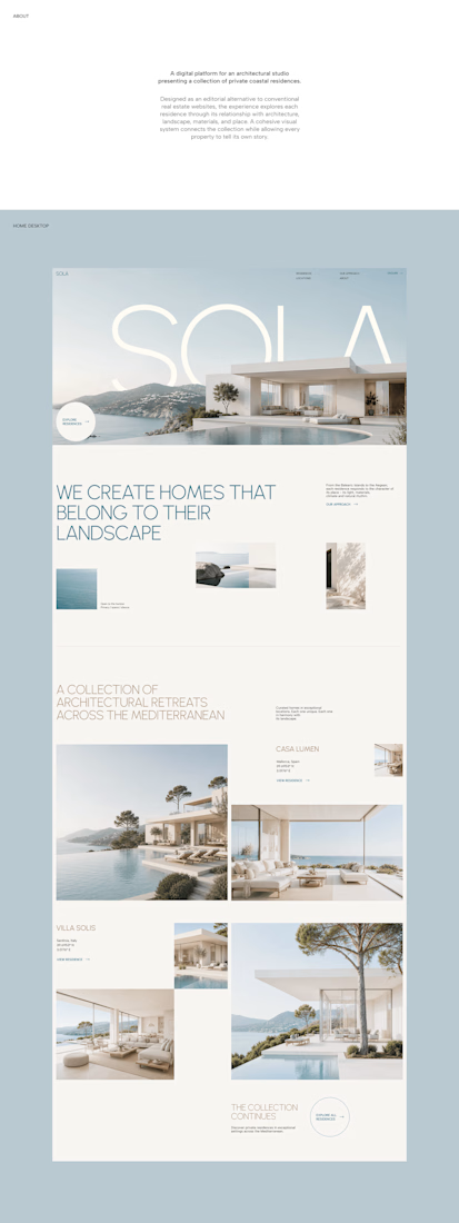
A luxury property deserves a presentation that does it justice.
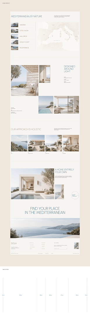
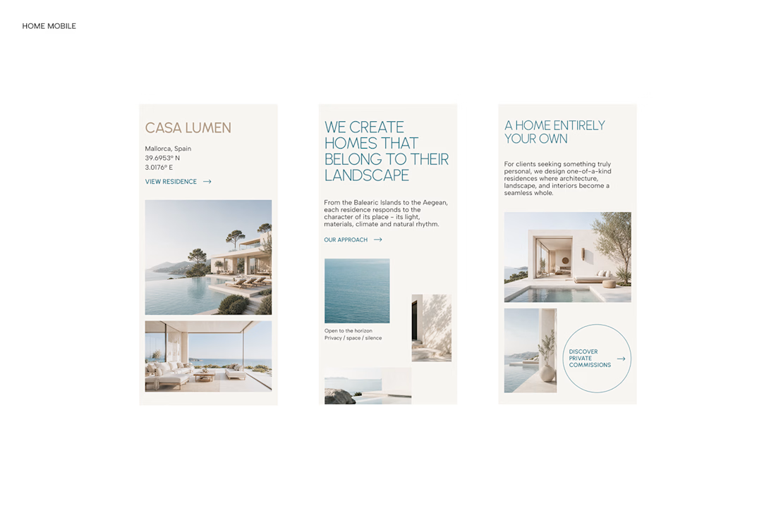

With SOLA – Architecture Studio & Luxury Real Estate, I wanted to bring the beauty of modern coastal architecture into the website itself.
From the large property images and soft blue tones to the clean layout across desktop and mobile, every part of the design helps create a calm, premium feel while making the homes the centre of attention.
I like how the website brings architecture and digital design together, giving visitors a chance to explore the properties before making an enquiry.
If you were looking for a luxury home, would a website like this make you more interested in the property?
#WebDesign #Architecture #LuxuryRealEstate

Incredible work, you transformed SOLA into a premium property brand.

I just put my first two Framer templates out into the world 🙌
Alder21 is a free landing page for real estate launches. Floor plans for every unit type, a payment-plan calculator you can actually play with, and a form to book visits.
Selects is a portfolio for photographers, built like a 35mm contact sheet. The film strips move on their own, and when you hover a project a red grease-pencil circle draws itself around it.
Both are up on Contra and the Framer Marketplace. Templates are new territory for me, so I'd really like honest feedback. What would you change first?


the payment plan calculator is the standout, id make it visible before the unit details