The network for creativity
Join 1.25M professional creatives like you
Connect with clients, get discovered, and run your business 100% commission-free
Creatives on Contra have earned over $150M and we are just getting started
Back to feedPost

𝗦𝗵𝗼𝗽𝗶𝗳𝘆 𝗮𝗽𝗽 𝗱𝗲𝘃𝗲𝗹𝗼𝗽𝗲𝗿𝘀, 𝗱𝗼𝗻'𝘁 𝗺𝗶𝘀𝘀 𝘁𝗵𝗶𝘀 𝗱𝗲𝗮𝗱𝗹𝗶𝗻𝗲. 🔐
Shopify is making IP allowlisting mandatory for public apps.
📅 November 12: Apps using bulk operations
📅 November 20: All public apps using the Admin API
An IP allowlist helps prevent leaked access tokens from being used outside approved networks.
If you maintain Shopify apps, now is the time to check your setup.
Don't wait until your app stops working.
Have you checked your app's IP allowlist yet?
#Shopify #ShopifyDevelopment #AppSecurity #ShopifyApps

The network for creativity
Join 1.25M professional creatives like you
Connect with clients, get discovered, and run your business 100% commission-free
Creatives on Contra have earned over $150M and we are just getting started



Related posts

How do you help someone find the right ski jacket fast?
For rehall.com, a Dutch skiwear brand, we started with who it's for. The Shopify mega menu opens by audience, so Men, Women, Boys and Girls each get their own garment list and campaign tiles in one hover.
On a collection, you filter by size, colour, waterproofness and breathability. The counts update live and the grid refreshes without reloading the page.
A custom Liquid theme, selling in the Netherlands, Belgium and Germany in three languages.
Would you shop by audience first, or by product type?


LUXE Furnish Studio is ready!!
I designed & built LUXE - a premium furniture brand on Shopify.
The goal was simple: Make it feel like a luxury showroom, not just an online shop.
What I did:
Clean, premium homepage with luxury branding
Curated collections: Sofas, Chairs, Tables & Decor
High-converting product pages with clear pricing & Add to Cart
Fully mobile-responsive - looks perfect on phone & desktop
Fast, clean navigation for easy shopping
Built on Shopify with a premium, minimal aesthetic focused on conversions.
If you need a luxury Shopify store that actually sells - let's build yours.
Live Demo: luxe-furnish-studio.myshopify.com
Password: 00
Services: Shopify Store Design, Shopify Development, E-commerce UI/UX
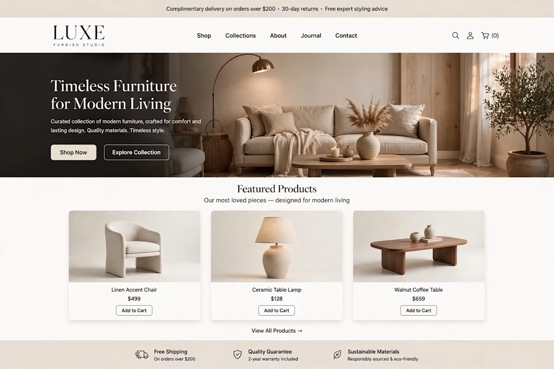
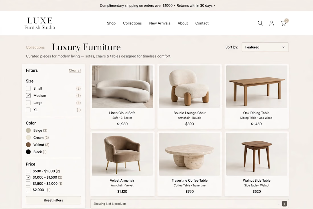
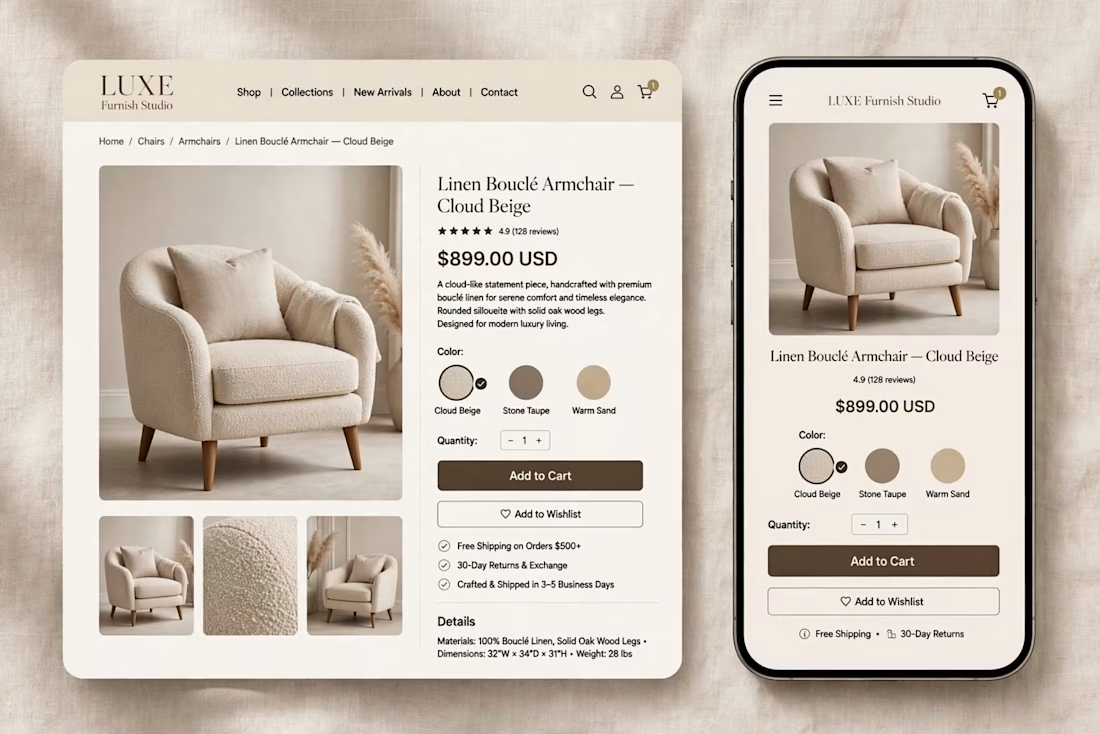

The warm beige palette and the sofa hero with the arc lamp feel like a real showroom, and the mobile product page keeps the same calm look. Which part took longer, the homepage or the product page?

I designed and built the Shopify store for Youegos ✨
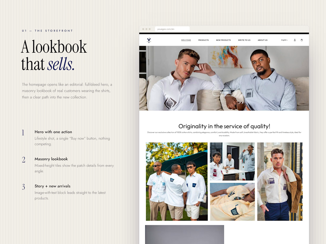
Youegos makes premium 100% cotton shirts in France, and each style carries its own woven patch details on the pocket, the chest or the collar. Those details are what make the brand, so the website had to put them front and centre.
So I built the store around that:
→ A homepage that opens like a lookbook, with real people wearing the shirts and every patch in focus
→ A product page that answers every “should I buy this?” question up front: size, stock left, delivery time and free returns
→ “Shop the Look” sections that turn lifestyle photos into products you can click straight into
→ A full French and English version, so the brand can sell beyond France
A premium product deserves a storefront that feels just as premium.
👇 When you’re buying clothes online, what makes you trust a brand enough to check out: the photos, the reviews, or the return policy?
https://contra.com/p/RFYogQQL-youegos-shopify-store-design-and-development?referralExperimentNid=DEFAULT_REFERRAL_PROGRAM&referrerUsername=muhammad_hammad_afkei70w