The network for creativity
Join 1.25M professional creatives like you
Connect with clients, get discovered, and run your business 100% commission-free
Creatives on Contra have earned over $150M and we are just getting started
Back to feedPost

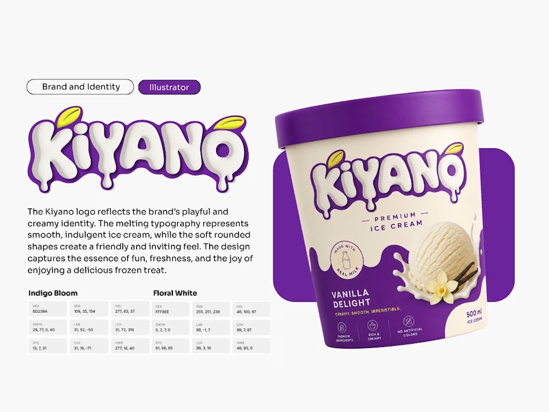
Developed a playful brand identity for Kiyano Premium Ice Cream, emphasizing indulgence and creamy personality.
Designed a melting typography logo with dripping effect to visually connect with the product’s texture and appeal.
Incorporated leaf accents in the logo to highlight freshness and natural ingredients.
Created packaging design for the “Vanilla Delight” flavor — cream‑colored tub with purple lid and accents, showcasing product imagery and vanilla flower/pods.
Communicated product values clearly: Made with real milk, Premium ingredients, Rich & creamy, No artificial colors.
Established a cohesive color palette: Indigo Bloom (HEX #60239A) and Floral White (HEX #FEF8EE) for strong brand consistency.
Delivered a design that balances premium feel with playful personality, making the product stand out on shelves.

The network for creativity
Join 1.25M professional creatives like you
Connect with clients, get discovered, and run your business 100% commission-free
Creatives on Contra have earned over $150M and we are just getting started





Related posts


The thing I keep relearning: a design is never finished because someone ran out of ideas. It's finished because someone decided to stop. Knowing when to stop is the hardest part.


Damn.... Crazy colors 👏😍

Brand identity work for WesoftAI



Still waiting to hear back from @Contra HQ
So I did what any designer would do: I made the card myself 😂
Brushed metal. Laser-engraved logo. Holographic Mastercard rings. Full 360° spin. I'm going to keep polishing this until the real one shows up in my mailbox. Your move, Contra 👀
(Concept / fan design, not an official Contra product..Yet 🙌 )


“Okay, this looks WAY too good 🔥 Contra needs to make this real 👀”