The network for creativity
Join 1.25M professional creatives like you
Connect with clients, get discovered, and run your business 100% commission-free
Creatives on Contra have earned over $150M and we are just getting started
Back to feedPost
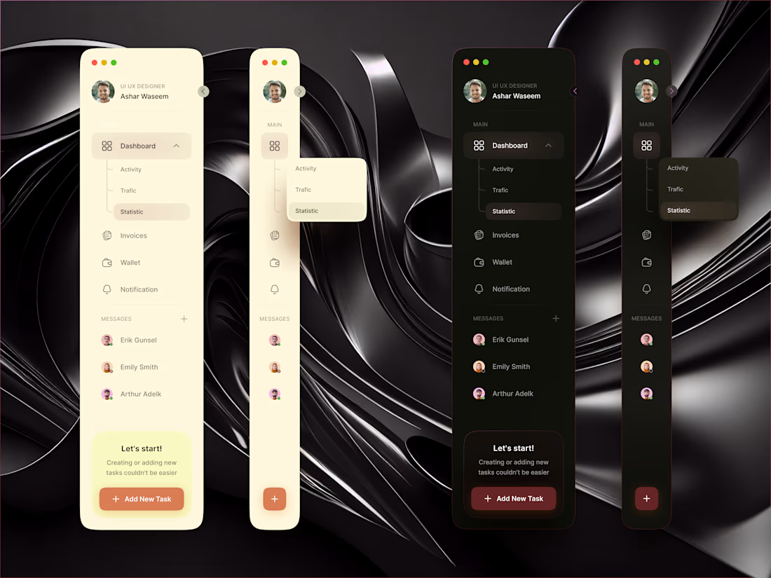
Sidebar Navigation UI, Light & Dark Themes
Exploring a clean and minimal Sidebar Navigation UI in both Light & Dark themes.
This concept focuses on clarity, smooth visual hierarchy, and modern layout rhythm, making navigation simple, intuitive, and aesthetically balanced.
The design includes:
• Light & dark mode variations
• Smooth dropdown interaction
• Clear icon structure
• Organized message section
• CTA placement with strong visual weight
The goal was to create a sidebar system that feels modern, functional, and visually refined while maintaining consistency across both themes.
Designed using Figma & Photoshop.
Feedback is always welcome! ✨



The light/dark pairing is especially convincing here—the shared navigation structure keeps the theme switch feeling like a system choice, not a separate redesign.

@Rohan Ahmed Thanks Rohan! Glad the light/dark consistency came through. I wanted both themes to feel like one system rather than two separate experiences.

The floating avatar stack at the bottom mirrors the team members already listed above it in the panel - you get the sense of who's active without duplicating a separate members list.
@Mark Barliet Thanks Mark! Exactly what I was aiming for keeping the active team visible without adding unnecessary UI clutter.
The network for creativity
Join 1.25M professional creatives like you
Connect with clients, get discovered, and run your business 100% commission-free
Creatives on Contra have earned over $150M and we are just getting started









Related posts

Accidentally made app navigation look more satisfying than the actual music!😍
16 seconds of spatial audio, smooth transitions, and tactile UI motion. Testing how far you can stretch digital minimalism✨
Feedback and love from the design community are always appreciated🙌
UI DesignmotiongraphicsmobileappdesignuiuxdesignMotion DesignUX DesignAdobe After EffectsCinema 4DFigma


This is so satisfying Raheel! 🔥 You nailed that tactile UI motion - 16 seconds but it feels so premium! The spatial audio card with that depth + smooth transition from Home to Made for Spatial Audio is chef's kiss. Minimalism stretched perfectly without losing the Apple Music...

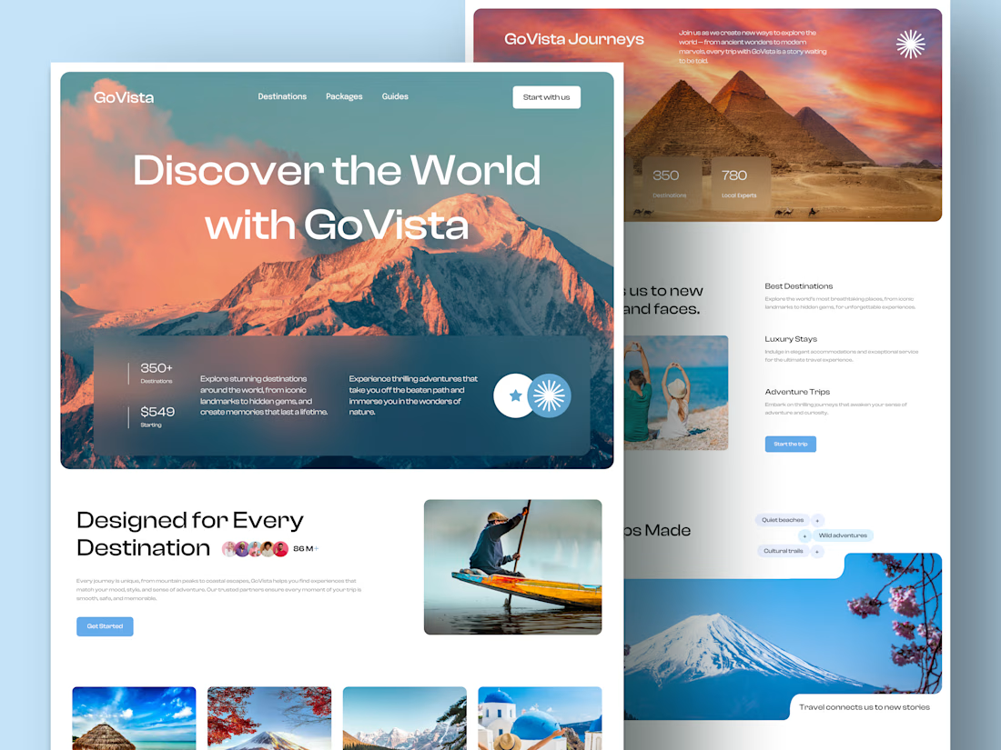
GoVista Journeys - A travel landing page designed to make people dream of their next destination.
A travel company based in Leicester, UK, needed a visually engaging landing page to showcase its destinations and travel experiences while its larger website was being prepared.
The goal was simple: make a strong first impression through beautiful travel imagery, a clean layout, and a design that makes people want to explore more.
Because in travel, the journey can begin long before the booking. ✈️
What catches your attention first on a travel website: the images, the destinations, or the overall design? 👇

I like this very much, very good concept

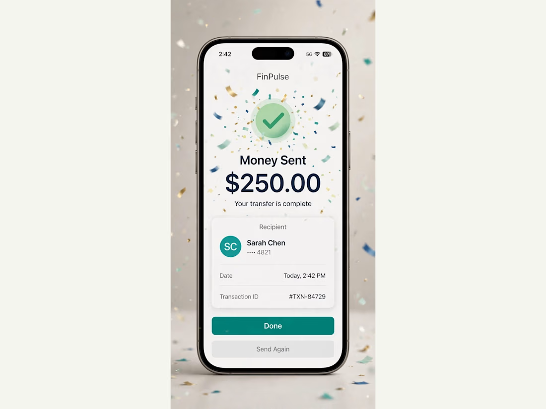
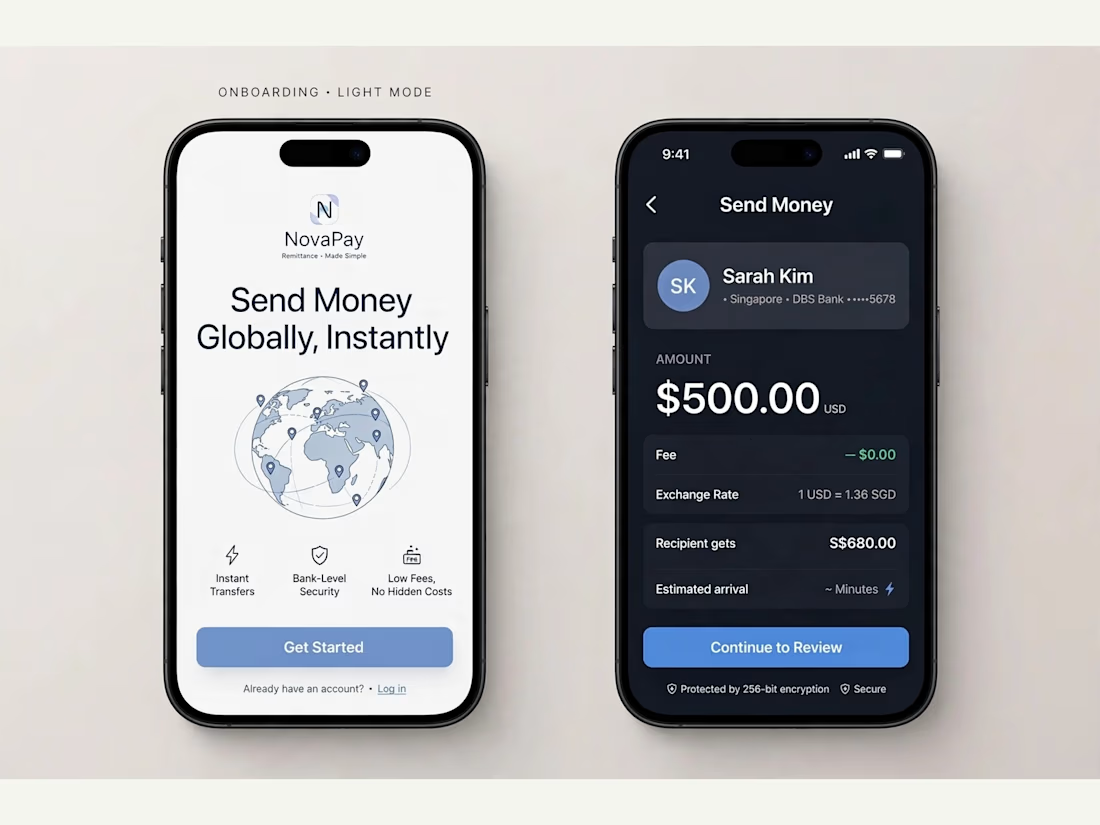
FinPulse — Premium Cross-Border Remittance App
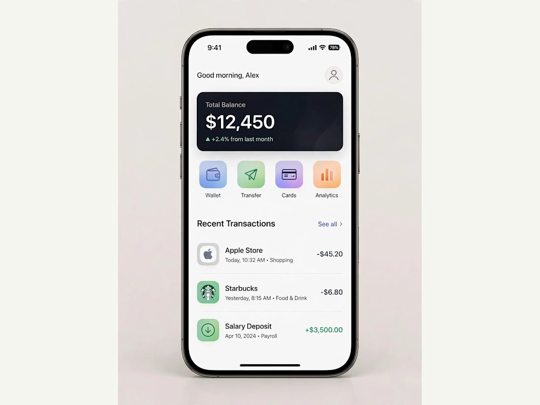
Designed a trustworthy FinTech mobile app for global money transfers.
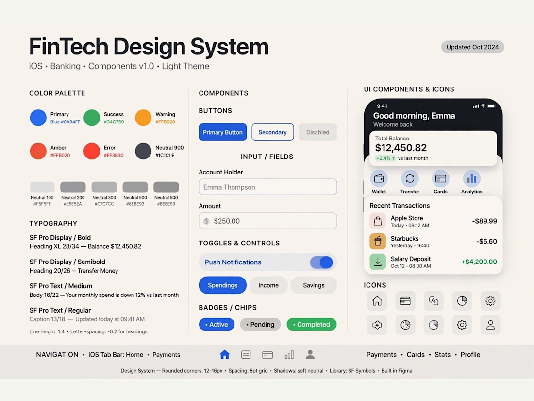
Process: Started with user flow & wireframes for 3-tap transfer, then built a scalable design system in Figma with 100+ components.
Outcome: Final UI focuses on clarity and trust — from onboarding to Home Dashboard ($12,450 balance), Send Money, and Money Sent success state. Built for conversion and speed.
Tools: Figma, iOS Design System, SF Pro
Tags: Mobile App, FinTech, UI/UX, Product Design



Really solid FinTech mobile design. Clean, trustworthy, and the user flow sounds well thought out. Great outcome on the final UI!