The network for creativity
Join 1.25M professional creatives like you
Connect with clients, get discovered, and run your business 100% commission-free
Creatives on Contra have earned over $150M and we are just getting started
Back to feedPost
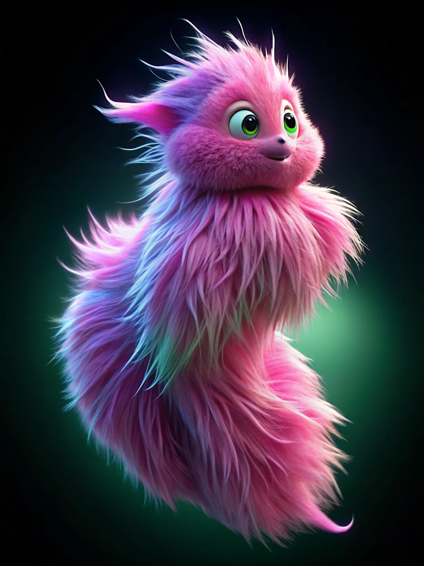
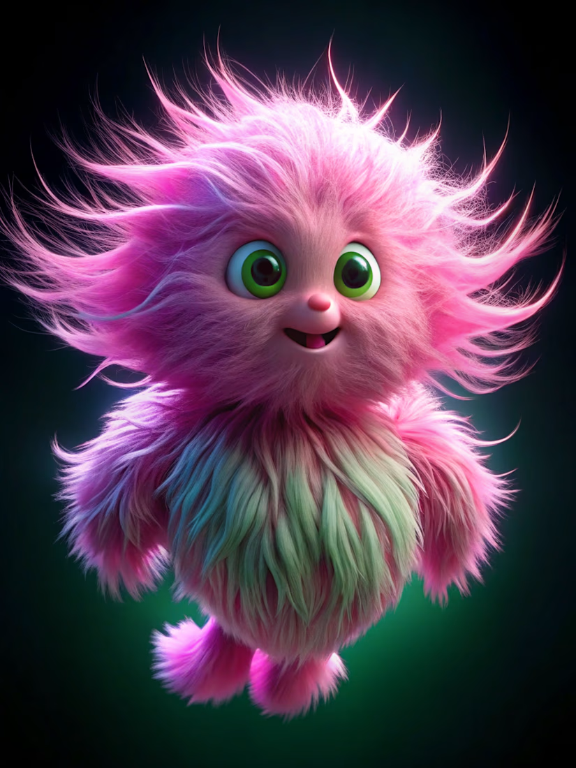
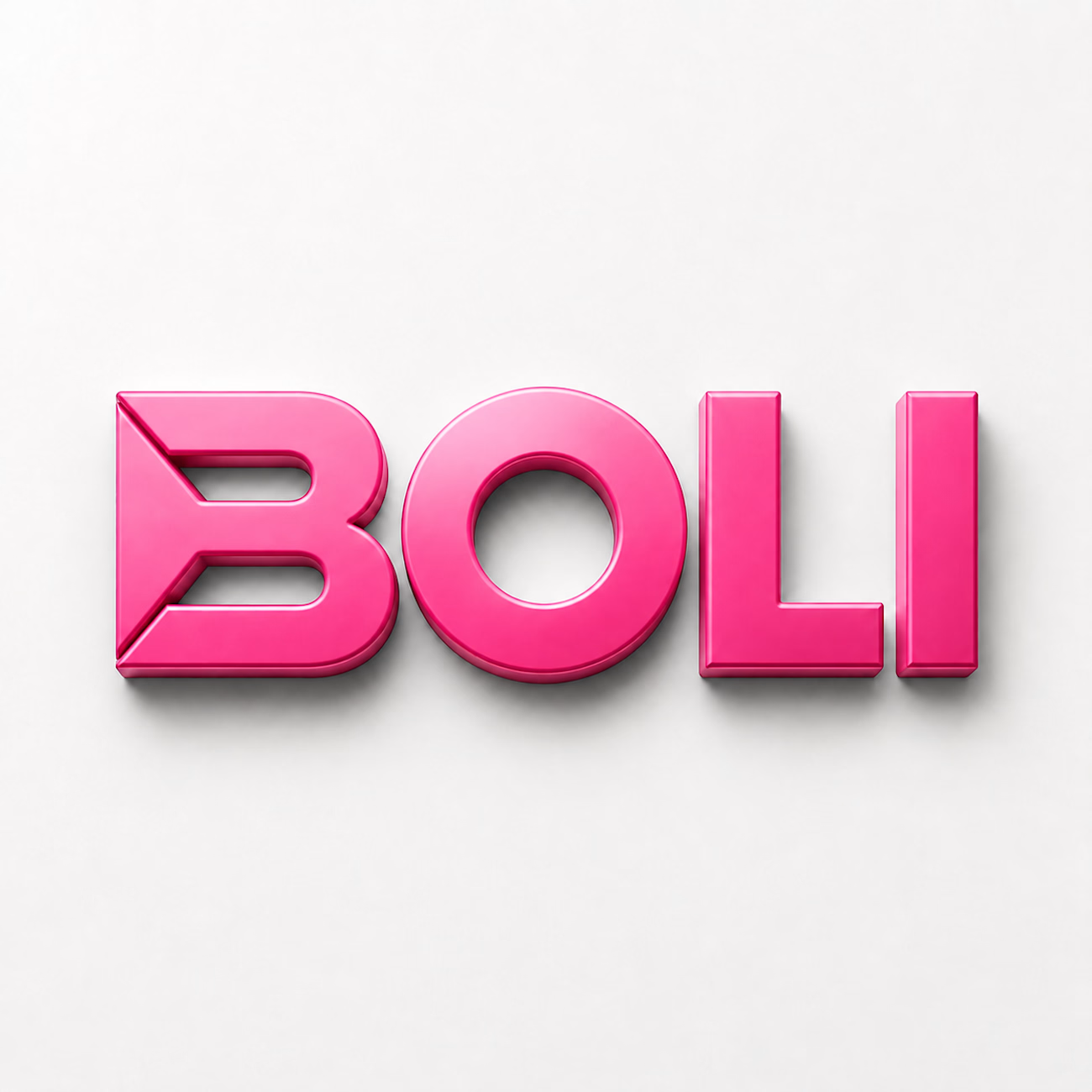
Hello, meet my Character name is [BOLI].
What started as a simple character sketch became an entire visual world.
For this challenge, I designed an original mascot with its own personality, custom wordmark, signature color palette, and a complete identity system that stays consistent across posters, stickers, packaging, and social media.
The goal wasn't just to create a cute character—it was to build a mascot that feels like it belongs to a real brand and can live across endless applications without losing its identity.
Created entirely in Recraft Studio using Exploration Mode, Vector, and reference workflows to keep every design on-model.
https://www.recraft.ai/project/35ea36f7-8c40-48dc-b5de-1006c4daf9c3
I'd love to hear what you think!
#Recraft #Contra #MascotDesign #BrandIdentity #CharacterDesign #GraphicDesign #CreativeChallenge



This is something.

thank you so much

BOLI looks like if a cotton candy got feelings 😭 That pink + green eyes combo is so striking. "Simple sketch to entire visual world" is exactly what a good mascot should do 🔥
Thank you so much!

So cute
Thank you so much!

BOLI LIKE GOLI!! 🤣 Love it soooo cute
Thank you so much!

Omg, so fluffy 😍
Thank you so much.

Boli is so cute, love the shades of pink and green
Thank you so much!
The network for creativity
Join 1.25M professional creatives like you
Connect with clients, get discovered, and run your business 100% commission-free
Creatives on Contra have earned over $150M and we are just getting started







Related posts

Recent work on MAE - Visual identity


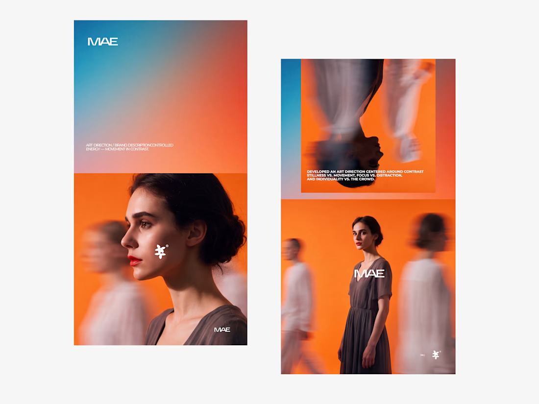

The motion blur on the figures gives the orange-to-blue gradient a reason to be there, and the small star mark stays readable on both the cheek and the shirt. Did the star come first as a standalone mark, or did it grow out of the photography direction?

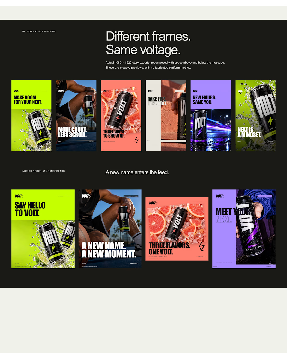
an electrolyte beverage campaign concept I created🚀👇
5 creatives. 20 static ads. One bold visual system built to stop the scroll.


This is genuinely creative! What I love most is how the design manages to stand out while still feeling intentional and well thought out. There’s something about the overall execution that naturally draws your attention and makes you want to take a closer look. It’s always...

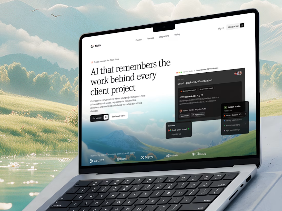
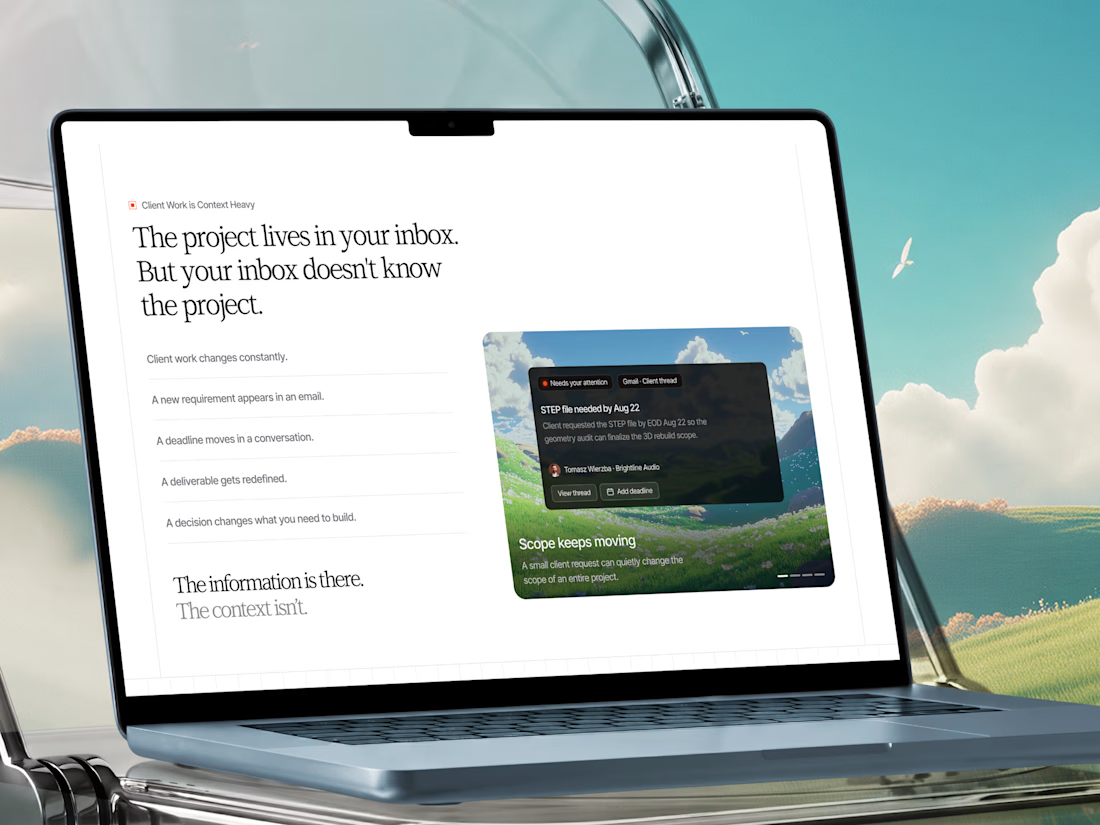
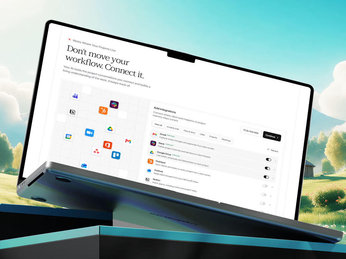
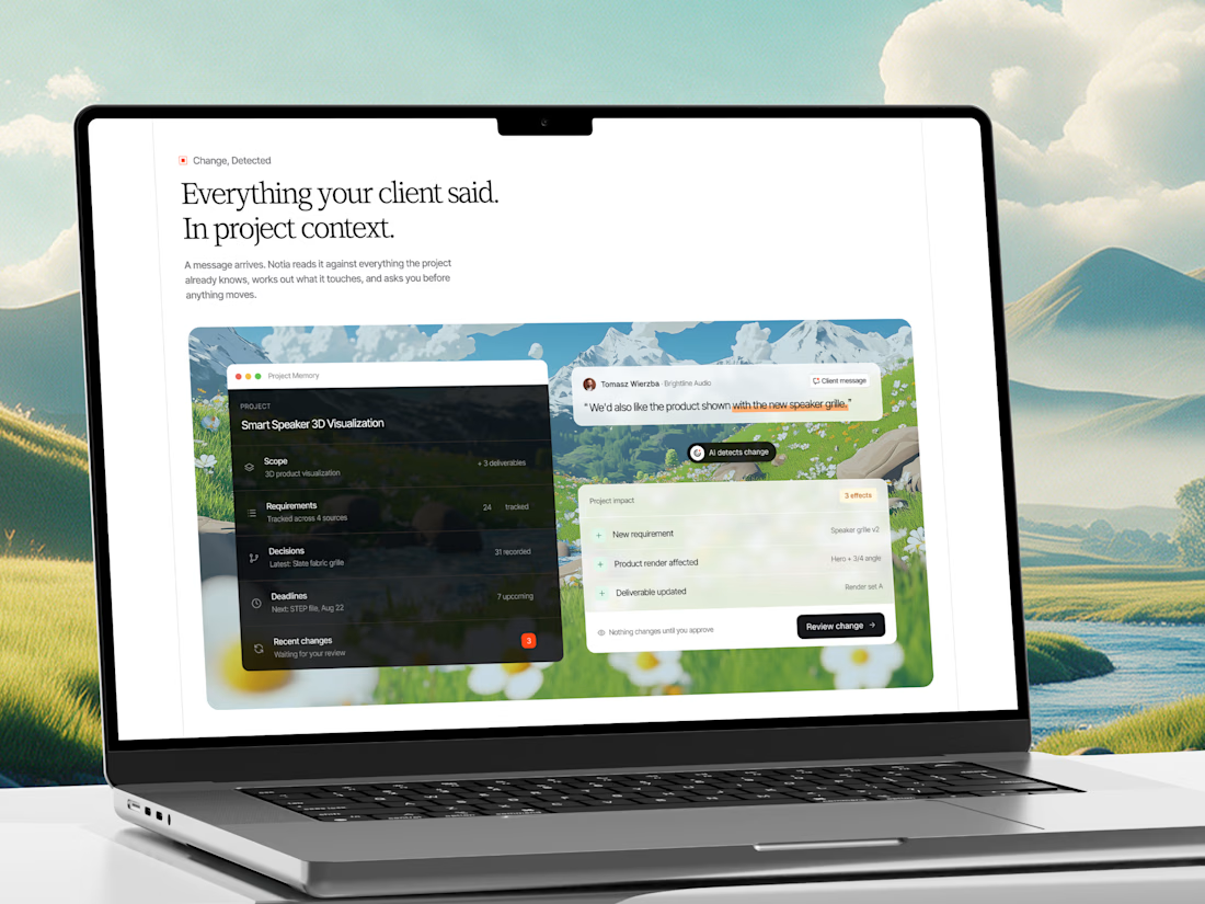
A few shots from our recent web design project for an AI Project Memory Platform.
Check it out
This project is a website and product experience for an AI-powered project memory platform built for freelancers, agencies, consultants, and client-service teams.

That's interesting project great job Fawaz🎉