The network for creativity
Join 1.25M professional creatives like you
Connect with clients, get discovered, and run your business 100% commission-free
Creatives on Contra have earned over $150M and we are just getting started
Back to feedPost

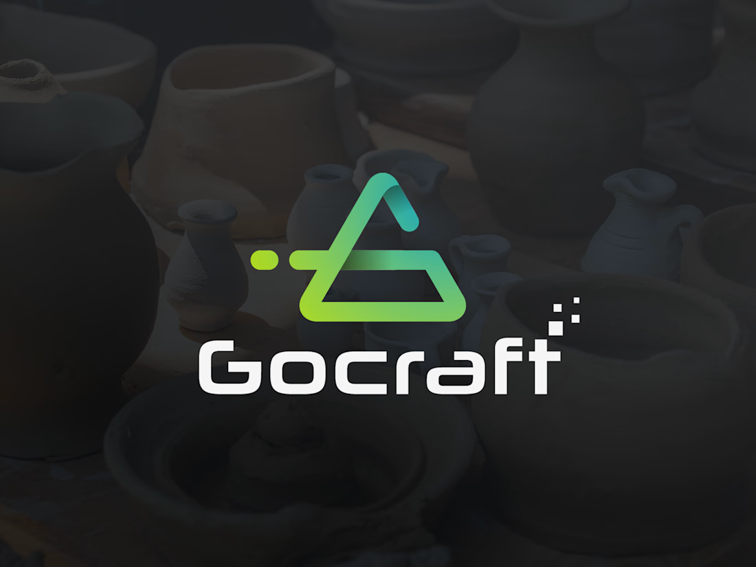

The pixel dots breaking off the triangle give the mark some motion, and the plain white wordmark balances it well. Did the dots come from the name's craft-meets-digital idea, or did they show up later while shaping the symbol?

Thank you for the thoughtful observation! It actually evolved naturally while shaping the symbol. As I was exploring ways to bring more energy and visual motion to the mark, introducing the pixel dots felt like the perfect bridge to capture that craft-meets-digital story. Glad...
Good to know they grew out of the shaping process instead of being added on top, which is probably why they feel part of the mark. Did you check how the dots hold up at favicon size?
The network for creativity
Join 1.25M professional creatives like you
Connect with clients, get discovered, and run your business 100% commission-free
Creatives on Contra have earned over $150M and we are just getting started











Related posts

A flower that inflates arrives in the mail.
Next month, a phone made of shell.
STILL LIFE SERVICE. Case study dropping soon.
Which object earns your shelf? Reply below.
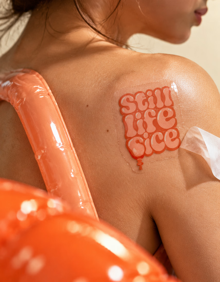
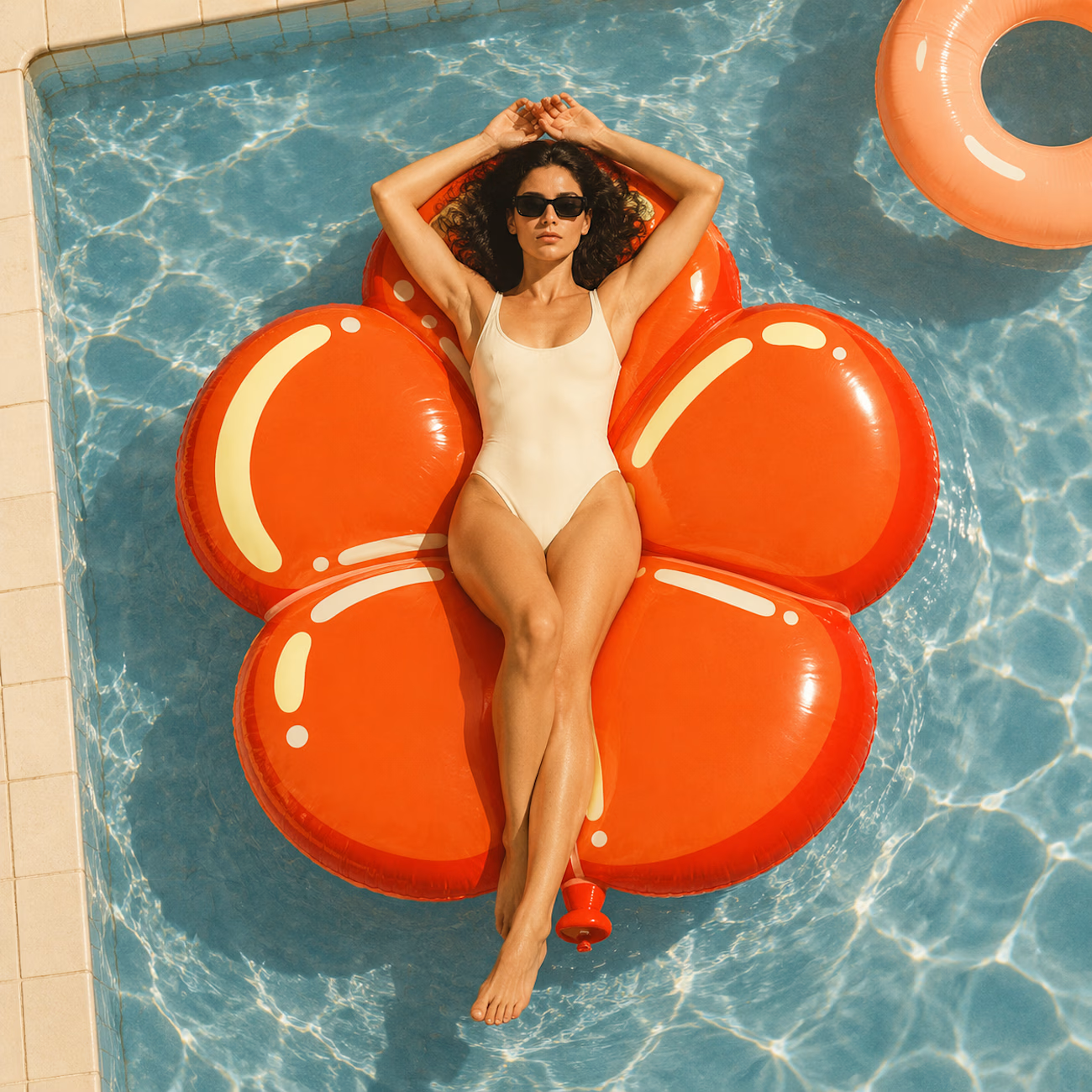
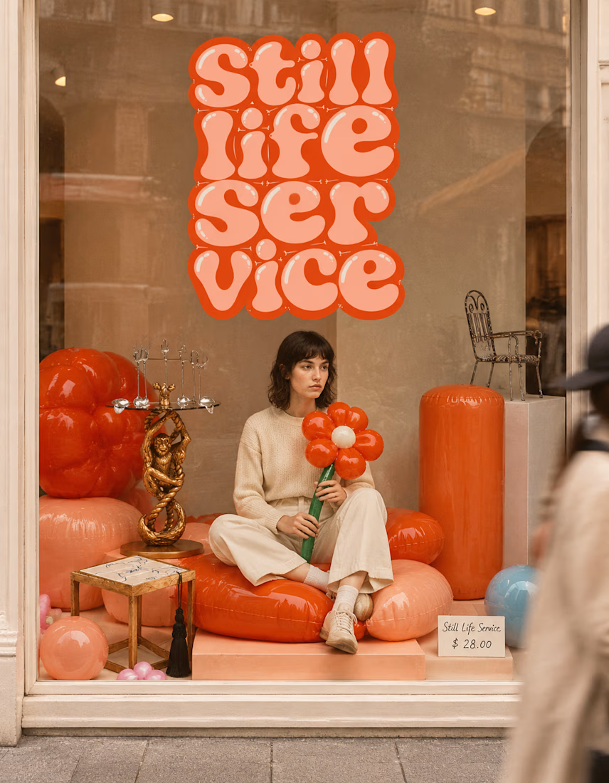

The inflatable flower. Only houseplant I'm guaranteed not to kill. Also, a new object every month is a sneaky good retention hook, people will stay subscribed just to see what's next.

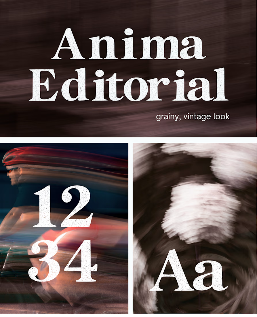
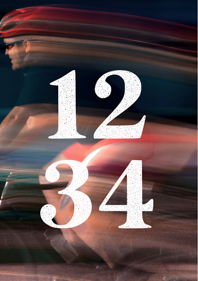
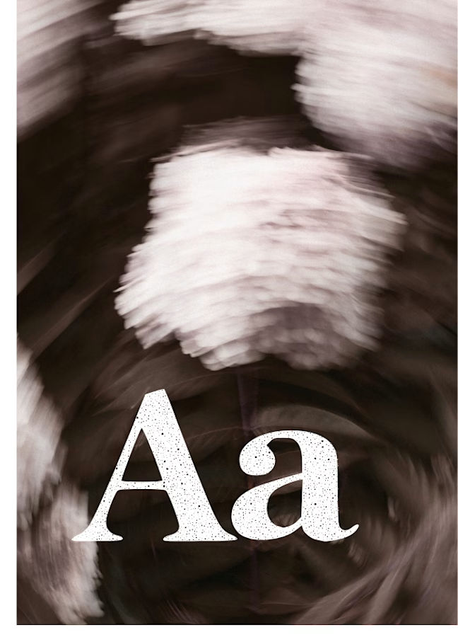
I created this font & it is free to download and use in your free or paid projects. Enjoy 🚀 find it at https://twaperdigital.com/anima-editorial



I like this font
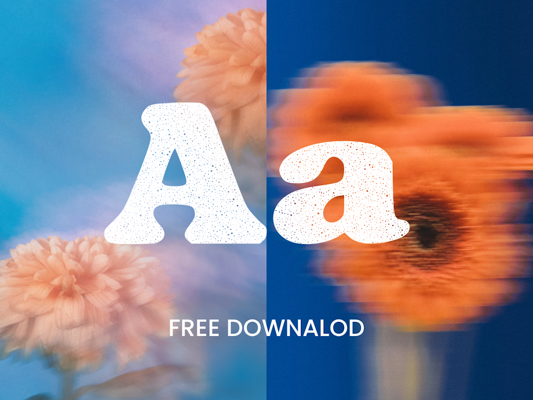
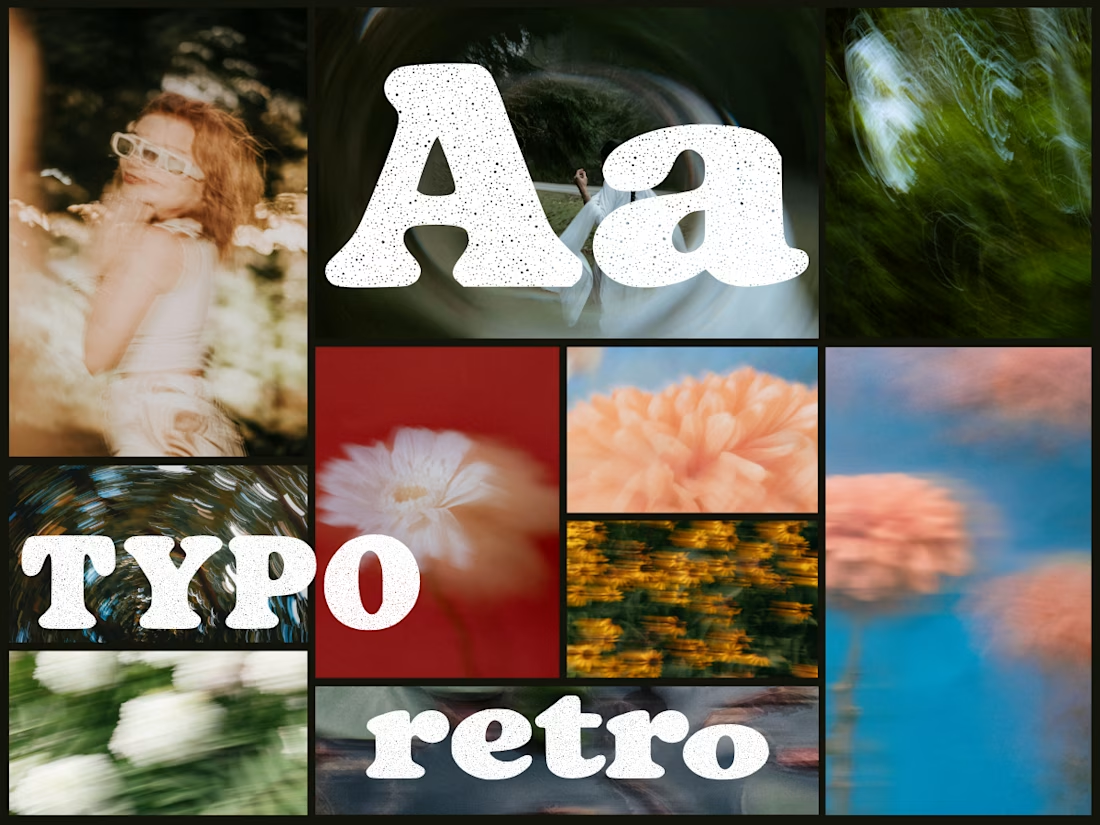
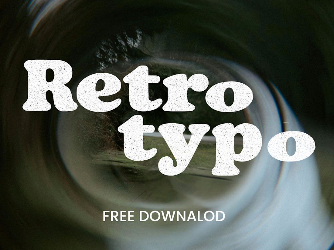
Anima is a self-initiated type design project inspired by vintage print, worn ink and analog photography.
The collection includes two experimental serif typefaces: Anima Editorial, with elegant proportions and contrasting strokes, and Anima Retro, with softer, bolder shapes. Both feature grain built into the letterforms.
I developed the creative direction, custom fonts and promotional artwork, combining AI-assisted exploration with font development. The campaign pairs textured typography with motion-blurred photography to capture a warm, nostalgic mood. FREE DOWNLOAD AT https://twaperdigital.com/anima-retro

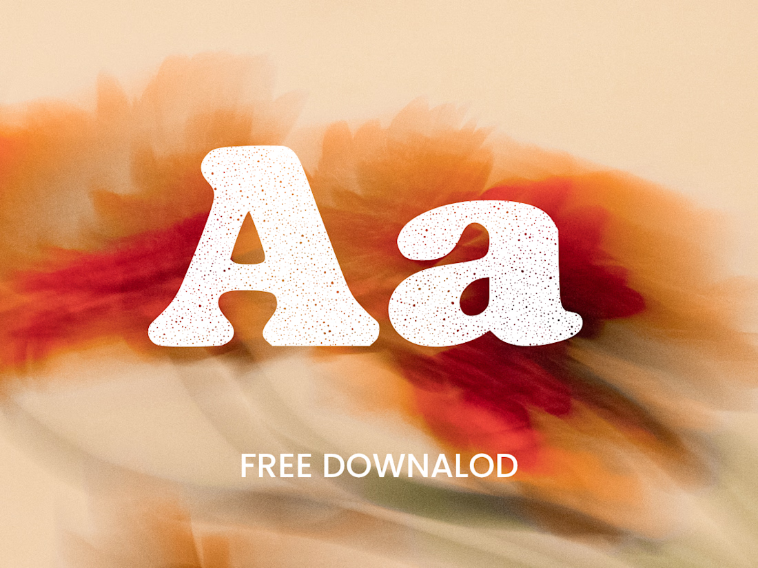

Great job Denisa the font style background and it's effects are great 🎉🎉🎉🎉
keep going Denisa🔥🔥🔥🔥