The network for creativity
Join 1.25M professional creatives like you
Connect with clients, get discovered, and run your business 100% commission-free
Creatives on Contra have earned over $150M and we are just getting started
Back to feedPost
Taste Test
I’m working on a redesign task. Which design do you think would help users understand what the site is about within a few seconds?

2 voted
33%

4 voted
67%

6 votes
Closed

With human

Thanks 👏

I feel like, human fills too much space, it can be implemented better.
I also felt that too thanks for commenting. I will share the final design in 2/3 days.


With Human ofcc
Adds a good UX tbh
Thanks; human emotion truly matters..
INDEED


With human
Thanks 😊

Thanks who joined in. I will share full version of design soon.

The network for creativity
Join 1.25M professional creatives like you
Connect with clients, get discovered, and run your business 100% commission-free
Creatives on Contra have earned over $150M and we are just getting started






Related posts


Should a personal brand hero lead with the name or the promise?
A client of ours is a speaking coach. People find her by name: podcasts, stages, word of mouth. Yet her first hero hid that name in the top-left corner.
We tested two directions:
The promise first. "Speak with confidence" in big type, the name small in the nav. Clear, but it could be any coach on the internet.
The name first. Her name at billboard scale, the promise in one line above it, her face right behind. Someone arriving from a podcast knows instantly they're in the right place.
When people search for you, your name is the headline.
Which one would you ship for a personal brand?
43 voted
51%
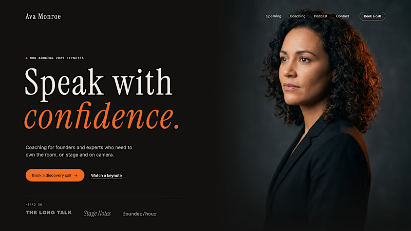
42 voted
49%
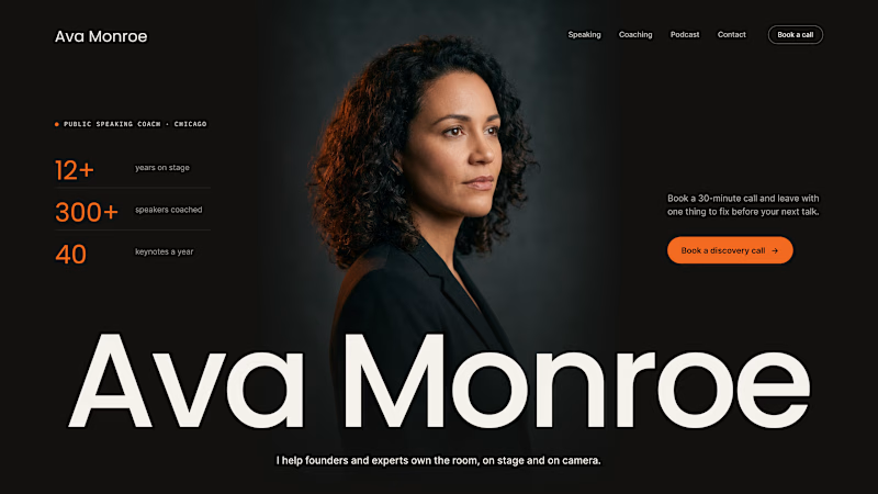
85 votes
Closed

Name first — podcast listeners arrive looking for her.

Most gyms follow a pretty similar approach to branding. I wanted to see what a strength club could look like if it drew more inspiration from a private-membership club vibe, since that's really trending right now.
Designed two directions for Arkos using the same mark. A is more refined and traditional, while B takes a bolder, more modern approach.
Which direction would you go with?
11 voted
50%
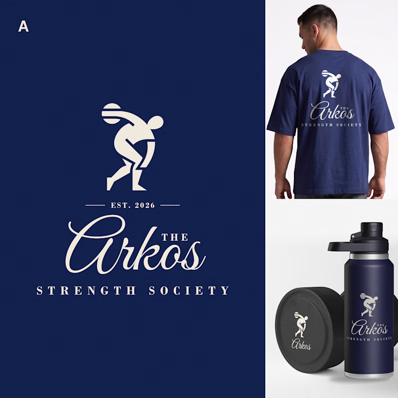
11 voted
50%
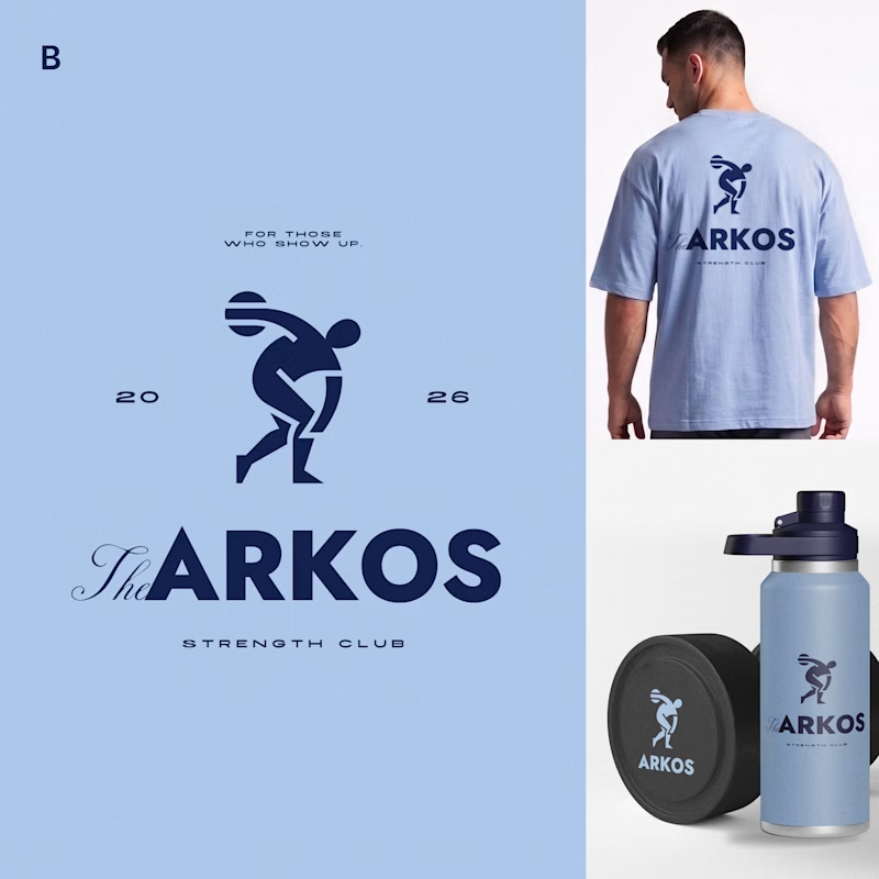
22 votes
Closed

The darker one is the best for me, but both are really good, man

Lime Cream or Peach Fuzz? 🍋🟩🍑
Two animated isometric sets — same system, different mood. Cast your vote 👇
68 voted
78%
19 voted
22%
87 votes
Closed

Lime Cream. The dark linework pops more on it.