The network for creativity
Join 1.25M professional creatives like you
Connect with clients, get discovered, and run your business 100% commission-free
Creatives on Contra have earned over $150M and we are just getting started
Back to feedPost

Everyone wants a higher conversion rate, but most founders focus on the wrong thing: traffic.
Traffic is vanity. Conversion is sanity.
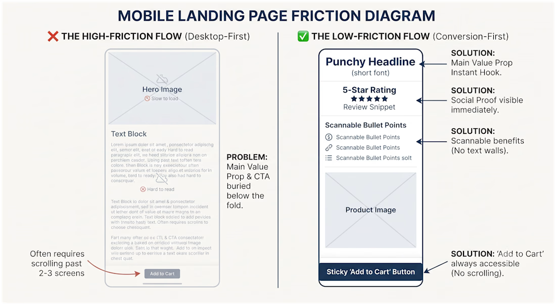
When I start designing a landing page, I ignore the colors, the fonts, and the 'cool' design trends for the first hour. I focus entirely on one thing: Friction.
If a customer has to:
Scroll more than twice to find the price.
Read more than three lines to understand the benefit.
Click more than once to find the 'Add to Cart' button...
...you aren't just losing sales, you're losing your customers to competitors who make it easy.
Design isn't about looking good it's about removing the obstacles between your customer and the 'Checkout' button.
What’s the biggest 'friction' point you’ve found on your own store? Let's fix it in the comments


If your store is converting under 2% and you aren't sure where the 'friction' is, drop your link below. I'll take a quick look and give you one free fix to implement today.
The network for creativity
Join 1.25M professional creatives like you
Connect with clients, get discovered, and run your business 100% commission-free
Creatives on Contra have earned over $150M and we are just getting started
Related posts

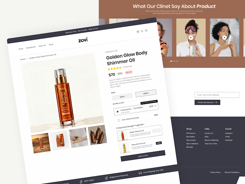
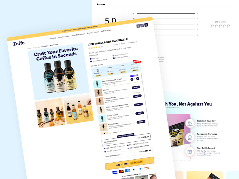
Which product page do you think is going to convert better?
I'd love to hear your thoughts and the reasoning behind your pick.

11 voted
73%
4 voted
27%
15 votes
Closed


Which of these two checkout pages do you think converted better?
Option A: more urgency copy (scarcity, countdown)
Option B: more trust signals (testimonials, guarantees)
1 voted
25%
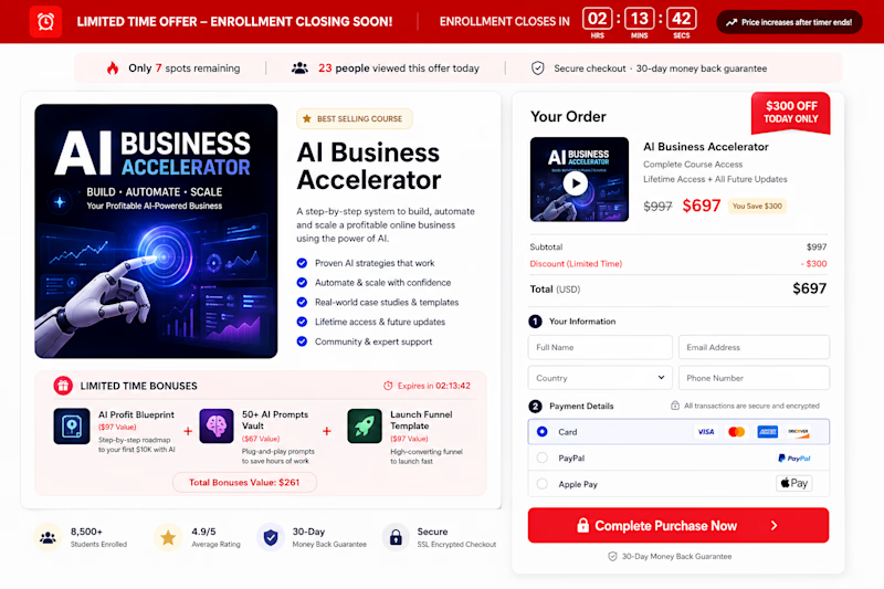
3 voted
75%
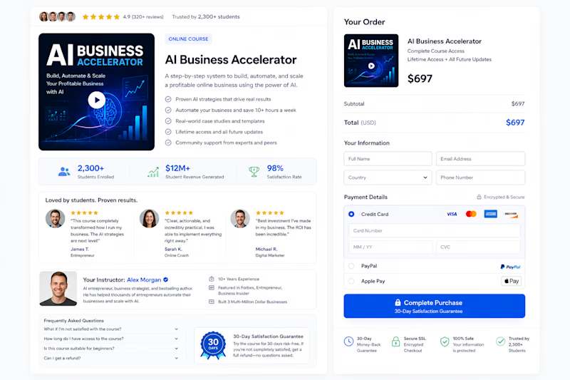
4 votes
Closed

Good Design Builds Trust
People notice good design.
A clean layout.
Easy navigation.
Fast loading pages.
These small details help visitors trust your business.
Design is not only about beauty.
It's about creating confidence.




Exactly. Trust isn't built by visuals alone; it's built when the design consistently helps users accomplish what they came to do without friction.







Trending

Claude
Claude has entered the design space. How are you using Claude Design?

Contra University
Learn from expert creatives how to earn more using next-gen AI tools.
fifaworldcup2026
The World Cup is here and the whole world's watching. How are you designing for the world stage?
creativeaiflow
Creative AI workflows are evolving. What tools do you use, and what are their strengths and weaknesses?
freelancerlife
Freelancer life is wins, pivots, and everything in between. What’s yours right now?