The network for creativity
Join 1.25M professional creatives like you
Connect with clients, get discovered, and run your business 100% commission-free
Creatives on Contra have earned over $150M and we are just getting started
Back to feedPost
Taste Test

So I Recently rebranded my upcoming AI Agent Harness from "Crank" to "Pixie" which is the name of my cat. Do you think it was the right decision?
Which one do you prefer? Crank or Pixie?!
Check it out here: pixie.ecnivs.com
#FreelancerLife #AIHarness #FrontendDesign #AIAgent #ArtificialIntelligence #WebDevelopment #Design #TasteTest
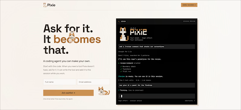
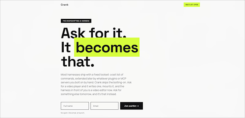
3 votes
Ends in 1d

The network for creativity
Join 1.25M professional creatives like you
Connect with clients, get discovered, and run your business 100% commission-free
Creatives on Contra have earned over $150M and we are just getting started







Related posts

Day 12/30 of my hero section challenge.
Another day of prioritising the visuals and imagining a company that doesn't exist. I promise the next one is a tech brief with barely any imagery at all, I've leaned hard on beautiful photography for twelve days straight.
Concept: a mycelium materials company producing leather, packaging and foam grown from fungal networks. The design deliberately inverts the category's defaults; biotech branding tends toward dark, clinical and electric blue, so this one goes warm and botanical, with a subtle looping video of spores drifting and mushrooms emerging. The copy pulls hard the other way: plain, technical, B2B-direct, anchored by two concrete numbers instead of sustainability adjectives.
Twelve briefs across travel, food retail, personal branding, events, landscape architecture, pet services, hospitality, coffee, lighting, wellness, restaurants and now biomaterials.
12 down, 18 to go.
Built on the Viper template by Westhill Studio, adapted and customised by me.
Imagery and video generated with AI.


brilliant

I made two versions of a logo intro animation for my brand, Pixelblue, and can't decide which one's stronger.
To get an idea of the brand → Pixelblue Brand guidelines
Quick context: Pixelblue is a motion design studio focused on SaaS product demos, explainer videos, and social motion content. We've been doing this for 10+ years, mostly white-label, for agencies and marketing teams worldwide.
Would love your eyes on this: which version hits harder for you, and why? Pacing, reveal, timing, anything that stands out.
Drop your pick below (A or B) - genuinely curious what lands better from a fresh perspective.

7 voted
27%
19 voted
73%
26 votes
Closed

Going with B! Great work

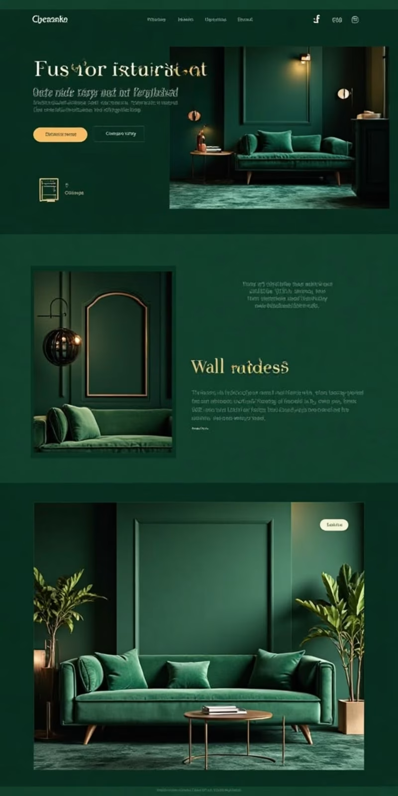
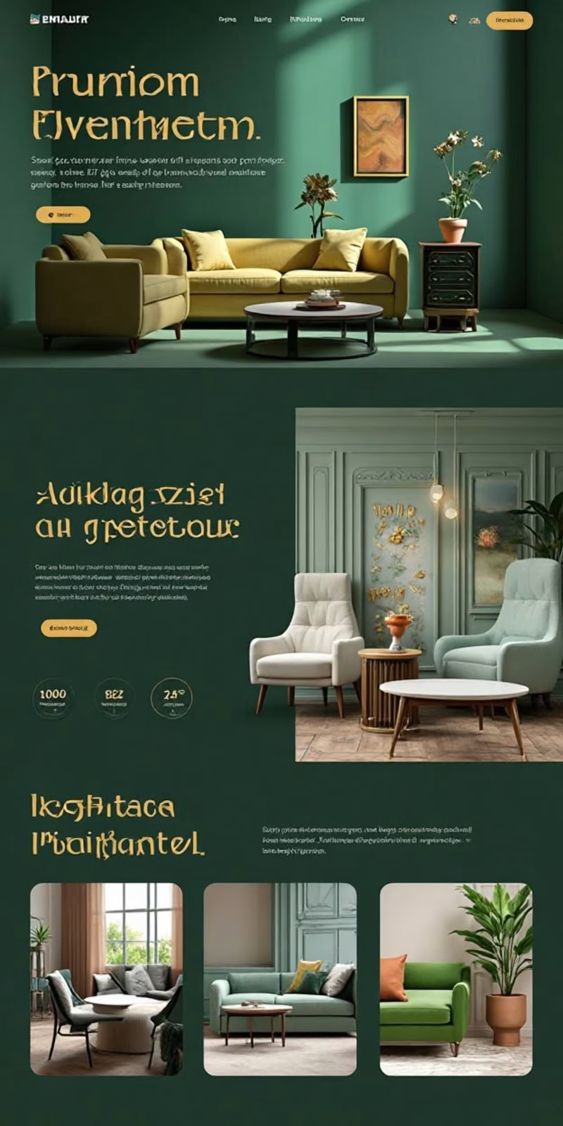

Option 2 closes on a four-up room grid while Option 1 keeps one full-width room per section — the grid suits browsing a catalogue, the stacked version suits selling a single look.