The network for creativity
Join 1.25M professional creatives like you
Connect with clients, get discovered, and run your business 100% commission-free
Creatives on Contra have earned over $150M and we are just getting started
Back to feedPost

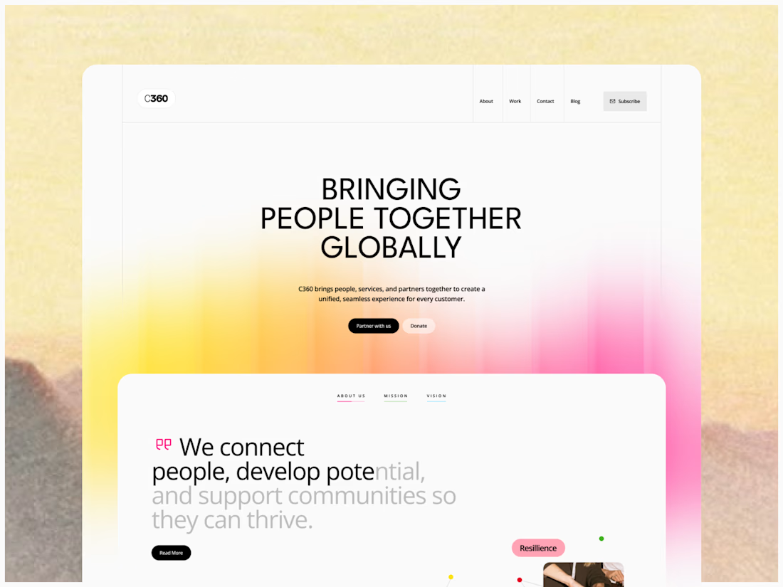
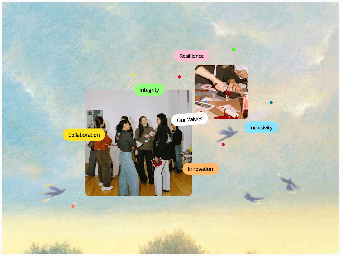
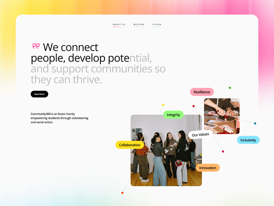
when the client asks you to make it colourful and only use open sans 🫠

The network for creativity
Join 1.25M professional creatives like you
Connect with clients, get discovered, and run your business 100% commission-free
Creatives on Contra have earned over $150M and we are just getting started



Related posts


A Halloween type study. One line, eight typefaces, eight ghosts. Each frame holds the same words and composition while the letterform, palette and figure change, from blackletter to dot-matrix to brush script.
I designed every frame in Figma, then used AI image-to-video to hallucinate the transitions between them, so the type melts, drips and reforms into the next face while the ghost dissolves into smoke and re-forms. The result loops like a bad dream that keeps changing its mind.
Made for 31 October.


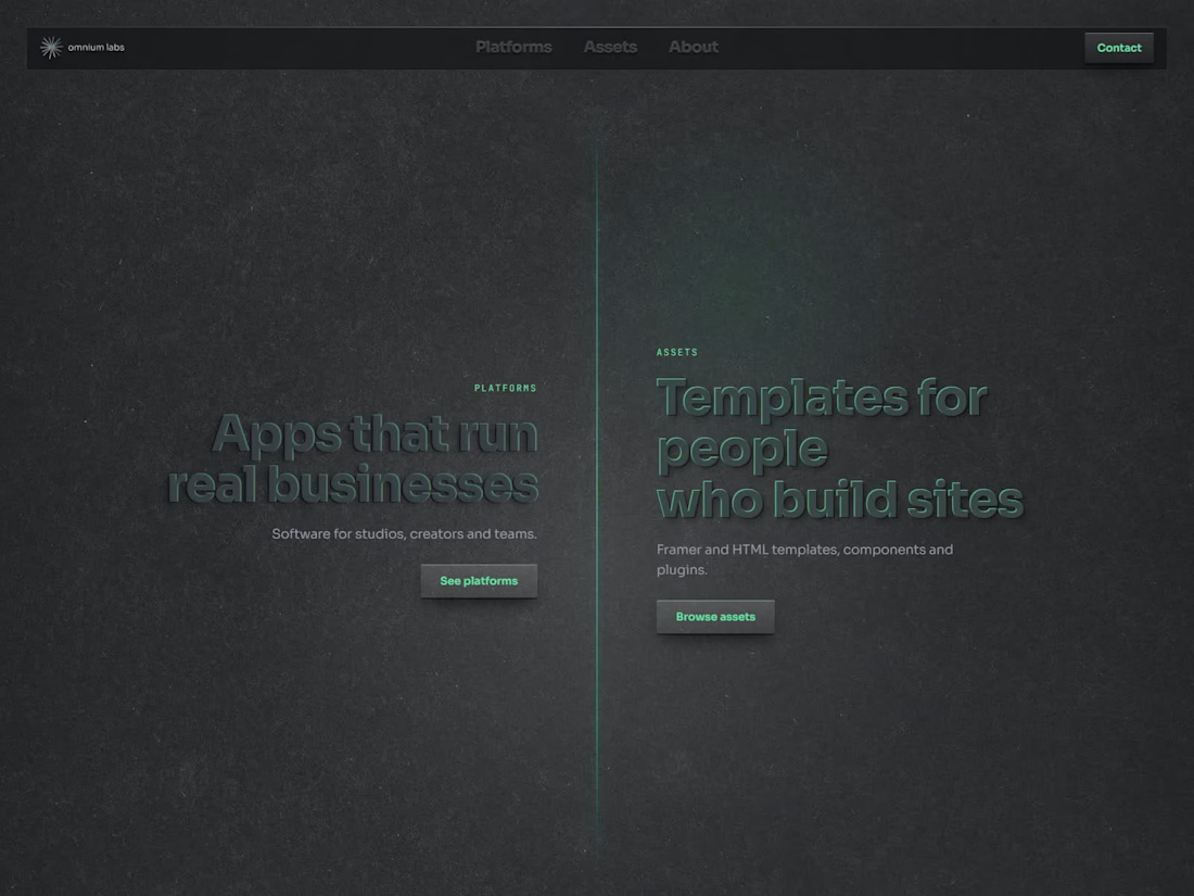
Dark sites don't need white text everywhere.
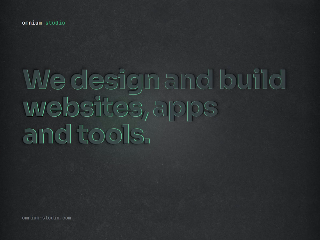
On omnium.tools the headlines are almost the same colour as the background. They're pressed out of the page, and a soft green light moving across them makes them readable. It's quieter than white on black and feels more physical.
Would you ship low-contrast headlines on a real client site, or is that only for your own portfolio?