The network for creativity
Join 1.25M professional creatives like you
Connect with clients, get discovered, and run your business 100% commission-free
Creatives on Contra have earned over $150M and we are just getting started
Back to feedPost

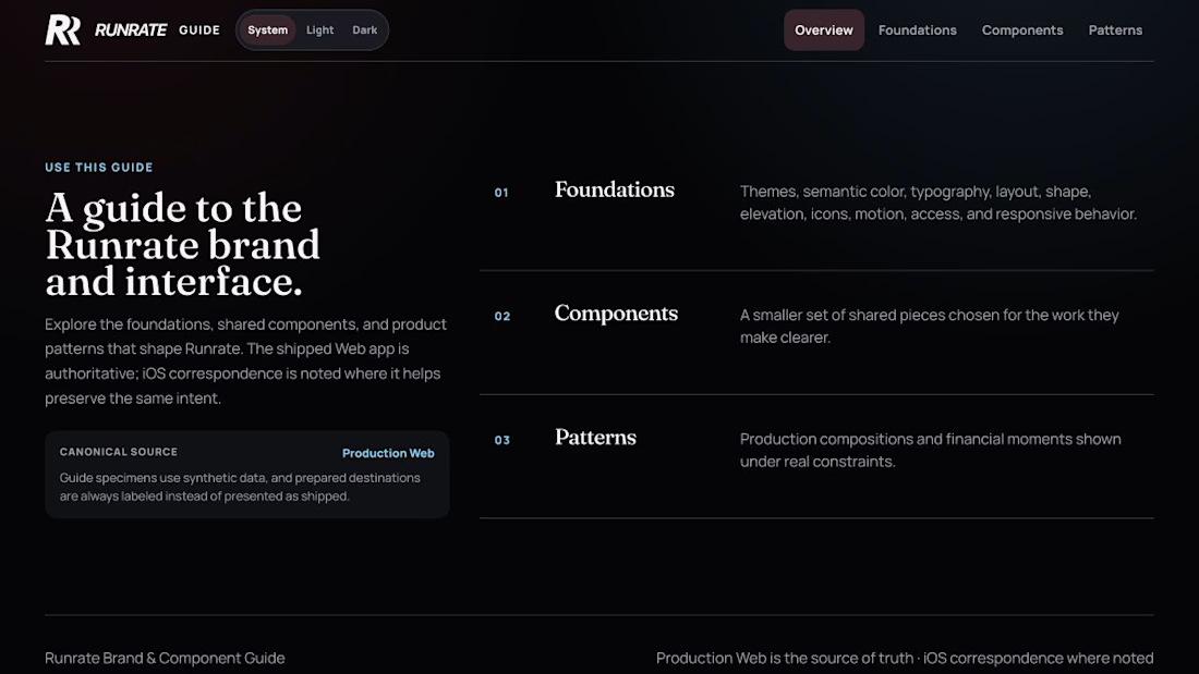
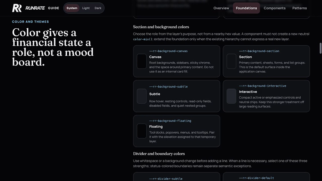
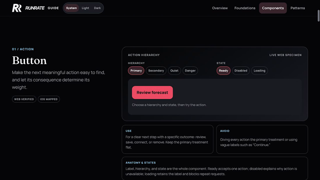
I built Runrate's design guide in HTML by describing it to Codex in natural language instead of starting in Figma.
It still covers what I would normally organize in a Figma library:
- semantic color tokens and themes
- typography, spacing, shape, elevation, icons, and motion
- accessibility and responsive behavior
- reusable components with states, usage guidance, anti-patterns, and live examples
- product patterns for the ledger, accounts, forms, navigation, and risk or recovery states
- guidance for translating the same intent between Web and iOS
The difference is that these are not static frames.
The tokens are implementation contracts. The components can be used in the browser. The patterns include real constraints, interaction behavior, and accessibility. Production Web remains the source of truth.
Then I point the project's AGENTS.md file at the guide.
The instruction is essentially this:
Before creating or changing a customer-facing Runrate surface, consult the design guide. Use Foundations for tokens, hierarchy, and voice. Use Components for behavior and states. Use Patterns for composition. Reuse the existing system before extending it.
That applies to new product features, email templates, marketing creative, and anything else that should match the guide.
So the design system is not only a library.... it becomes part of the context used to generate the work.
What do you think about this? And are you making your design system readable by agents? Curious what other people are doing.

The network for creativity
Join 1.25M professional creatives like you
Connect with clients, get discovered, and run your business 100% commission-free
Creatives on Contra have earned over $150M and we are just getting started



Related posts

A fashion storefront needs to show the outfit and make its individual pieces easy to find.
For FORM, I paired a warm, editorial lookbook with clearly grouped product names, prices, and size choices.
Cream surfaces, charcoal typography, and consistent product cards connect the homepage with the desktop and mobile screen concepts.
One useful design principle from this project: give campaign imagery and shopping details their own readable zones. The collection can have a strong visual presence while the next product decision stays clear.
Explore the complete design case study:
https://contra.com/p/rNPRqooQ-form-fashion-e-commerce-website-design
When exploring a clothing collection, what helps you most: a styled outfit or an individual product grid?

Adorable

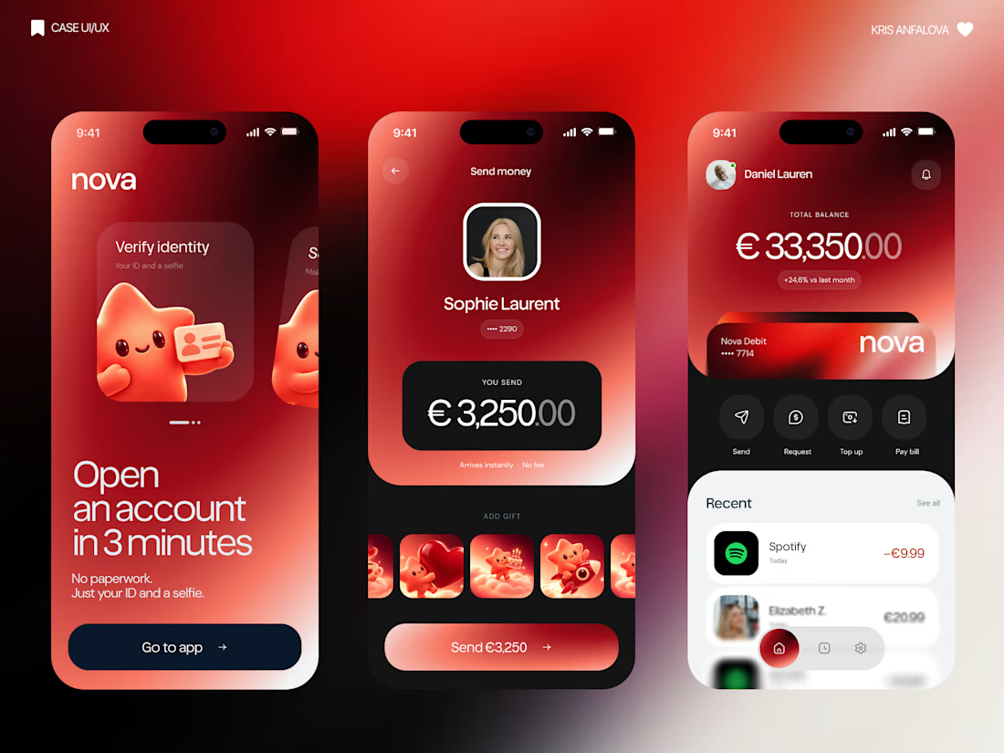
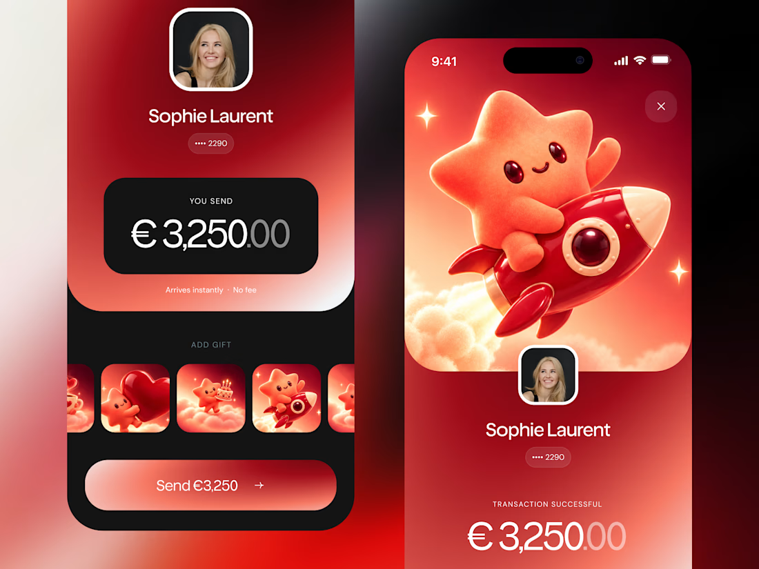
What if sending money felt a little more like giving a gift?
For Nova, I explored a banking app that brings payments, cards, and a bit of personality together. You can check your balance, browse recent transactions, send or request money, top up, and pay bills.
My favorite part is the digital postcard feature. Before sending a transfer, you can add a little illustrated card—a heart, a birthday greeting, or a playful character. A simple way to make birthday money or a thank-you feel more personal.
I carried that same 3D character into onboarding, pairing it with bold red gradients and large, clear payment details. There’s room for play, while the recipient and amount stay easy to check.
Would you add a postcard to a transfer? I’d love to know what occasion you’d use it for.




𝗗𝗮𝘆 𝟮𝟲𝘁𝗵 𝗼𝗳 𝟯𝟬𝗱𝗮𝘆𝘀, 𝟰 𝗗𝗮𝘆𝘀 𝘁𝗼 𝗴𝗼
𝗙𝗿𝗮𝗺𝗲𝗿 𝘃𝘀 𝗪𝗲𝗯𝗳𝗹𝗼𝘄 𝗶𝗻 𝟮𝟬𝟮𝟲: 𝗦𝗽𝗲𝗲𝗱 𝘃𝘀 𝗖𝗼𝗺𝗽𝗹𝗲𝘅 𝗖𝗠𝗦 𝗔𝗿𝗰𝗵𝗶𝘁𝗲𝗰𝘁𝘂𝗿𝗲
Both platforms excel at visual development, but their modern use cases are distinct:
• 𝗙𝗿𝗮𝗺𝗲𝗿: Best for rapid AI layout iteration, SaaS conversion pages, and Figma-native auto-layout fidelity.
• 𝗪𝗲𝗯𝗳𝗹𝗼𝘄: Unmatched for complex relational database logic, multi-locale localization, and enterprise governance. Here is how to choose between them in 2026.
𝗪𝗵𝗶𝗰𝗵 𝗽𝗹𝗮𝘁𝗳𝗼𝗿𝗺 𝗶𝘀 𝗰𝘂𝗿𝗿𝗲𝗻𝘁𝗹𝘆 𝗶𝗻 𝘆𝗼𝘂𝗿 𝗺𝗮𝗶𝗻 𝗰𝗹𝗶𝗲𝗻𝘁 𝗽𝗿𝗼𝗱𝘂𝗰𝘁𝗶𝗼𝗻 𝘀𝘁𝗮𝗰𝗸❓❓❓
𝗟𝗲𝘁 𝘂𝘀 𝗸𝗻𝗼𝘄 𝗯𝗲𝗹𝗼𝘄!


Amazing