The network for creativity
Join 1.25M professional creatives like you
Connect with clients, get discovered, and run your business 100% commission-free
Creatives on Contra have earned over $150M and we are just getting started
Back to feedPost

People often associate motion design with eye-catching visuals.
But sometimes, the strongest asset in a video is the message itself.
This piece leans more into typography and storytelling than heavy visuals, a creative direction some clients intentionally prefer.
Good motion isn't about doing the most.
It's about doing what serves the message best.


The network for creativity
Join 1.25M professional creatives like you
Connect with clients, get discovered, and run your business 100% commission-free
Creatives on Contra have earned over $150M and we are just getting started








Related posts


Recent product update video for a client

Really curious about your process here. Did you start with a storyboard or go straight into motion?

Wellness shouldn’t feel like another task on your to do list.
Elixra turns breathing, sleep, and mindful routines into an immersive digital experience through cinematic visuals, soft interactions, and rewarding micro moments.
What if wellness felt like this?


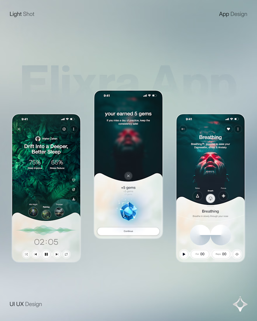
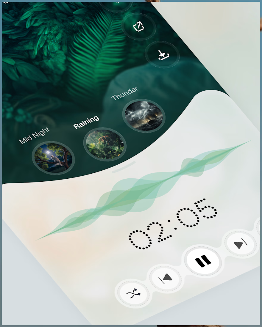
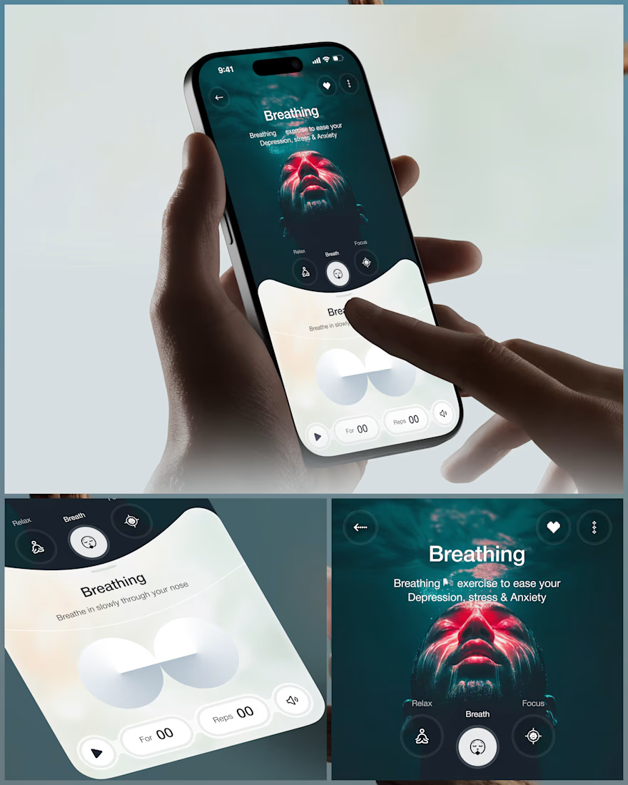
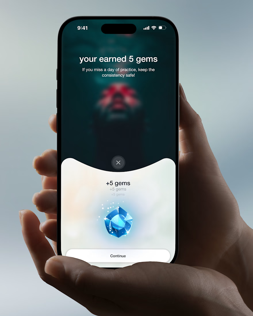

Love the soft interactions and micro moments idea. The cinematic approach makes wellness feel calm, not clinical.

Should I go for left or right? Focusing on updating and finishing up my portfolio... and then I came across this crossroads. Another alternative is to make them switchable themes through a toggle, but I still need to decide which should be the default.
27 voted
75%
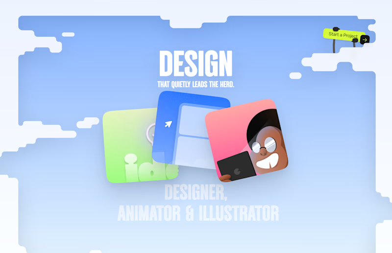
9 voted
25%
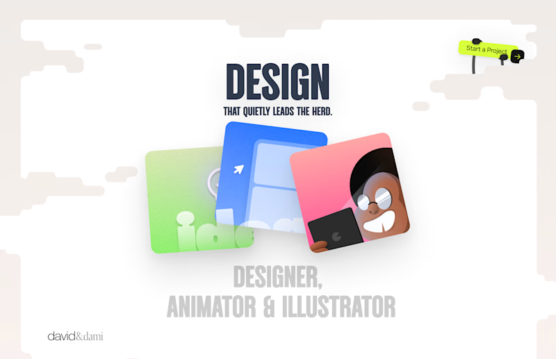
36 votes
Closed

Left is better because the text is readable, the overall blue background is not flashing to the eyes as compared to the right one.
For the top right button " Start a project ", you can add some animation so that it stands out and encourage users to click on it.