The network for creativity
Join 1.25M professional creatives like you
Connect with clients, get discovered, and run your business 100% commission-free
Creatives on Contra have earned over $150M and we are just getting started
Back to feedPost

The trip you keep postponing.
This video is for that person.
↓
Built the complete Voya app in 3 days — onboarding to trip booking, 10+ screens, full design system.
Prototype made with Google Stitch

The network for creativity
Join 1.25M professional creatives like you
Connect with clients, get discovered, and run your business 100% commission-free
Creatives on Contra have earned over $150M and we are just getting started


Related posts

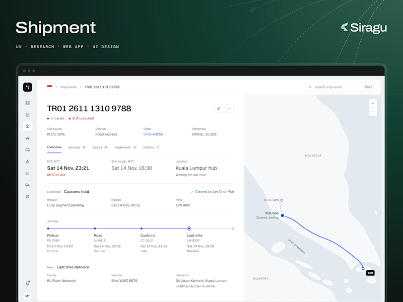
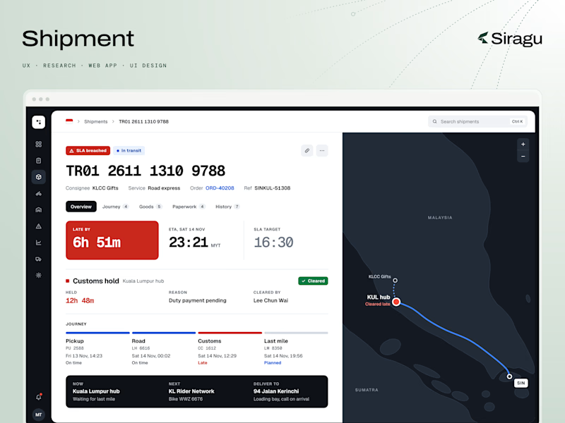
Web app designs for a logistics business.
Shipment is the screen an operations lead opens when one delivery goes wrong. This one is a road shipment from Singapore to Kuala Lumpur. It was held at customs, it's now cleared, and it's waiting for last mile, 6h 51m late.
Two directions, same data. Which one would you pick?
How would you design this screen? What should the operator see first: the delay, where the shipment is, or what happens next?
Scope: UX, research, web app, UI design.
Siragu designs and builds web apps, websites and MVPs. If you have a product screen that needs this kind of work, send us a message.
3 votes
Ends in 1d

#2 unlocked: GoTravelo 🔓
For a travel agency, the booking is only half the job. Someone still has to check the passengers, issue the ticket, email it and record the payment.
GoTravelo is a UK travel agency that sells flights, hotels and tours. We designed both sides of it: the website travellers book on, and the admin panel the team runs every booking from.
What the video walks through:
1. One search bar for flights and hotels, with route, dates and passengers in a single row.
2. Popular trips and hotels on the homepage, with the price on every card.
3. An admin dashboard with bookings, revenue and ticket sales at a glance.
4. Add a booking, check every passenger, preview the ticket email and send it.
5. The payment is recorded on the same booking.
The hard part was the admin side. Issuing a ticket always happens in the same order: passengers, ticket, email, payment. We laid the screens out in that order, so the team never has to look for the next step.
#3 unlocks next.
Travel agents on here: which step in your booking flow still takes the most time?

Sharing a case study for an app walkthrough project I worked on back in January 🚀

Really clean walkthrough — the app stays dynamic without losing the user journey, which is the hardest part of a feature tour. The deep green 'Financement simplifié' frame sets the tone nicely too. Strong work, Hasmik.