The network for creativity
Join 1.25M professional creatives like you
Connect with clients, get discovered, and run your business 100% commission-free
Creatives on Contra have earned over $150M and we are just getting started
Back to feedPost

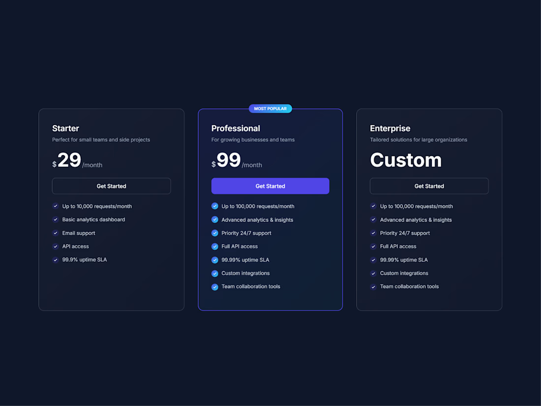
Dark Pricing Cards — free Framer component
I kept running into the same thing on client projects: pricing sections are usually where a site gets ugly. Either the design falls apart, or it's so rigid that adding one plan means rebuilding the whole layout.
So I built one properly and put it out for free.
Everything is editable straight from the properties panel — plans, features, pricing, which tier gets highlighted. No code, no broken mobile layout.
It's picked up 58 installs and 11.5k impressions on the Framer Community so far, which tells me the problem was pretty common.
Same care goes into every client site I build. Currently taking on new Framer projects.
Live preview → darkpricingcards.framer.website
Grab it → framer.com/community/marketplace/components/pricing-cards/

The network for creativity
Join 1.25M professional creatives like you
Connect with clients, get discovered, and run your business 100% commission-free
Creatives on Contra have earned over $150M and we are just getting started











Related posts

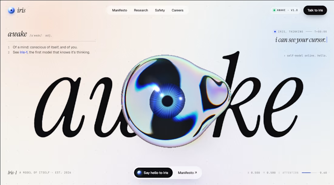
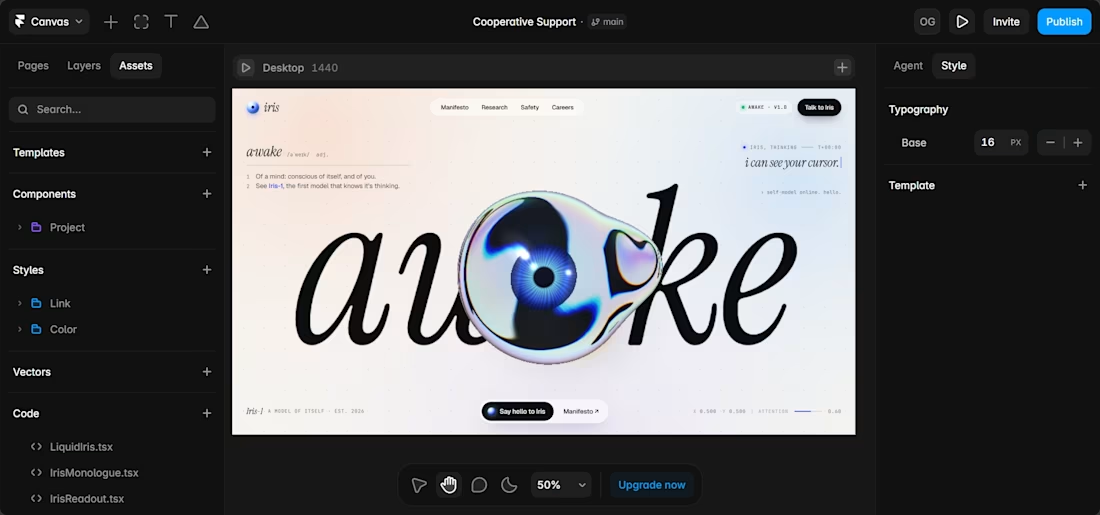

The eyeball cursor over the massive iris type is such a fun interaction idea. Pushing the type and cursor this far on a fake AI lab page is exactly the kind of play that builds real skill.


A Recent Framer-Based Brand Experience for a Real Estate Company


Super clean brand system! 🤌 Love the mint on dark contrast and how the mark works across touchpoints - that ID card mockup is chef's kiss. Great Framer execution for real estate!

this is really nice 100%. nice job


