The network for creativity
Join 1.25M professional creatives like you
Connect with clients, get discovered, and run your business 100% commission-free
Creatives on Contra have earned over $150M and we are just getting started
Back to feedPost

NewFab Constructions. A full rebrand, from skyline to slab.
THE PROBLEM
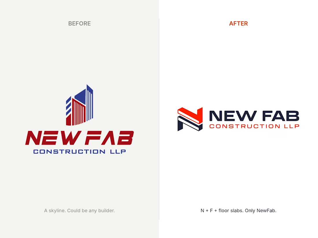
NewFab is a Mumbai based firm doing construction, restoration and structural work. Their logo was two towers, a skyline and a slanted red-and-blue wordmark. The same idea half the builders in India already use.
WHY IT HURT
A skyline says "we sell apartments". NewFab doesn't. They fix, restore and strengthen buildings. So the brand was pitching the wrong job, looked interchangeable next to every other contractor, and its thin stripes blurred at small sizes.
THE SOLUTION
I stopped drawing buildings and drew what holds them up.
Letter N + letter F + stacked floor slabs → one mark.
Isometric, so it reads as something poured, not illustrated.
A wide, flat wordmark, because a structural firm should look steady.
Signal red and deep navy that hold up on concrete, steel and screens.
THE RESULT
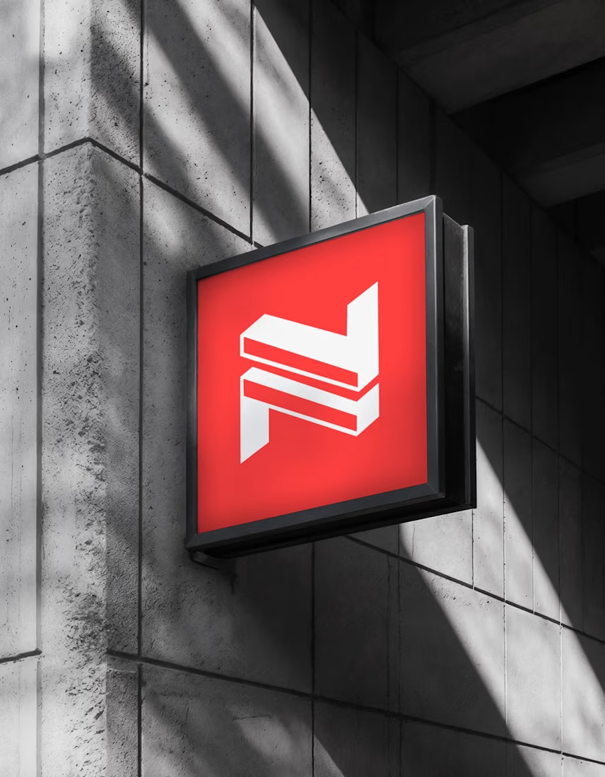
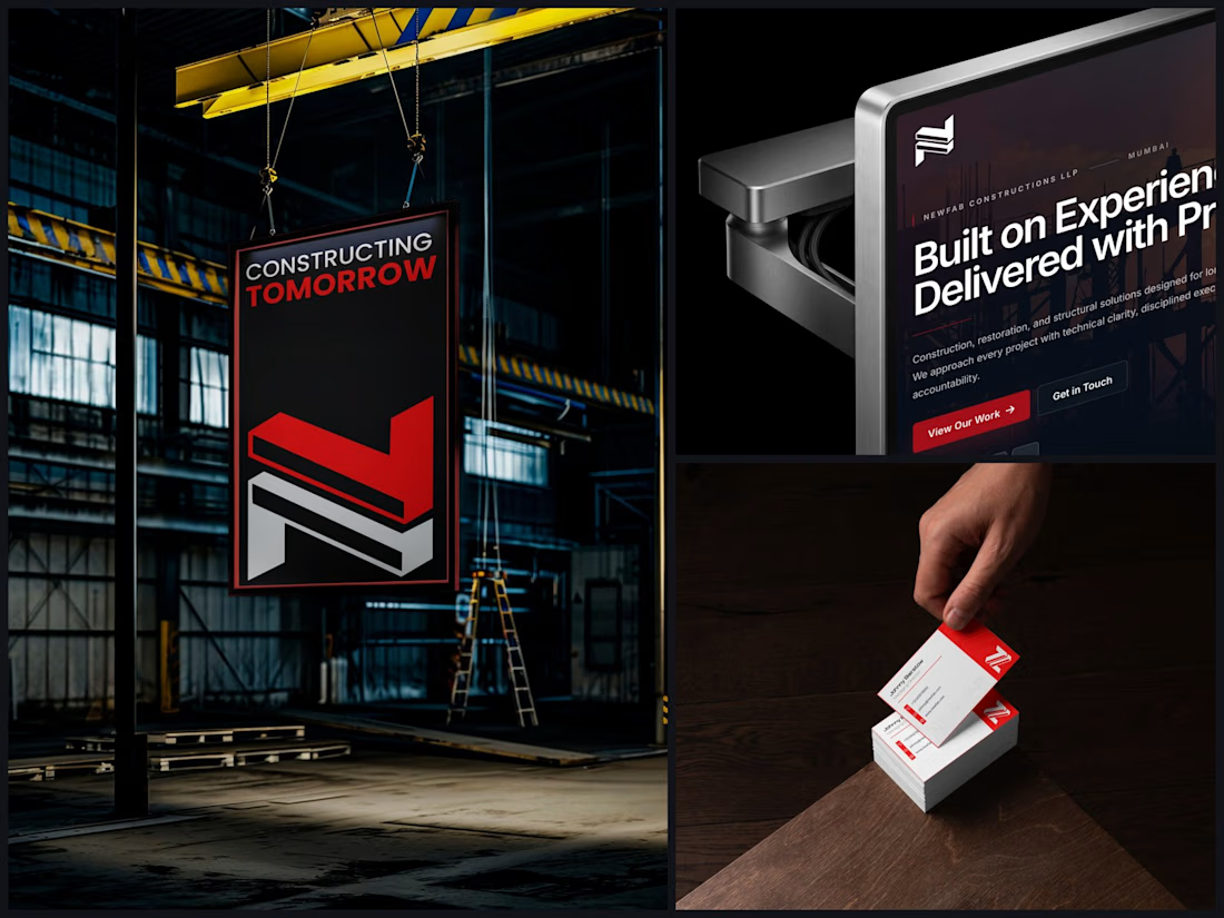
One identity system that works everywhere NewFab shows up. Site signage, a banner hanging off a gantry crane, the website, business cards. Even in a single flat colour.
Swipe through 👇 before/after, the concept, then the brand in use.

The network for creativity
Join 1.25M professional creatives like you
Connect with clients, get discovered, and run your business 100% commission-free
Creatives on Contra have earned over $150M and we are just getting started







Related posts



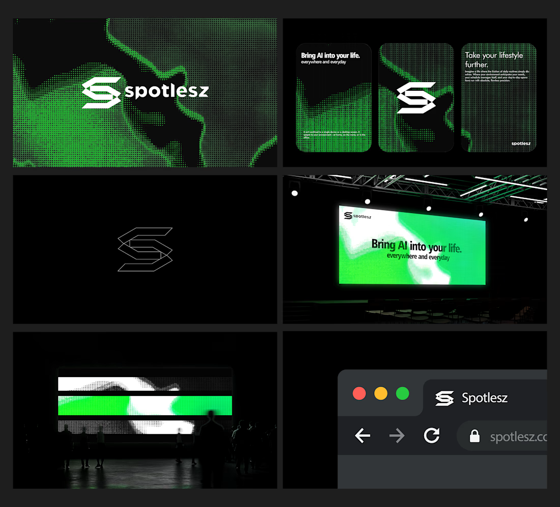
Branding identity completed for Spotlesz in just few days!




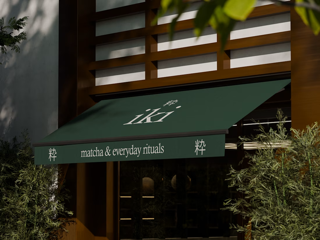
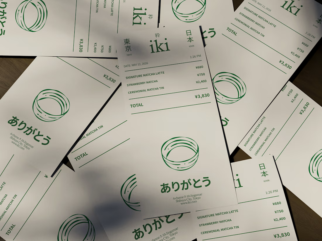
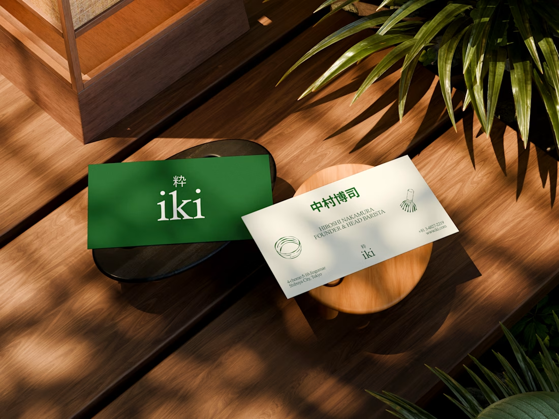
some visuals from iki, a matcha shop i’m currently working on 🍵
one of the most interesting parts of this project has been figuring out how to turn an abstract concept into something people can actually see and feel.
from the typography to the illustrations and overall visual language, every element is an opportunity to give the brand more personality and make it feel like its own world.
still exploring, but i’m really enjoying where this is going.
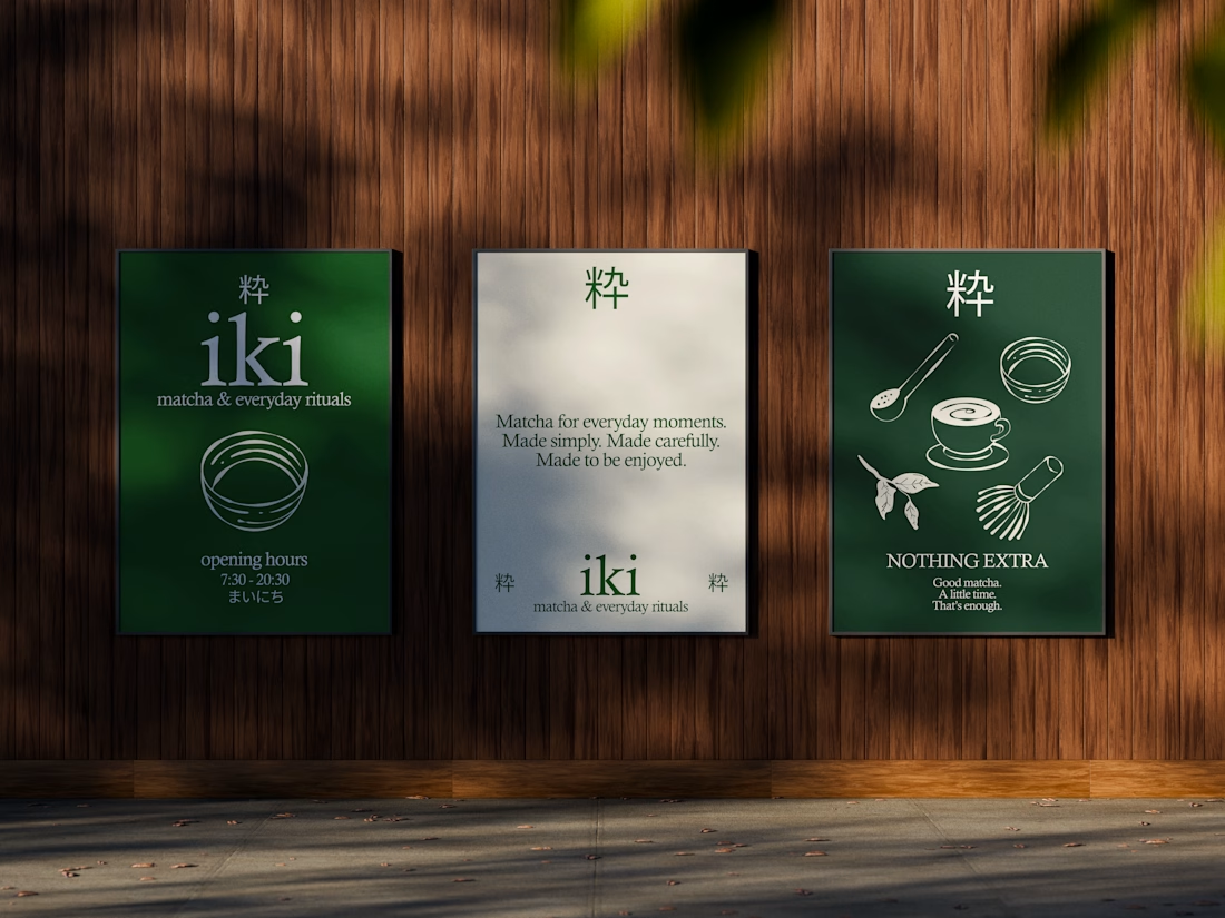


the illustration direction feels like it could take over the whole shop interior, not just the cups. thats usually where these projects fall apart