The network for creativity
Join 1.25M professional creatives like you
Connect with clients, get discovered, and run your business 100% commission-free
Creatives on Contra have earned over $150M and we are just getting started
Back to feedPost
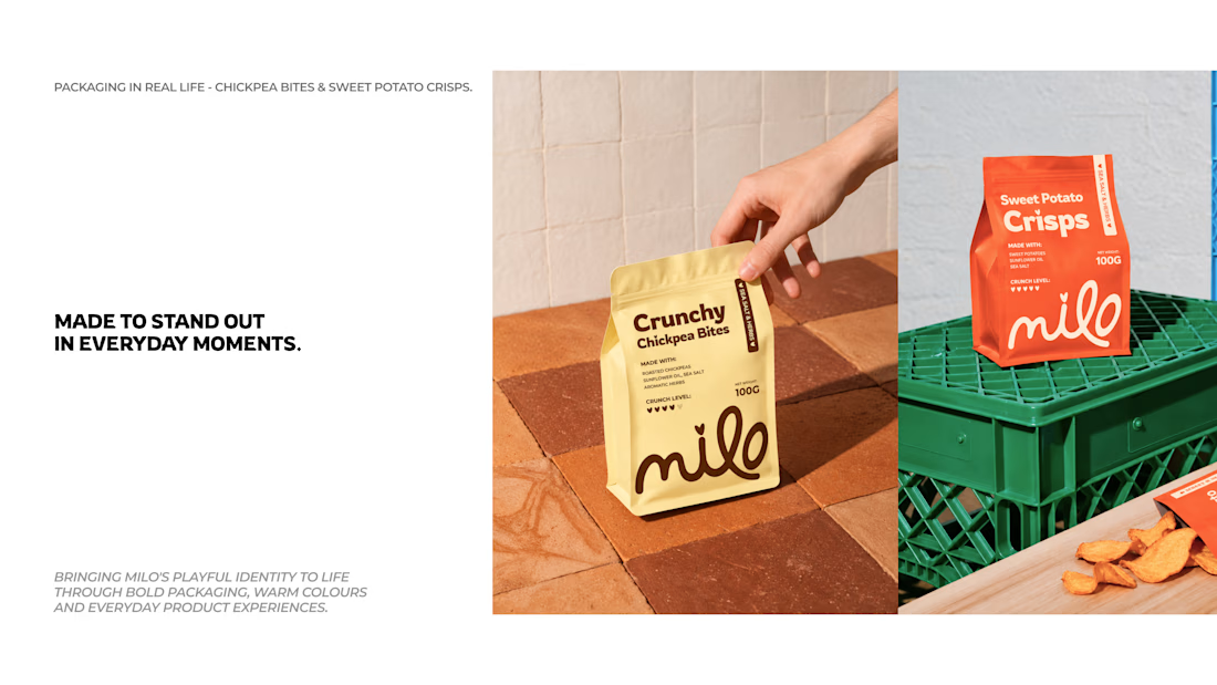
Sharing a little branding project I've been working on Milo!
The idea was to create a fun, fresh identity for a snack brand that feels just as good as the products themselves.
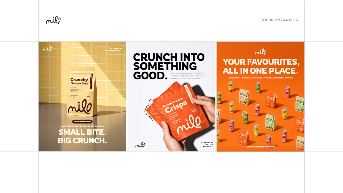
I had fun exploring the packaging, playing with colours, creating social media posts, and seeing how the identity could come to life through outdoor advertising.
I wanted to keep things simple, playful and bold while making sure everything felt connected.
Here’s a look at some of the work!
Would love to know what you think.
#BrandIdentity #GraphicDesign #PackagingDesign #CreativeDesign


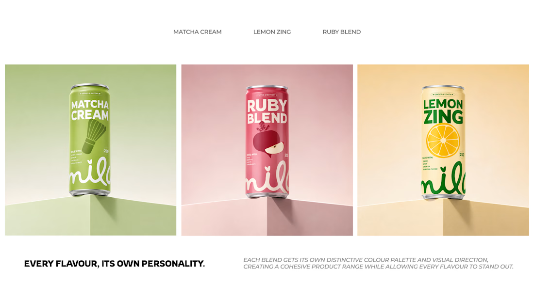

The looping handwritten Milo wordmark keeps the whole snack range friendly without tipping into childish. How did you set up the flavour colours so the cans still read as one family when lined up?

Thanks! I chose colours inspired by each flavour and kept the typography and layout consistent so they still feel like one family.
The network for creativity
Join 1.25M professional creatives like you
Connect with clients, get discovered, and run your business 100% commission-free
Creatives on Contra have earned over $150M and we are just getting started



Related posts

What happens when 1,000 people follow a one-person studio? 🎉
1K on Contra, 13 clients hired, a clean 5.0, and zero shortcuts on taste.
Thank you for watching the work.
Brand identity, web and code keep coming. If yours is next, my DMs are open.


amazing work!!

Happy to share a little piece of what I've been working on lately: Nexus.
Nexus is a concept for a network that moves money and data as fast as the internet moves information. Payments, tokenized assets, AI agents that pay for things on their own, apps that need privacy by default.
The full website is coming soon.



Big idea and it looks great. Excited to see where you take Nexus next.

Website & Branding for Blockchain Payments Consortium (Mysten Labs)
