The network for creativity
Join 1.25M professional creatives like you
Connect with clients, get discovered, and run your business 100% commission-free
Creatives on Contra have earned over $150M and we are just getting started
Back to feedPost

Your Strategy Can Be Brilliant. But Can People Feel It?
I'm beginning to realise that the real challenge isn't only knowing what your brand stands for. It's making other people experience it.
Hey lovelies, happy new week! 🤎
I hope you're entering this week with a little more energy, a little more clarity, and hopefully something exciting to look forward to.
I've been spending more time learning about branding, and one idea from Marty Neumeier's The Brand Gap has been sitting in my head.
The gap between strategy and creative execution.
Here's how I'm currently understanding it.
A business can know exactly:
Who it serves.
What it stands for.
What makes it different.
How it wants to be positioned.
What it wants people to remember.
That's strategy.
But strategy doesn't automatically become perception.
At some point, all that thinking has to travel from inside the business to the people experiencing it.
That's where creativity comes in.
Design.
Language.
Content.
Photography.
Packaging.
Websites.
Visual identity.
Customer touchpoints.
These aren't simply decorations placed on top of a strategy.
They're some of the ways people see, understand and experience that strategy.
And this has made me rethink social media too.
Because a social media manager shouldn't only be thinking:
“What are we posting today?”
There should also be a bigger question:
“What is this content communicating about the brand?”
A business can have a beautiful content calendar and still have inconsistent brand communication.
It can post every day and still leave people unsure about what makes it different.
It can have a great strategy sitting in a document while its public presence tells an entirely different story.
That's the gap I'm beginning to understand.
And honestly, I'm enjoying this stage of learning.
Not because I know everything.
I absolutely don't.
But because every new concept is making me look at businesses, content and communication a little differently.
That's why I'm sharing the process.
I'm not waiting until I've read every book, worked with every kind of business or figured everything out.
I'm learning now.
I'm thinking now.
I'm asking questions now.
And I'm building from there.
The Brand Gap introduces five disciplines of brand-building:
Differentiate. Collaborate. Innovate. Validate. Cultivate.
I haven't finished exploring them yet.
So, naturally, I'm taking you down the rabbit hole with me. 😂
If you're a brand strategist or you've been working in branding for years:
Where do you think businesses most often lose the connection between strategy and execution?
And if you're a business owner:
Does your brand currently communicate what you believe it stands for?
Something tells me this branding journey is going to teach me a lot.
And I'm excited to share what I discover along the way.
Abisola Olapade
Brand Strategy | Branding | Personal Branding | Social Media Management | LinkedIn Strategy
The network for creativity
Join 1.25M professional creatives like you
Connect with clients, get discovered, and run your business 100% commission-free
Creatives on Contra have earned over $150M and we are just getting started
Related posts

If a logo had to tell what a brand does, Apple would be a fruit stand.
New on our blog: why comparing "logo + guidelines" with a branding process is comparing two different products, how to tell whether you need a new logo or a new brand, and why sometimes the professional move is to turn the work down.
A logo is the signature. The story is everything else. Read it here: https://ander.agency/blog-posts/branding-is-not-a-logo

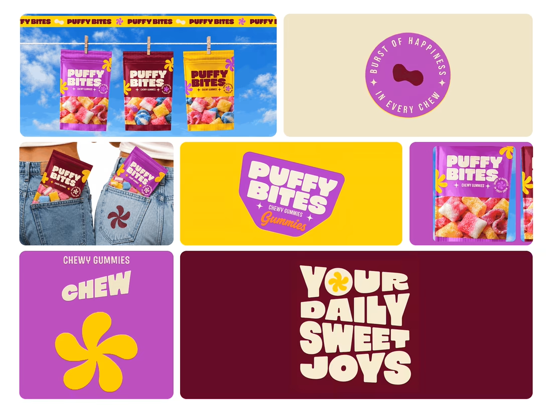
What makes a candy brand recognizable across every pack?
For Puffy Bites, I built the identity around rounded lettering, expressive symbols, and a palette of burgundy, purple, yellow, and cream.
The same visual language carries through pouch packaging, smaller wrappers, campaign imagery, and an animated brand showcase.
One design decision that ties it together: the packaging color changes, while the logo placement, product descriptor, and supporting graphics maintain a consistent structure.
I handled the full client project, from logo and visual identity to packaging and campaign applications.
Which colorway would catch your eye first—purple, burgundy, or yellow?
Explore the full Puffy Bites case study. If you’re developing a candy or snack brand, I’m available for branding and packaging projects.

Love it,
Great work