The network for creativity
Join 1.25M professional creatives like you
Connect with clients, get discovered, and run your business 100% commission-free
Creatives on Contra have earned over $150M and we are just getting started
Back to feedPost

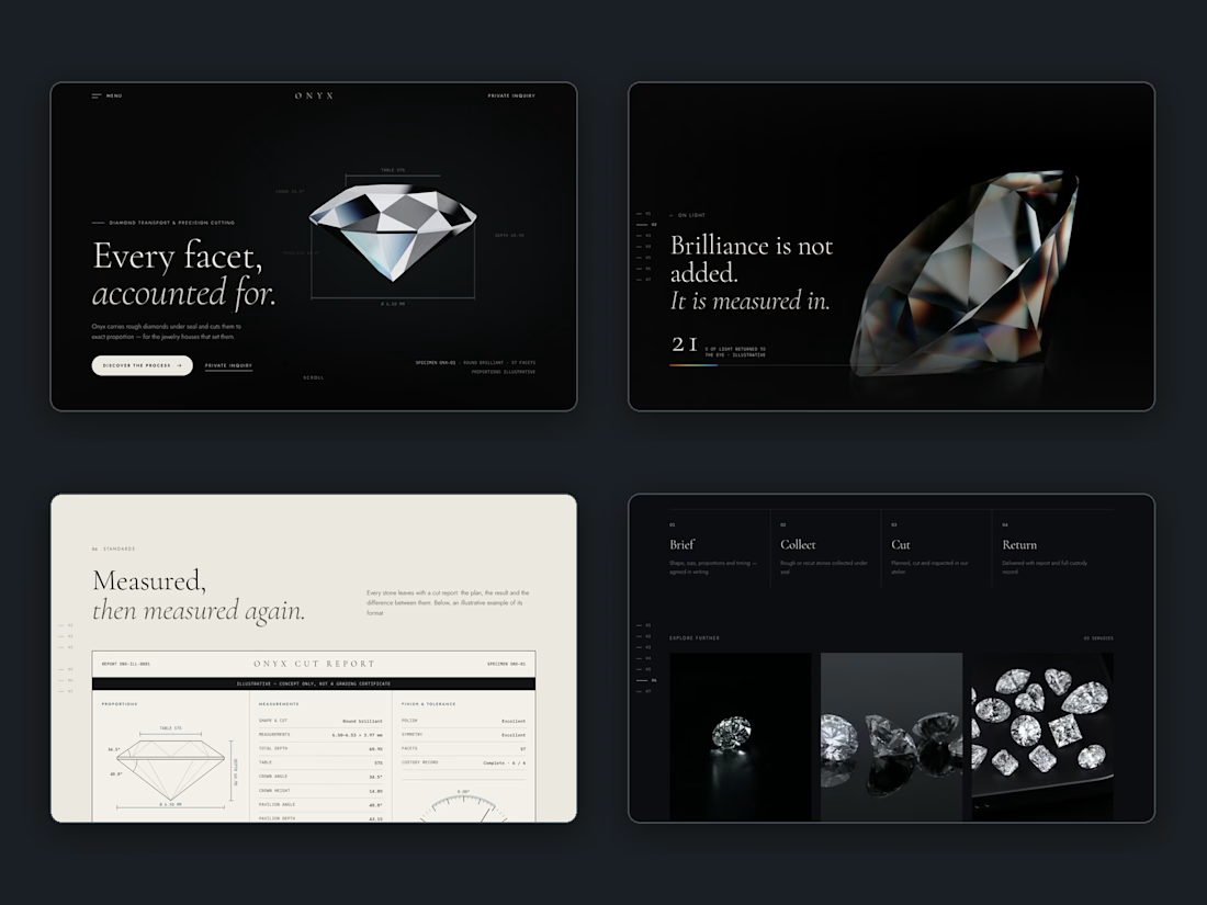
We hide something in every site. We don't tell you where.
We hide a small Easter egg in every site we build. No label, no hover hint, no "click here." If you find it, you found it.
It has to come from that business's world, or it feels stuck on. If you're putting a chair together, the secret belongs on the chair. If the page digs into soil, the secret belongs in the ground. We don't use a stock confetti button, and we don't put a sign next to the trigger.
Most sites are exhausted in one pass. An egg rewards the person who lingers, and it gives the owner something to discover on their own. We test that it actually fires. Then we leave it alone — including in this post.
The network for creativity
Join 1.25M professional creatives like you
Connect with clients, get discovered, and run your business 100% commission-free
Creatives on Contra have earned over $150M and we are just getting started


Related posts

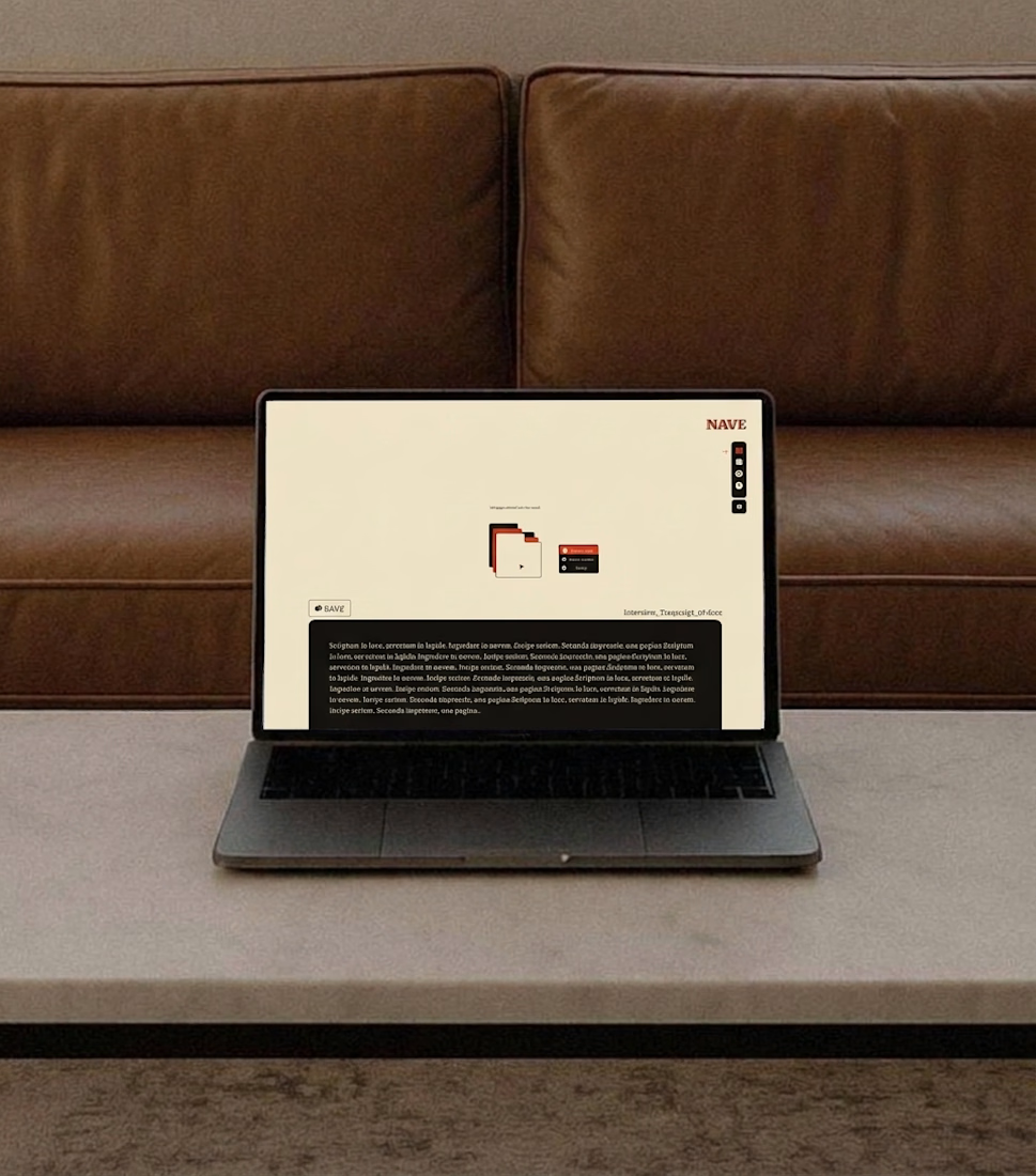
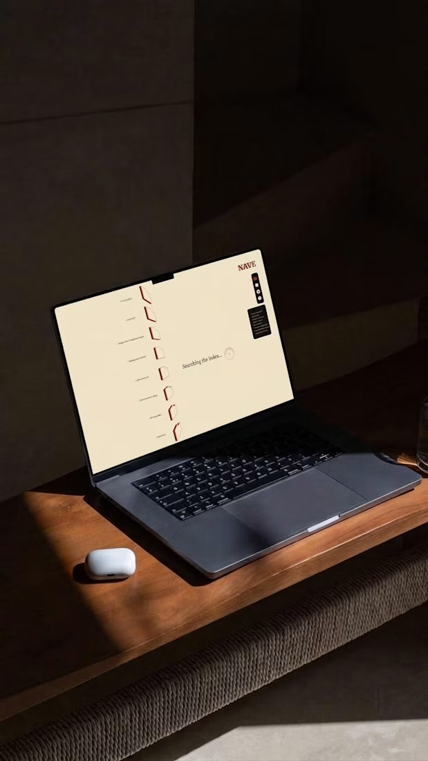
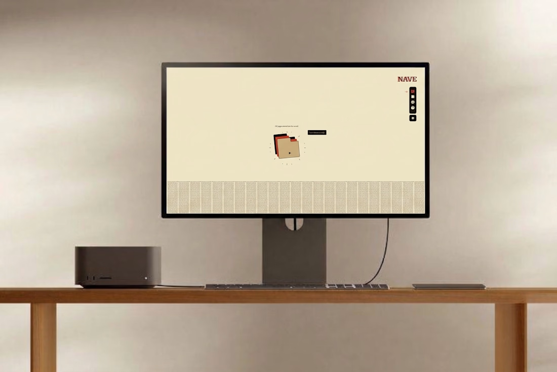
Where did your best idea go last month?
Not the one you finished. The one in a tab you closed, a note you can’t find, a draft you overwrote.
NAVE keeps all of it, every revision, searchable by whatever you half remember.
Written in light. Kept in stone.

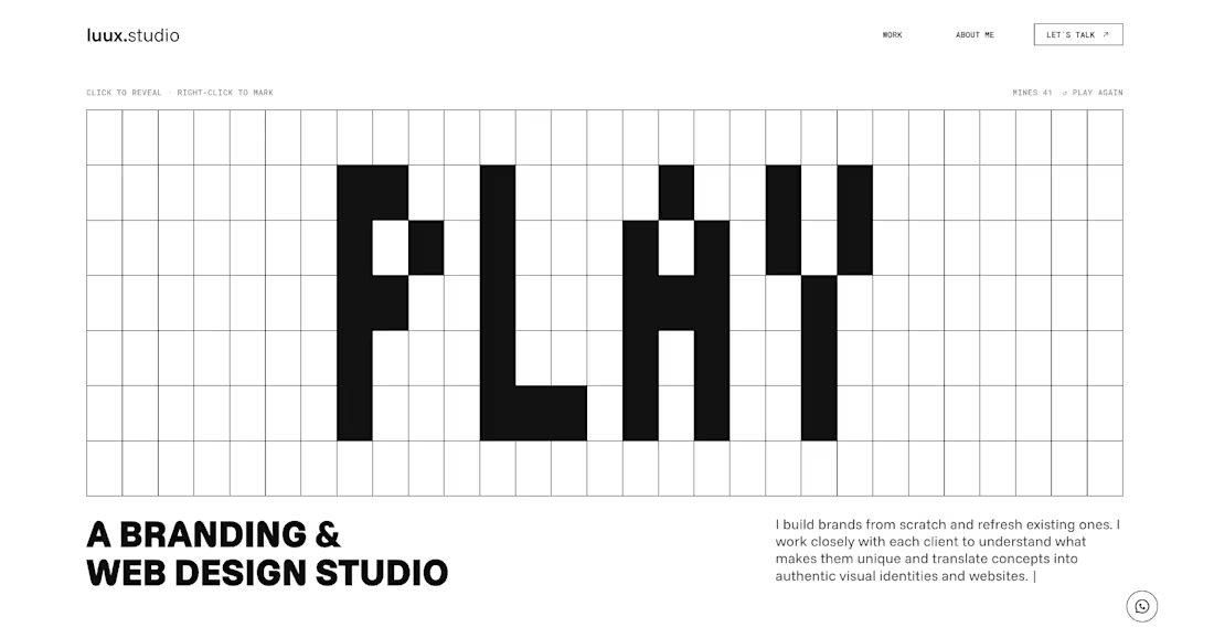
The new luux.studio website is live.
I rebuilt my site around one idea that guides how I work:
⚡️ every project starts by bringing light to what’s hidden ⚡️
So the homepage is a game.
A full-screen minesweeper where you explore the grid, read the clues and, eventually, find the spark. Hit a mine and it explodes, literally, into a “Start your project” button.
What else is new:
→ Three clear services: Brand Strategy, Visual Identity and Website & E-commerce
→ A work index where every project comes to life on hover
→ One person behind it all, from the first idea to launch
Designed and built in Framer, with a few custom code components for the game and the details.
Go play: luux.studio
How many clicks did it take you to find the spark?
Please, leave your feedback below 🫶🏻


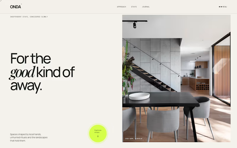
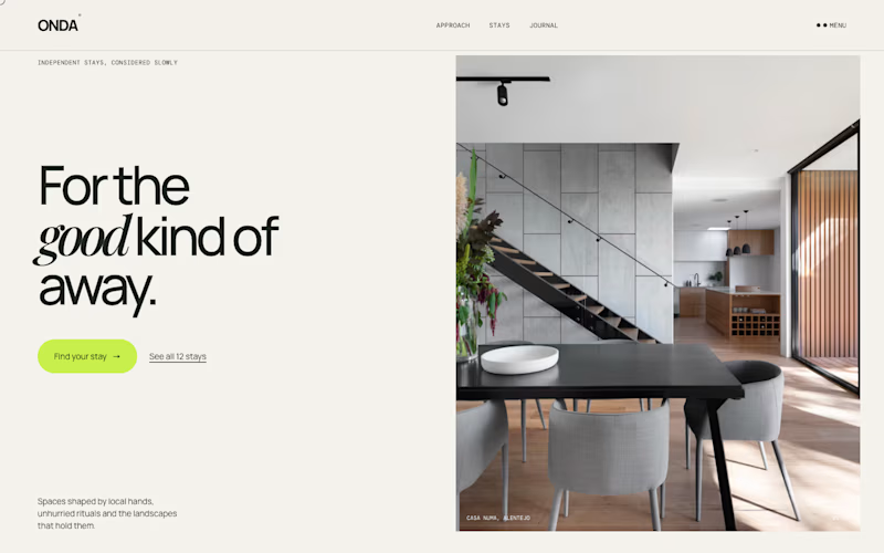
Same homepage, two approaches.
One keeps it calm with a single round button at the bottom. The other puts the action right under the headline, with a second option.
Which one would get your click?
3 votes
Ends in 1d
The calm version is the live Onda site. Full case study here: https://contra.com/p/m7gFOYUZ-onda-a-holiday-homes-website-that-sells-the-feeling