The network for creativity
Join 1.25M professional creatives like you
Connect with clients, get discovered, and run your business 100% commission-free
Creatives on Contra have earned over $150M and we are just getting started
Back to feedPost

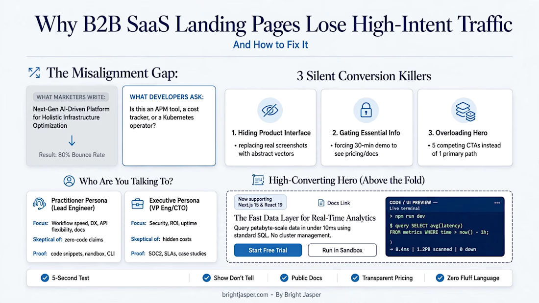
Why B2B SaaS Landing Pages Lose High-Intent Technical Buyers
When a developer, engineering manager, or technical lead lands on your website, they aren't looking for corporate buzzwords like "Empower your enterprise synergies."
They want answers to three basic questions in under 10 seconds:
1. What does this tool actually do?
2. How does it integrate into my stack?
3. How much does it cost?
If your landing page hides these answers behind vague marketing speak, abstract graphics, or a "Book a Demo" button, you are bleeding high-intent traffic.
The Three Silent Conversion Killers
- Hiding the Product UI: Replacing real code snippets or product dashboards with abstract vector illustrations.
- Gating Essential Info: Forcing engineers into a 30-minute sales call just to view basic pricing tiers or documentation.
- Jargon Overload: Using phrases like "Next-Gen AI-Driven Platform" instead of stating the actual mechanism (e.g., "Query petabyte-scale data in under 10ms using standard SQL").
Practitioner vs. Executive Positioning
High-converting technical landing pages address both personas simultaneously:
Practitioners (Engineers/Architects): Want workflow speed, clean developer experience (DX), explicit CLI/API capabilities, and interactive code blocks.
Executive Buyers (CTOs/VPs): Want security compliance (SOC2), cost predictability, uptime SLAs, and clear ROI.
Stop making technical buyers guess what your product does. Replace marketing fluff with concrete engineering facts.
🔗 Read the full landing page teardown and audit checklist on brightjasper.com:

The network for creativity
Join 1.25M professional creatives like you
Connect with clients, get discovered, and run your business 100% commission-free
Creatives on Contra have earned over $150M and we are just getting started




Related posts

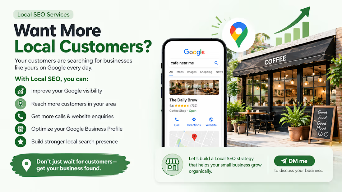
Want More Local Customers?
Your customers are searching for businesses like yours on Google every day. Is your business showing up?
With the right Local SEO strategy, you can:
✅ Improve your Google visibility
✅ Reach more customers in your area
✅ Get more calls & website enquiries
✅ Optimize your Google Business Profile
✅ Build stronger local search presence
📍 Don’t just wait for customers—get your business found.
Let’s build a Local SEO strategy that helps your small business grow organically.
📩 DM me to discuss your business.
#LocalSEO #SmallBusiness #SEO #GoogleBusinessProfile #DigitalMarketing #BusinessGrowth #LocalBusiness

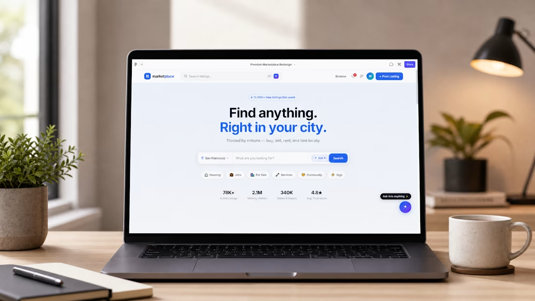
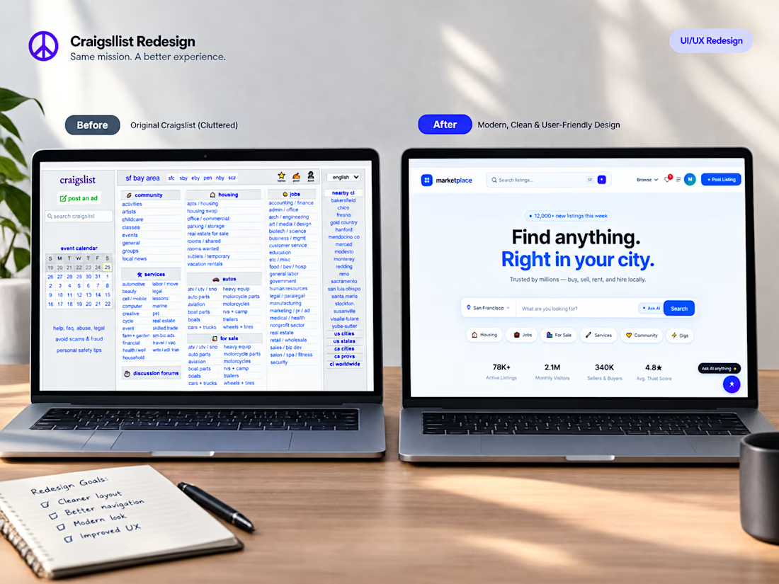
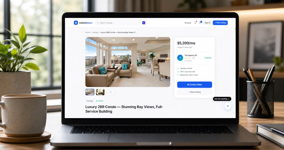
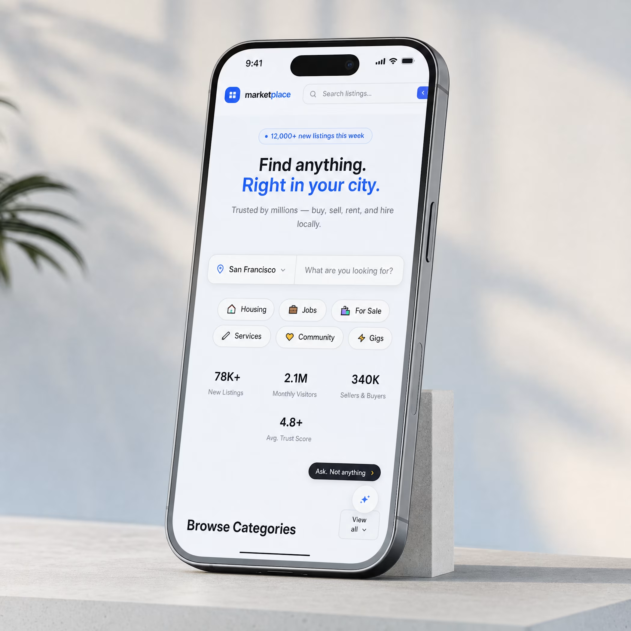
🚀 Reimagining Craigslist: Turning Legacy UX into a Trust-First, AI-Powered Marketplace [Independent Case Study]
Most local marketplaces lose millions in revenue due to one core issue: User Distrust and Fragmented Interface. For this independent product design case study, I took Craigslist's massive legacy framework and completely re-engineered it into a premium, high-converting B2C interface.
🎯 The Business & Design Problem:
Traditional local classifieds feel unsafe, cluttered, and slow. Users abandon platforms because they cannot verify buyers or filter out spam efficiently.
💡 The Conversion-Focused Solution:
Using strategic product thinking in Figma and Lovable, I structured a clean, modern design system built around three core pillars:
AI-Driven Smart Search: Reducing user friction by replacing text filtering with conversational, contextual search queries.
Trust-First Safety Architecture: Integrated clean, transparent verification metrics into the core user profiles to eliminate fraud vectors.
Scalable Information Hierarchy: Clean typography grids and card patterns optimized for lightning-fast scanning and high engagement rates.
🔗 Project Artifacts:
🎨 Explore Interactive Figma Prototype: [https://tree-nice-91506355.figma.site ]
📖 Full Detailed Case Study: [https://elevate-marketplace-story.lovable.app ]
💼 Looking for a Product Designer for your Startup?
I specialize in transforming complex workflows, legacy platforms, and B2B SaaS dashboards into high-performance, beautiful digital products that increase user retention.
I am fully available for contract roles, end-to-end UX/UI redesigns, and scalable web/mobile platforms. Let’s build something profitable together. Drop me a DM here or email: productdesigner786@gmail.com

Really like the idea of making local information and services easier to find in one place! With so much city-specific information, I imagine keeping it accurate and up to date is a big part of the work. How did you approach collecting the data, and how do you handle updates when something changes?

been working on some complex workflow illustrations for a big tech startup landing page redesign... [WIP]


The code panel against that Temporal checklist makes the retry logic readable. Pairing it with a plain headline like Handling Failures is what lets a dense workflow land on a marketing page.