The network for creativity
Join 1.25M professional creatives like you
Connect with clients, get discovered, and run your business 100% commission-free
Creatives on Contra have earned over $150M and we are just getting started
Back to feedPost

From the archive: a motion identity piece for The Potter’s House Dallas.
The goal was to take an already established visual system and make it move without turning it into something new.
So the film stays rooted in the brand itself: oversized editorial typography, gritty black-and-white photography, posterized imagery, rounded image windows, tactile grain, sharp masks, match cuts, and restrained motion throughout.
The TPH mark was treated as locked artwork rather than something to redraw or reinterpret, with the motion built around reveals, scale, cropping, and surrounding graphic elements while keeping the original geometry intact.
The result is a short brand film that moves between community, identity, typography, and applications while keeping the whole thing raw, human, tactile, and distinctly The Potter’s House.
One of those projects where the motion had to feel like the brand book simply came to life.
The network for creativity
Join 1.25M professional creatives like you
Connect with clients, get discovered, and run your business 100% commission-free
Creatives on Contra have earned over $150M and we are just getting started
Challenges
View all


Related posts

The refined version of my latest brand film for the Treal studio. More texture, improved design.


The added texture gives the film more character.

I gave out the source code for my old portfolio.
So instead of rebuilding the same thing, I decided to start again from scratch.
I’m currently designing a completely new portfolio experience — experimenting with 3D, motion, interactions, and a more cinematic way of presenting my work.
I’m documenting the process as I build it.
Sharing a few early explorations below. More to come.


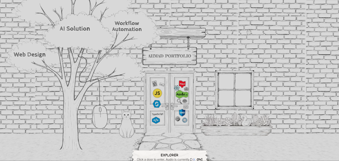

Starting over in three.js feels right if the old portfolio is already public. Those sketch frames read like a shot list, not a reskin.

Short-form motion graphics and video editing project focused on creating a cinematic, high-retention visual experience. I handled the editing, animated typography, motion graphics, transitions, timing, composition, and final vertical delivery using Adobe After Effects and Premiere Pro.
Strong pacing for a short-form edit.