The network for creativity
Join 1.25M professional creatives like you
Connect with clients, get discovered, and run your business 100% commission-free
Creatives on Contra have earned over $150M and we are just getting started
Back to feedPost
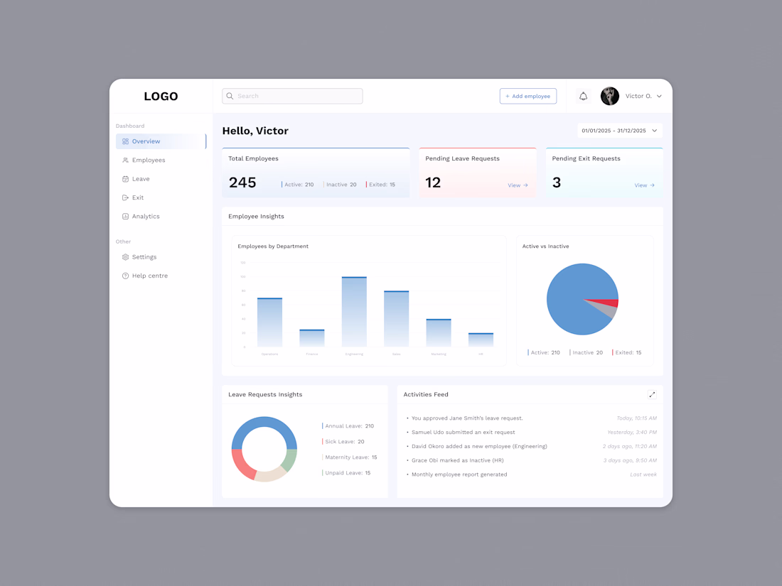
Just wrapped up this HR dashboard design, and the goal was simple: make the data feel alive without overwhelming the people actually using it every day.
I focused on giving HR managers a clear snapshot of what’s happening across the company. Employee counts, leave requests, exits, department insights, and activity feeds — all in one calm, easy-to-breathe space.
Designing dashboards is always a balancing act between clarity and personality, and colour plays a big role in that.
Do you think too much colour on dashboards can distract from the data displayed? What are your thoughts?
Good work 👍
Thanks
The network for creativity
Join 1.25M professional creatives like you
Connect with clients, get discovered, and run your business 100% commission-free
Creatives on Contra have earned over $150M and we are just getting started
Trending
Claude
Claude has entered the design space. How are you using Claude Design?
Contra University
Learn from expert creatives how to earn more using next-gen AI tools.
creativeaiflow
Creative AI workflows are evolving. What tools do you use, and what are their strengths and weaknesses?
freelancerlife
Freelancer life is wins, pivots, and everything in between. What’s yours right now?