The network for creativity
Join 1.25M professional creatives like you
Connect with clients, get discovered, and run your business 100% commission-free
Creatives on Contra have earned over $150M and we are just getting started
Back to feedPost


The network for creativity
Join 1.25M professional creatives like you
Connect with clients, get discovered, and run your business 100% commission-free
Creatives on Contra have earned over $150M and we are just getting started








Related posts

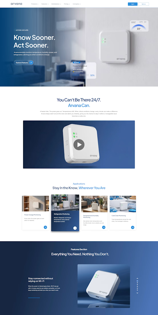
🌐 Arvana | Website Design
Designed a modern, premium website for Arvana, combining clean layouts, engaging product visuals, and intuitive navigation to showcase its smart home solutions.
#WebDesign #UIUX #Arvana #WebsiteDesign

This is very nice and beautiful 😍


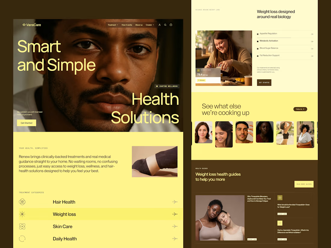
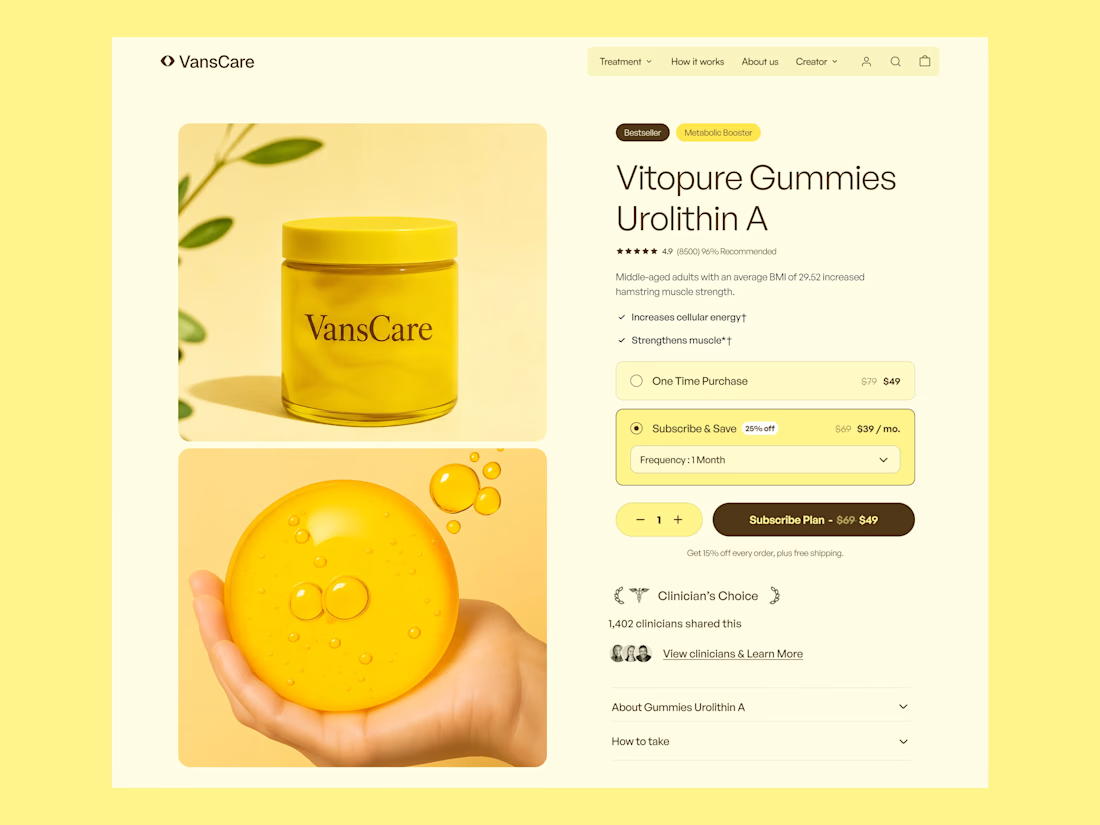
Healthcare & Supplement Ecommerce Website Design
Telehealth Design, Supplement Ecommerce, Healthcare UX/UI, Wellness Website Design, Ecommerce Design, Healthcare Website Design, Product Page Design, Conversion Rate Optimization, DTC Healthcare, Nutrition Supplement Design, Shopify Design, Health and Wellness, Landing Page Design, Mobile Ecommerce, Digital Health, Telehealth Website, Supplement Branding, Ecommerce UX, Healthcare Branding, Wellness Product Design
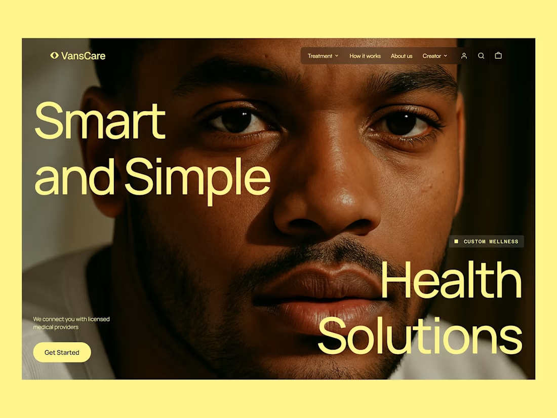

thats nice, i love that you dared to play with that strong of a color!

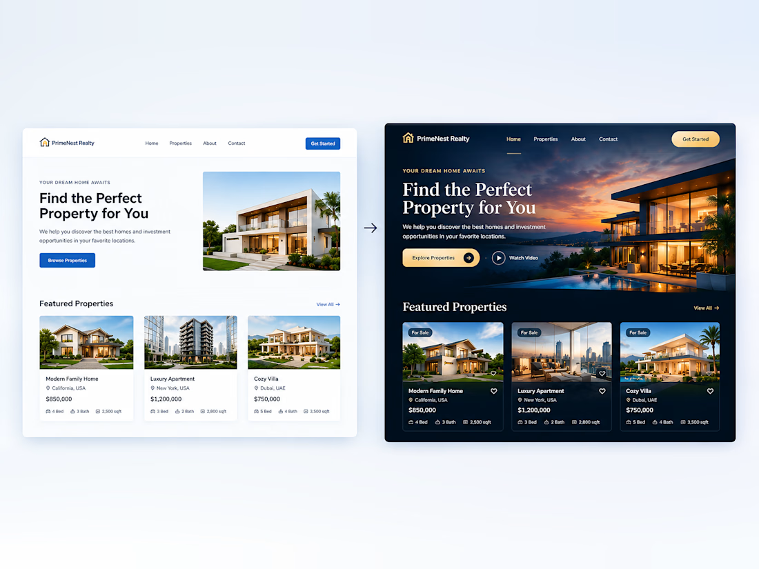
Small Design Changes. A Bigger Difference.
You don’t always need a complete redesign to make a website look more professional. Small improvements in color, typography, spacing, and visual effects can transform the entire experience.
Don’t you agree?