The network for creativity
Join 1.25M professional creatives like you
Connect with clients, get discovered, and run your business 100% commission-free
Creatives on Contra have earned over $150M and we are just getting started
Back to feedPost

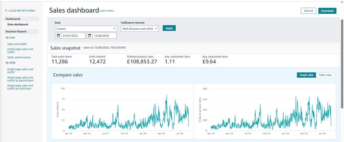
From 1 SKU to a Scalable Amazon Brand.
We started with just 1 SKU focused on getting the fundamentals right before scaling.
The results speak for themselves:
📈 £87.24K+ sales in the last 12 months
📦 12,472 units ordered
🛒 11,286 total order items
💷 £108K+ total product sales shown in the business report
Now, the next phase begins: SCALING. 🚀
Our approach is simple:
Start small → Validate → Optimize → Scale
No shortcuts. No blind scaling. Just data-driven decisions and consistent execution.
One SKU was the starting point. The goal now is to build a bigger, scalable Amazon business.

The network for creativity
Join 1.25M professional creatives like you
Connect with clients, get discovered, and run your business 100% commission-free
Creatives on Contra have earned over $150M and we are just getting started











Related posts

17 of 50 well-known SaaS homepages never say what the product is in their headline. Big brands can afford that. A new product can't.


Big brands can afford that. A new product can't is such a clean way to frame it. The blurred headline demo makes the point better than any paragraph could, if a visitor can't say what the product is in five seconds, the headline failed.


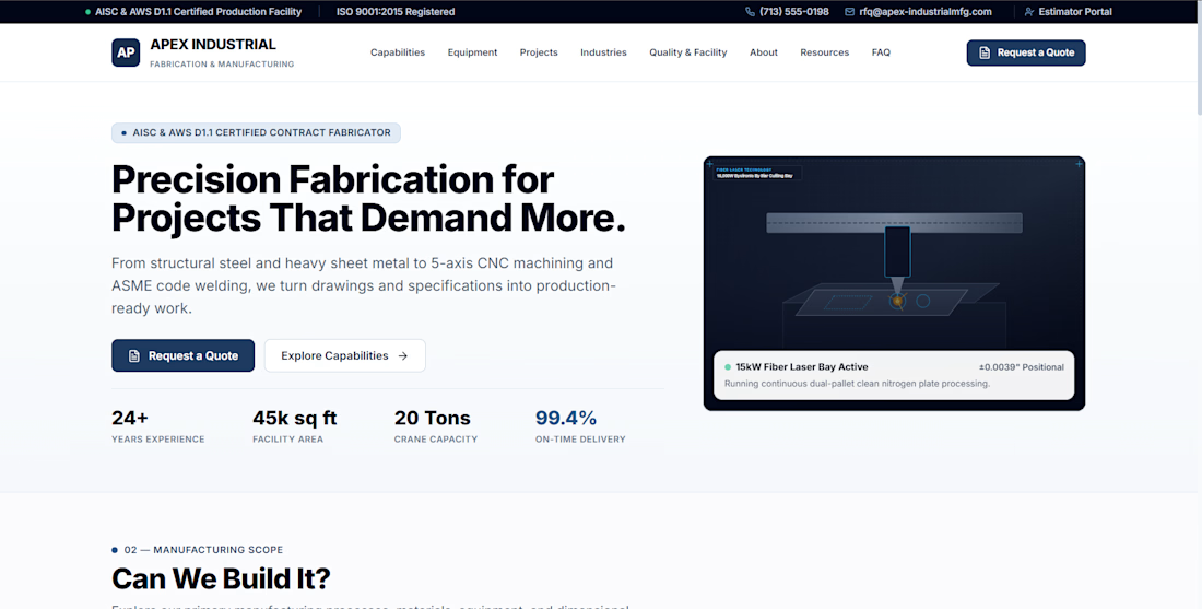
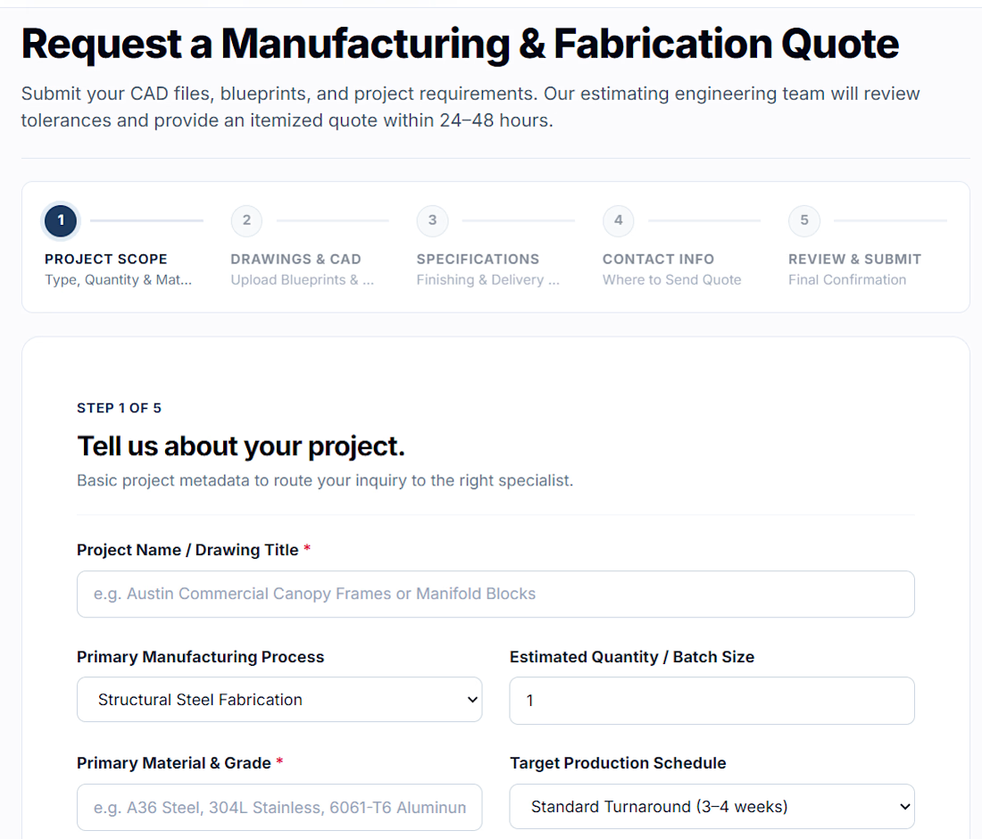
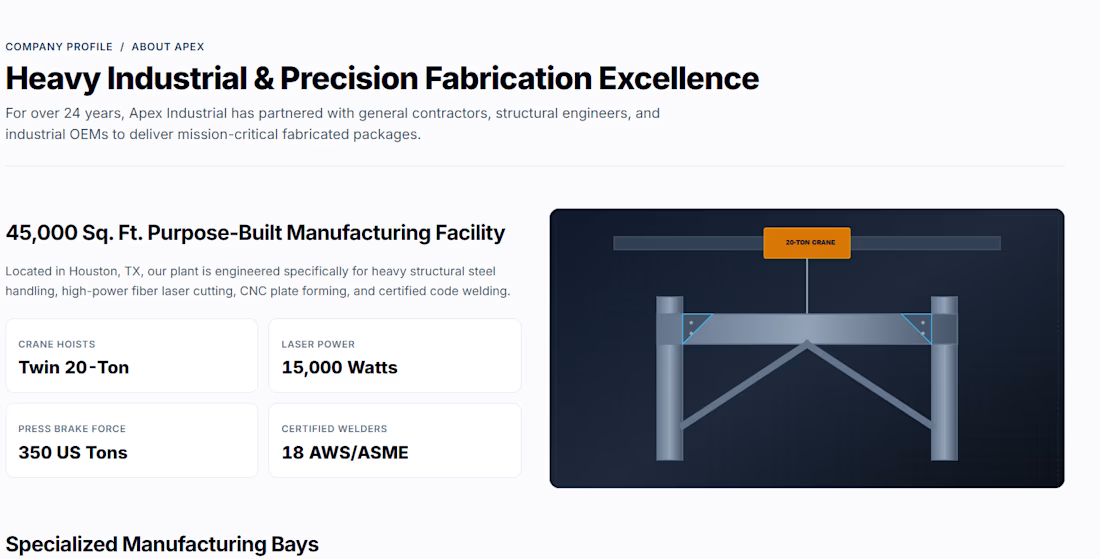
This isn't an experimental concept or an AI playground test — this is a fully realized, production-level platform architecture.
Hands down, this is the most cohesive and technically refined demo we have engineered at Orillusive to date.
Live Interactive Sandbox:
https://industrydemo.orillusive.com/
When scaling web platforms for modern industry leaders, superficial UI is never enough. We built this build to address the real bottlenecks:
• Sub-second layout transitions without Cumulative Layout Shift (CLS)
• Deterministic state handling built on production-grade component architecture
• Purpose-driven typography and dark aesthetic engineered for enterprise credibility
• Zero unnecessary runtime bloat — purely optimized for conversion and speed
Most platforms look impressive in a static Figma frame, but break down under real client interactions. We engineer live proofs-of-work so founders can feel the speed, accessibility, and precision firsthand before writing a single contract.
Take it for a spin and inspect the responsiveness across viewports.
What is the biggest technical benchmark you test first when evaluating an agency's frontend capabilities?

Shipping a live sandbox instead of a static Figma frame is exactly how you prove frontend chops. Sub-second layout transitions with zero CLS is the kind of benchmark that actually separates production-grade builds from pretty mockups.


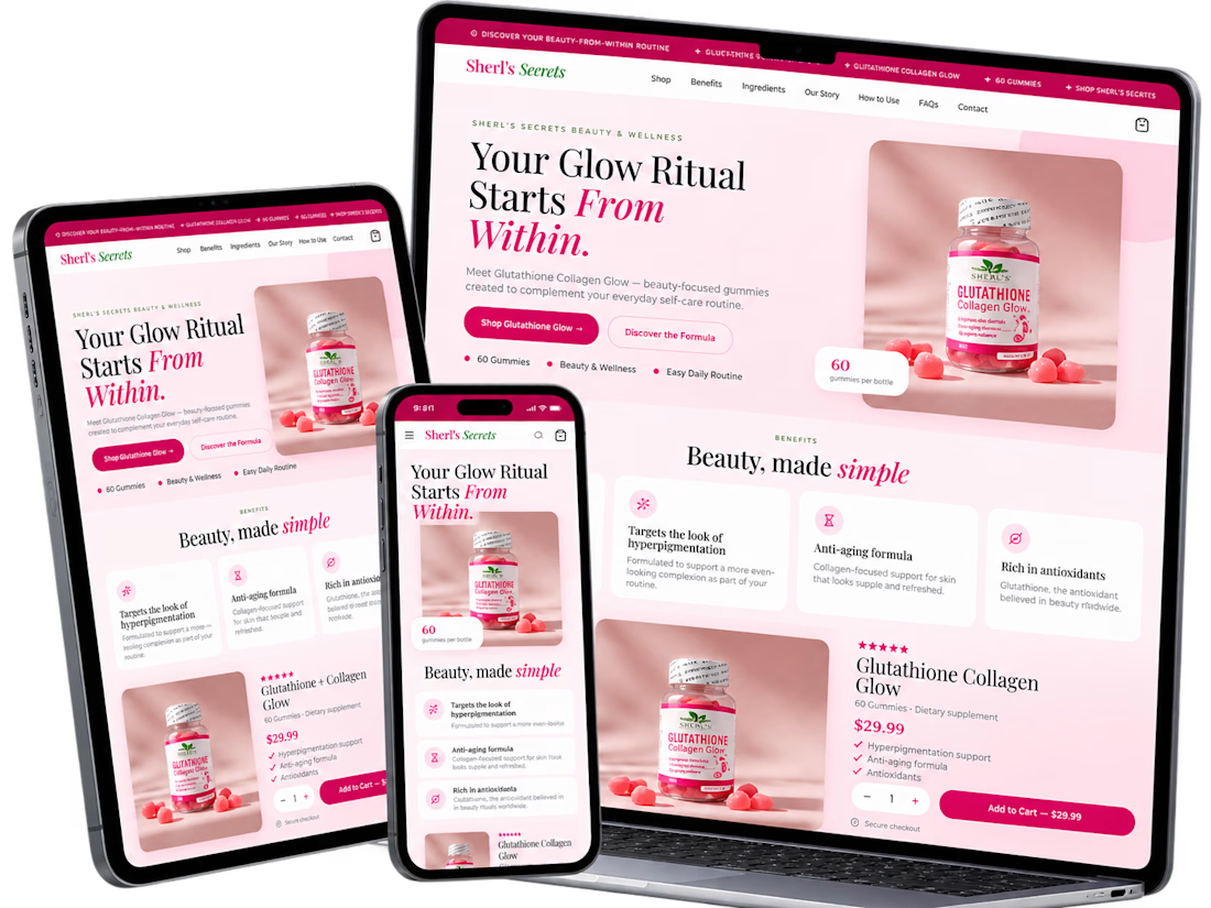
A conversion-focused Shopify product page featuring a clean, modern layout and an intuitive shopping experience.
The page brings together an engaging product gallery, bundle selection, clear Add to Cart actions, customer testimonials, product education, comparison tables, and FAQs.
The design emphasizes visual hierarchy, product discovery, purchase clarity, and trust-building elements to help shoppers make informed decisions.
Focus: Shopify UI/UX, product page design, and conversion rate optimization.



The comparison table is the part I'd check hardest on mobile. It often ends up as a horizontal scroll nobody touches, so I usually cut it to three rows with the one claim that really sets the product apart. How did you decide the order below the fold, testimonials before education or the other way around?