The network for creativity
Join 1.25M professional creatives like you
Connect with clients, get discovered, and run your business 100% commission-free
Creatives on Contra have earned over $150M and we are just getting started
Back to feedPost
Taste Test

I explored two creative directions for a promotional campaign for Café Aurora's Matcha Espresso Fusion + Pistachio Cookie Combo.
Option A → Clean, minimalist, modern.
Option B → Rich, editorial, premium café advertising style.
Both designs promote the same product, but they create very different first impressions.
I'm curious:
👉 Which poster would make you stop scrolling?
👉 Which one feels more premium and professional?
👉 Which one would make you more likely to order the combo?
1 voted
25%

3 voted
75%

4 votes
Closed

Option A
The network for creativity
Join 1.25M professional creatives like you
Connect with clients, get discovered, and run your business 100% commission-free
Creatives on Contra have earned over $150M and we are just getting started



Related posts

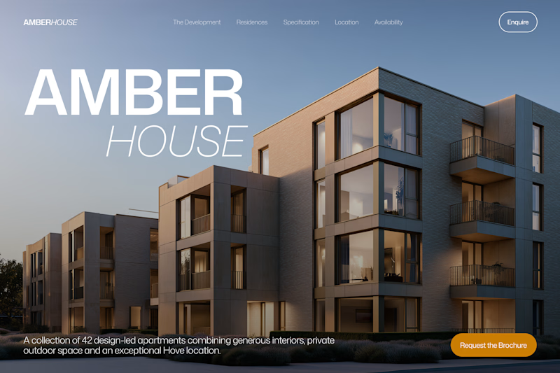
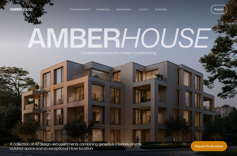
Which hero would you choose — 1 or 2?
Two directions for Amber House, my real estate website template. The first pairs a closer architectural crop with an asymmetric layout. The second gives the building more breathing room, with a wide view and a centered headline.
Same template, two different first impressions. Which feels stronger to you, and why?
24 voted
59%
17 voted
41%
41 votes
Closed

I will go with Bold & Asymmetric!

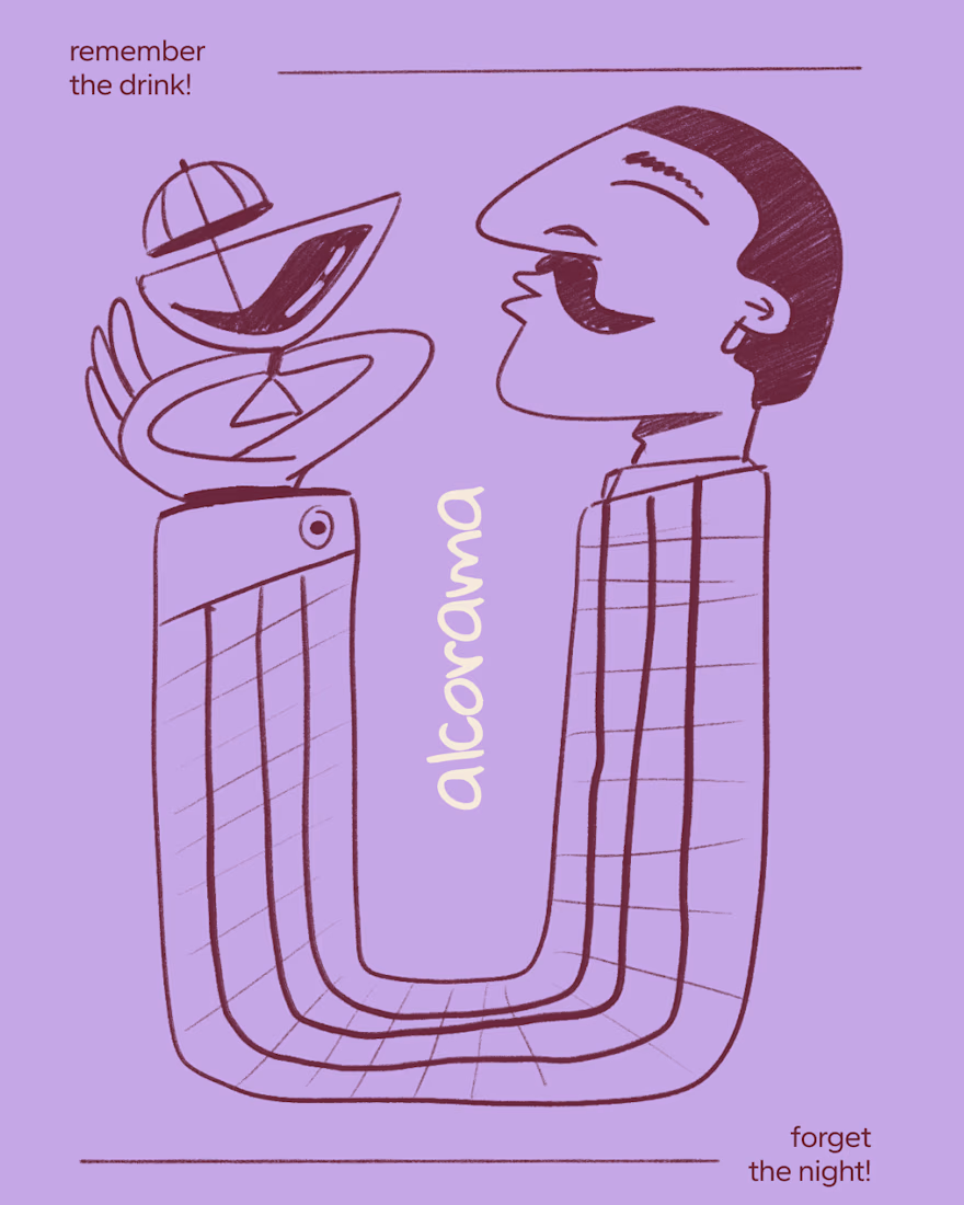
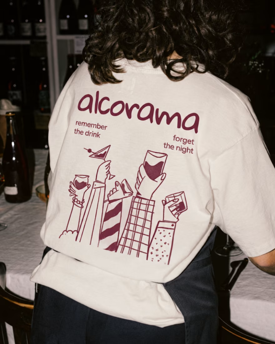
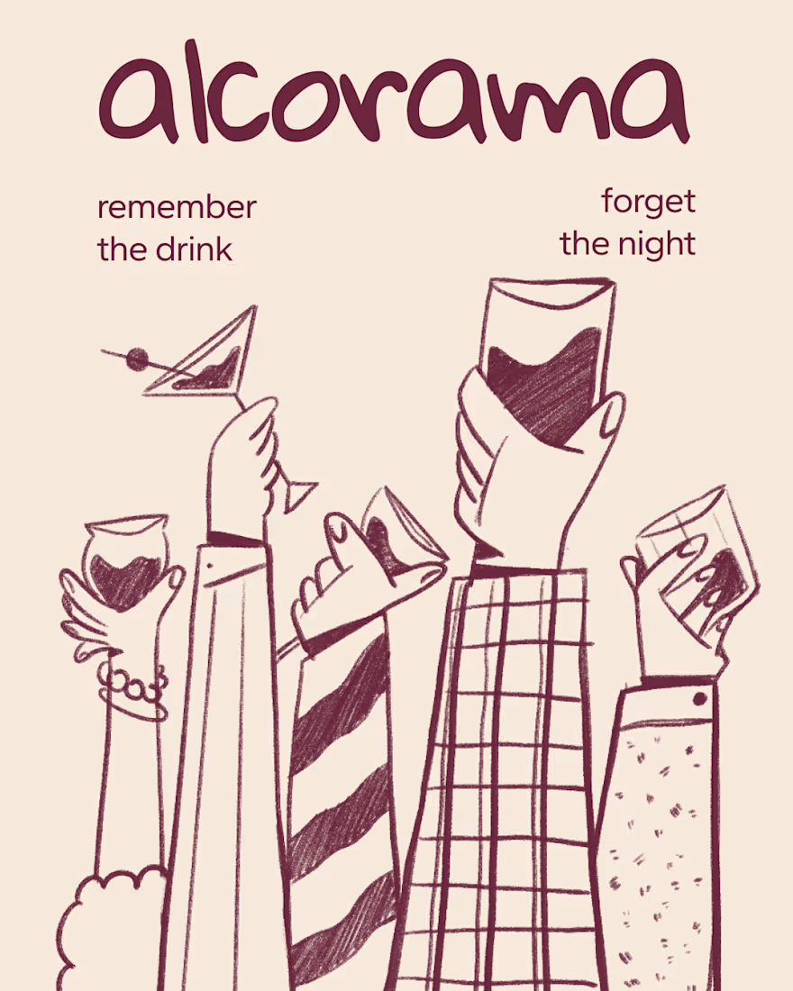
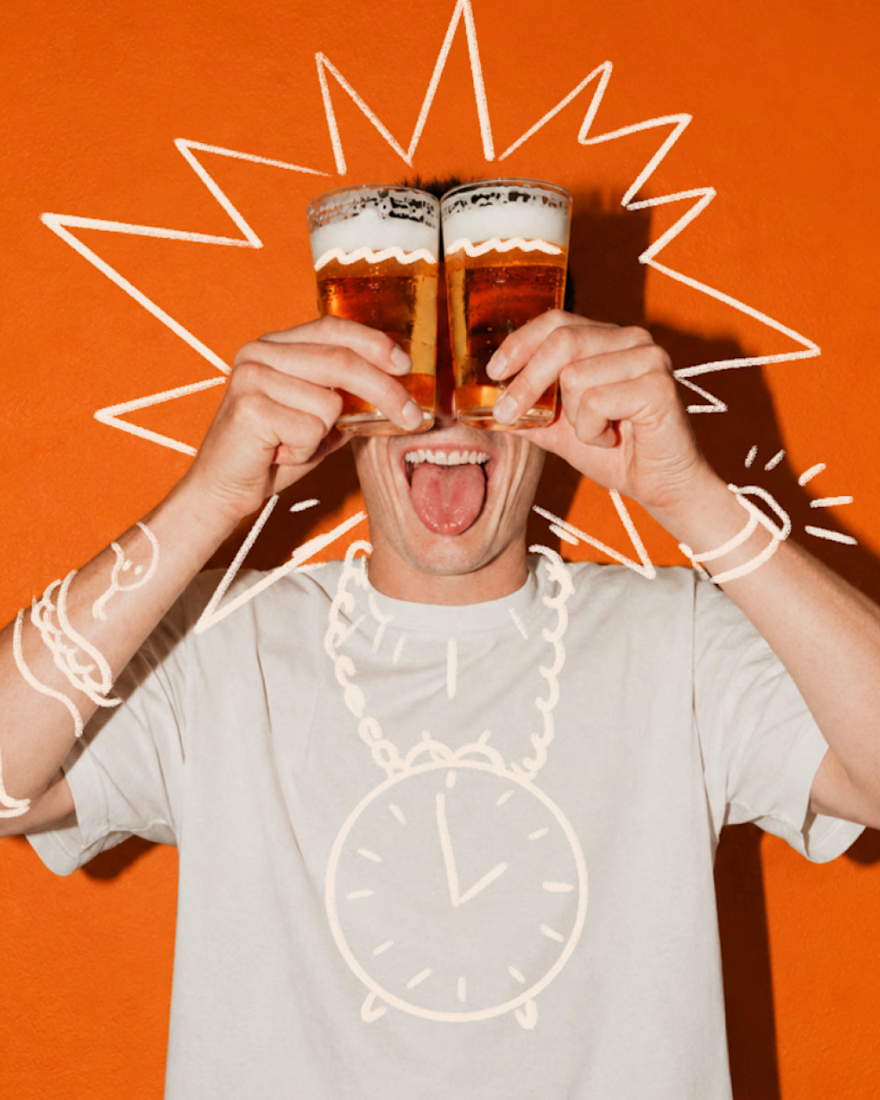
Final direction picked! I love when brands use custom illustration as the main way to communicate with their audience.
Direction discovery should not take more than one week and it should be full of personality! Ready to upgrade your brand?

Amazing work!

What if your product could steal the spotlight without saying a word? 🍉✨
A product deserves more than just a beautiful image. It deserves an experience.
This 3D product animation was all about bringing a beverage brand to life through eye-catching visuals, dynamic product movements, realistic details, and refreshing fruit elements.
From the product presentation to the final reveal, every frame was crafted to make the product feel more appealing, memorable, and impossible to scroll past.
Looking to give your product the same treatment?
I create:
3D Product Animations & Commercials
Premium Product Ads
3D Modeling & Rendering
Creative Brand Visuals
Let's turn your product into something people can't ignore. DM me and let's create something remarkable! 🚀
3D Modeling3D AnimationmotiongraphicsadvertisingAdvertisement DesignAdobe After EffectsAdobe Premiere ProBlender


Amazing!