The network for creativity
Join 1.25M professional creatives like you
Connect with clients, get discovered, and run your business 100% commission-free
Creatives on Contra have earned over $150M and we are just getting started
Back to feedPost

You didn’t start a business to post on Instagram. I’ll do it.
The network for creativity
Join 1.25M professional creatives like you
Connect with clients, get discovered, and run your business 100% commission-free
Creatives on Contra have earned over $150M and we are just getting started






Related posts

hi everyone 👨💻
im new here, what’s the sauce on getting clients
would like to know the ins and outs 🫶
feel free to connect dm me on instagram


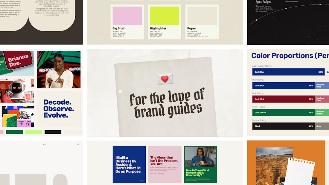
Be honest, how many times did you open your brand guide to stare after the handoff? 👀
(Just like opening this email or message after sending it, to re-read it 💀)
Today I wanted to pay a tribute to brand guides, aka the most selfish part of my process lol.
Why selfish? Because I put SO much love into these. Color proportions, logo breakdowns, presenting each little dancing alien… knowing most clients will open it once and never again 💔
But it’s my moment. After weeks of decisions, seeing the whole brand in one place feels like watching your kid graduate (no kids here, but I imagine it’s close).
So yes, I’ll keep making them way too pretty. Sorry not sorry 🙂↕️
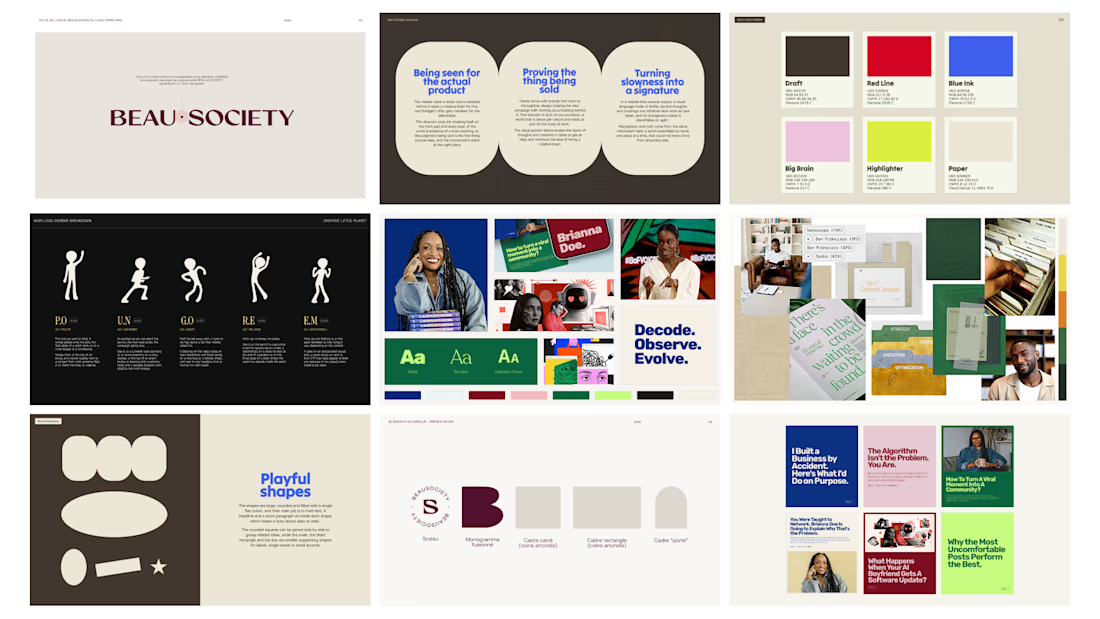
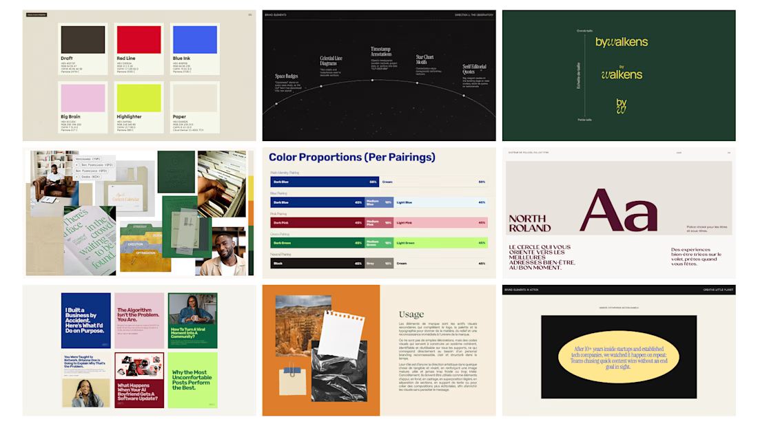

From the developer side, the guide gets opened a lot more than once. Whoever builds the website or the Shopify theme lives in it, and the colour proportions page is the one that stops a site from turning into 80% accent colour. So it isn't only for you 🙂

New to Contra, not new to making ideas real.
I’m Girish, a creative digital marketer working across short-form video, motion graphics, web design and Shopify.
One B2B Instagram Reel I created reached 37K views in two days. It reminded me how far a clear idea and a strong opening can travel.
Here, I’ll share the thinking behind my work, not just the final pixels. Recent projects include motion graphics for TroviqAI and a university anthem video that won first place.
Take a look at my work: https://girishfolio.me
What makes you stop scrolling: a strong hook, a surprising visual, or a story?

girishfolio.me
GRSHfolio — Girish Suthar
I don’t let ideas stay ideas. Strategy, creative and shipped builds — websites, AI video, graphic work and marketing.