The network for creativity
Join 1.25M professional creatives like you
Connect with clients, get discovered, and run your business 100% commission-free
Creatives on Contra have earned over $150M and we are just getting started
Back to feedPost
Taste Test

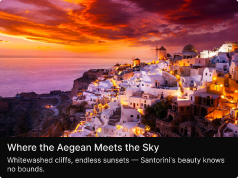
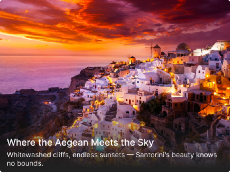

Solid, because the copy underneath already has to compete with a sunset photo - a gradient adds a second layer of contrast to manage and the caption gets harder to guarantee legible across different images.

that's a valid point you made.

The gradient route adds a lot of atmosphere here, especially with the warm image behind it. I’d be curious to see how the solid option performs for readability on hover.
Thanks for your reply.

Gradient background
Great choice, I must say 👍

Your shot is exceptional. I'm overwhelmed with the quality of work!
The network for creativity
Join 1.25M professional creatives like you
Connect with clients, get discovered, and run your business 100% commission-free
Creatives on Contra have earned over $150M and we are just getting started







Related posts

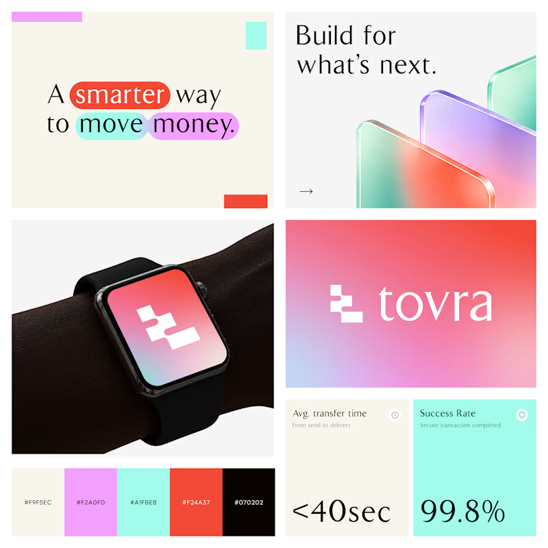
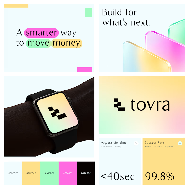
Two Color Directions. One Brand Identity.
Exploring two visual directions for Toyra, a modern fintech brand focused on making money movement smarter and simpler.
Both concepts feature bold typography, vibrant colors, playful gradients, and a clean visual identity.
Which color direction works better for Brand Option A or Option B? 👀
19 voted
40%
29 voted
60%
48 votes
Closed


✨ Two styles. One campaign. Which Daymade design hits differently?
I explored two creative directions for Daymade, combining lifestyle storytelling with bold typography and fresh, energetic colors. ☀️🥤
💛 Option 1: Fresh & Minimal 💗 Option 2: Bold & Playful
Which one grabs your attention? 👀
Cast your vote! 🗳️👇
25 voted
26%
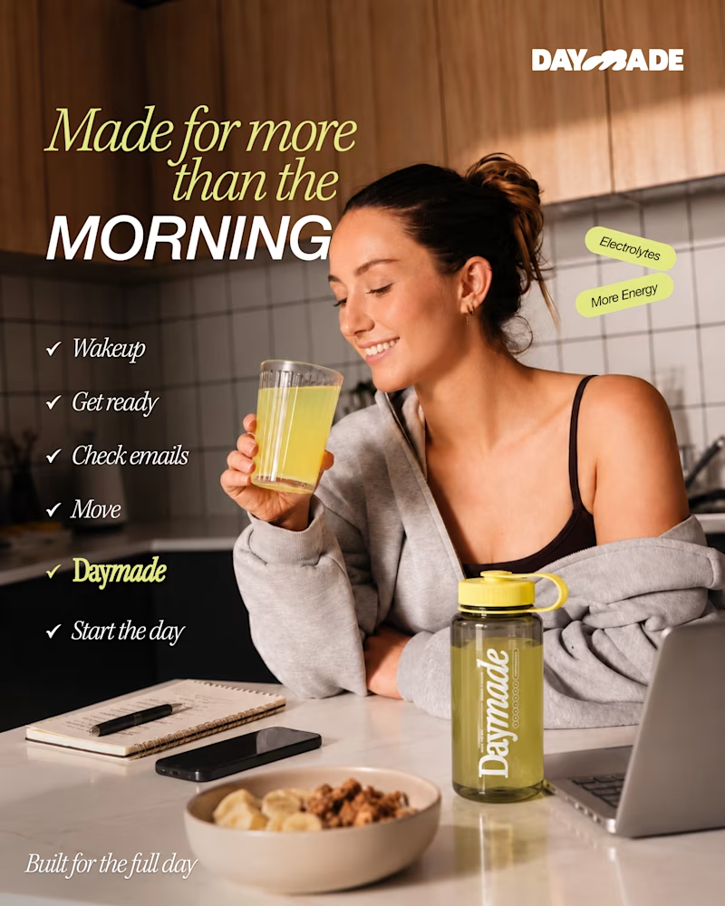
73 voted
74%
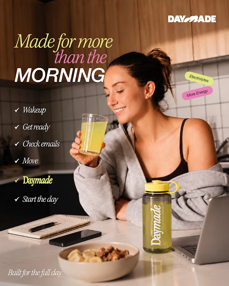
98 votes
Closed

Option 2 looks better

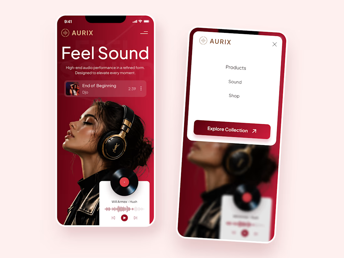
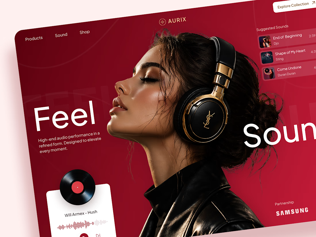
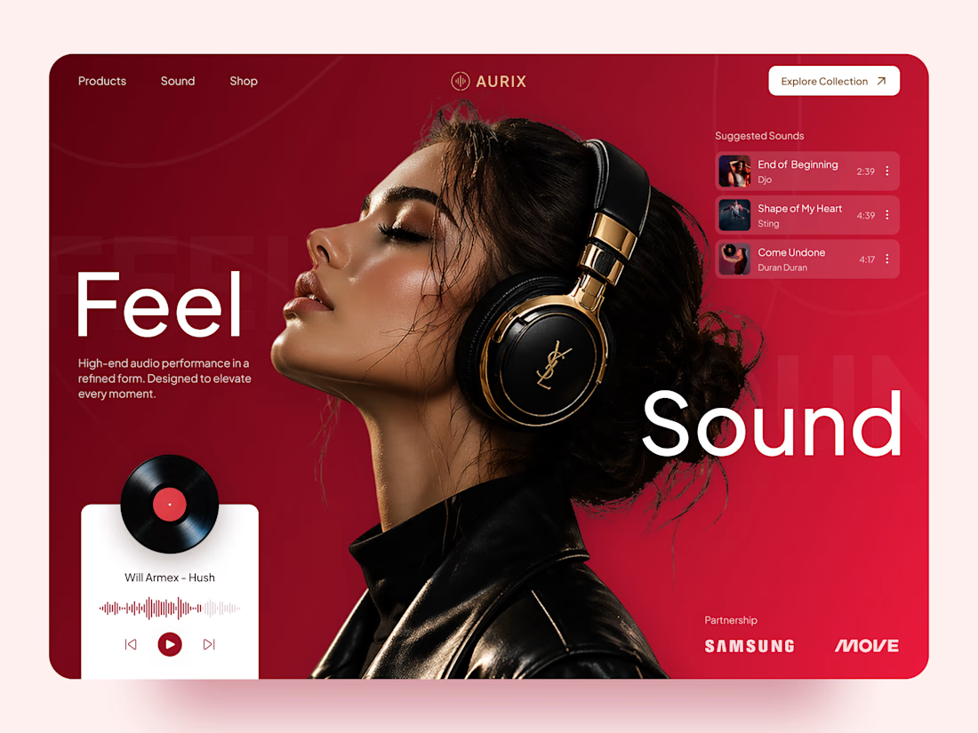
AURIX — Premium Headphones Landing Page 🎧❤️
A bold landing page concept for a premium audio brand, combining luxury headphones, music, and a strong lifestyle aesthetic
The design brings together deep red tones, elegant black and gold details, oversized typography, and immersive lifestyle imagery to create a modern, fashion-inspired experience
Special attention was given to:
• Bold lifestyle-focused hero composition
• Rich red and gold color palette
• Clean, oversized typography
• Music player and suggested tracks
• Premium product presentation
• Responsive mobile experience
• Minimal navigation and clear CTA
The result is a stylish, immersive landing page that connects premium audio with fashion, music, and everyday lifestyle ✨


Love the style!