The network for creativity
Join 1.25M professional creatives like you
Connect with clients, get discovered, and run your business 100% commission-free
Creatives on Contra have earned over $150M and we are just getting started
Back to feedPost

Lettro, the game for which I've illustrated every asset, is now available on Steam! We have opened playtesting, and I am proud of our progress as a team of three.
Here is the website I made on Lovable: https://lettrogame.com/
Here you can find our game and request access to playtest!


lettrogame.com
Lettro — Word-Building Roguelike Deckbuilder
Lettro is a word-building roguelike where language, logic, and strategy intersect. Wishlist now on Steam.
The network for creativity
Join 1.25M professional creatives like you
Connect with clients, get discovered, and run your business 100% commission-free
Creatives on Contra have earned over $150M and we are just getting started





Related posts




Most creative brands try to say everything at once.
More colour.
More shapes.
More visual noise.
But for this identity exploration, the idea was simpler:
Make creativity feel meaningful.
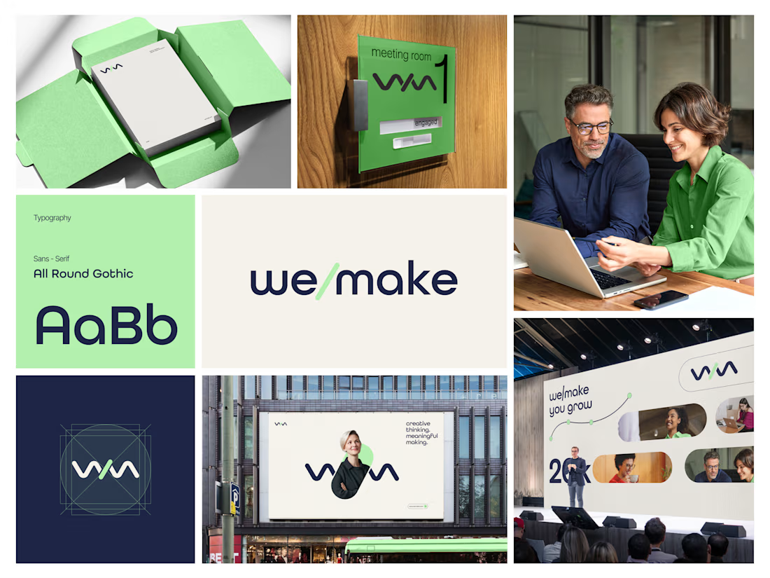
Introducing we/make, a bold, human-centred visual identity built around collaboration, growth, and purposeful making.
The mark is designed as a flexible expression of “we” and “make” coming together.
It represents:
• Ideas turning into action
• People creating together
• Growth through meaningful work
• A creative process that stays clear, warm, and confident
The visual system pairs a deep navy foundation with a fresh green accent, bringing together trust, focus, energy, and optimism.
Rounded typography and soft graphic elements keep the brand approachable, while the structured layouts give it a modern, professional feel.
From stationery and meeting-room signage to campaigns, billboards, and event spaces, the identity is built to work wherever creativity needs to show up.
Creative thinking. Meaningful making.
Would love to hear your thoughts on the visual direction.
What stands out to you first, the logo, colour palette, or overall brand feel?
#BrandIdentity #BrandDesign #CreativeDirection #VisualIdentity #GraphicDesign #LogoDesign

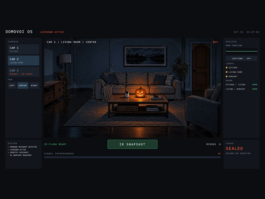
DOMOVOI is a complete horror game inside a single Rive file.
Halloween night. You're a technician locked in the server room of an empty smart home. The system has detected an "unknown resident" and opens the locks only when you photograph it.
How to play (2-4 min, sound on):
Catch the resident with IR SNAPSHOT: the camera must point at the exact room and zone it is in.
Listen: each room has its own sound. Hover and click things in the picture; the technician's remarks are the only hints.
CAM 3 is offline. Fixing it is the first puzzle and leads to a device that shows where the resident is.
Every miss adds 20% SIGNAL INTERFERENCE. At 100% the console dies.
Stuck? CAM 2 RIGHT: router, then the wall socket, POWER, router again. CAM 3 LEFT: click the vacuum, open MAP, send it to a zone, snapshot the red mark.
Built with the Rive CLI and an AI agent (RML + Luau, 192 unit tests), a GPU Canvas WGSL shader for the camera feed, data binding and state machines. Sound from the Rive editor's library, voice recorded by me.