The network for creativity
Join 1.25M professional creatives like you
Connect with clients, get discovered, and run your business 100% commission-free
Creatives on Contra have earned over $150M and we are just getting started
Back to feedPost

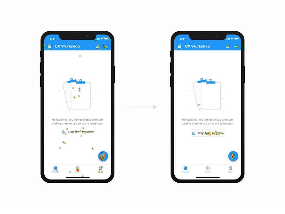
These are click heatmaps from usability tests I ran for a past project. It was for a to-do app, and users were given an objective of adding tasks from a template.
After testing the initial version (left), I made some updates and tested the new version (right). I really like showing people this example to illustrate how a change as small as adding an outline to a button can make a big difference.
The network for creativity
Join 1.25M professional creatives like you
Connect with clients, get discovered, and run your business 100% commission-free
Creatives on Contra have earned over $150M and we are just getting started

Challenges
View all


