The network for creativity
Join 1.25M professional creatives like you
Connect with clients, get discovered, and run your business 100% commission-free
Creatives on Contra have earned over $150M and we are just getting started
Back to feedPost

Just shipped a clean minimalist e-commerce site in Framer for a streetwear essentials brand 🖤
"Ordinary" – no loud logos, just premium vibes, perfect fit, and engineered for everyday wear. From bold typography to smooth product browsing and a calm brand manifesto, everything screams intentional design.
Built with love for brands that choose silence over noise.
Live preview: https://ordinary-ecom.framer.website/
Web Developer & Designer | Software Engineer
Open for new Framer projects & custom web builds 💼


The network for creativity
Join 1.25M professional creatives like you
Connect with clients, get discovered, and run your business 100% commission-free
Creatives on Contra have earned over $150M and we are just getting started



Related posts


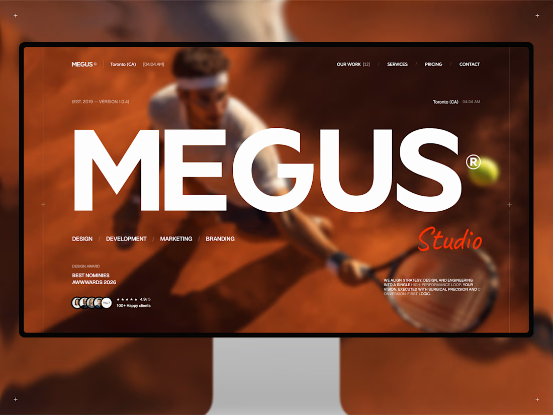
Finally, MEGUS® ⚡️ is live on the @Framer Marketplace! 🚀
After 2 months of focused work, the template is now published and ready.
MEGUS is a complete system for modern brand and portfolio sites — strategy, identity, motion, and development in one cohesive setup. 👾
Explore the full template and see it in action here:
https://www.framer.com/marketplace/templates/megus/
Available now. ⚡️


I've been playing with scroll motion in Framer, and I'm planning to add this one to an upcoming template. What do you think?

The soft colours look beautiful.

Not every website needs more elements.
Sometimes, it needs better decisions.
A thoughtful layout.
A strong typographic hierarchy.
The right images.
Consistent spacing.
A clear navigation.
And enough room for the design to breathe.
These details might seem small, but together they shape how people experience a website.
That's one thing I appreciate about working with Framer: the opportunity to explore layouts, interactions, and visual details while keeping the experience intentional.
For me, good web design isn't about adding more.
It's about knowing what to keep, what to remove, and what deserves attention.
Less noise. More meaning. Better experiences.
What's one small design detail that immediately makes a website feel premium to you?

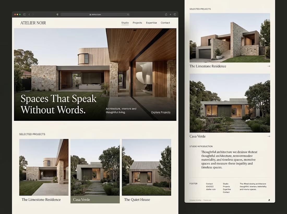

Generous whitespace for me. The serif headline over the photo on your Atelier Noir layout is a good example.