The network for creativity
Join 1.25M professional creatives like you
Connect with clients, get discovered, and run your business 100% commission-free
Creatives on Contra have earned over $150M and we are just getting started
Back to feedPost
The Rotary Dial: A Navigation For Everyone
I built a mobile menu with Figma Make that ACTUALLY fits your hand, whether you are left- or right-handed.
The Vision 🚀
Large phones make buttons hard to reach. The Dial moves everything to the 'Natural Zone', the bottom corner where your thumb rests or where it is most comfortable for you. Inspired by the old-school rotary phone dial.
Why it works:
No Stretching: Everything stays within thumb’s reach.
Movability: Slide the dial to either side to match your grip.
Contextual: Icons change automatically (e.g., Feed vs. Chat).
The best part? You get massive functionality without screen clutter. Every tool is just a quick thumb-flick away.
Figma Make let me focus on what is more important, 'the user' rather than the build.
Try it: https://nimbus-rabid-02055702.figma.site/
🔊 Sound On


It’s about time someone addressed this. We’re still stuck using desktop-era navigation on massive 'Pro' phones, and my thumb is tired of the gymnastics! This is such a smart way to bridge that reachability gap without overcomplicating the UI. Great work!

😂 Haha, 'thumb gymnastics' is the perfect way to describe it! I really wanted to retire that old desktop-style navigation and build something that actually respects how we hold our phones today. So glad you noticed the reachability gap!

This is genius 🙌
Thank you Halyna, I thought it would be a great opportunity to rethink something that every other app just reuse and never thinks about and its such a simple upgrade and usable for everyone.
Especially for those who dose not have 2 hands. 😞

This is a brilliantly intuitive solution. As someone with smaller hands who constantly struggles to reach top-corner menus on large phones, placing adaptive navigation in the natural thumb zone feels thoughtful, ergonomic and genuinely user-first without adding clutter. I most definitely will be wanting to use this. Well done!
Thank you Tania! That was exactly the goal, to make sure mobile navigation is comfortable for everyone, regardless of hand size. No one should have to do 'thumb gymnastics' just to use their favorite apps!😊
The network for creativity
Join 1.25M professional creatives like you
Connect with clients, get discovered, and run your business 100% commission-free
Creatives on Contra have earned over $150M and we are just getting started
Related posts

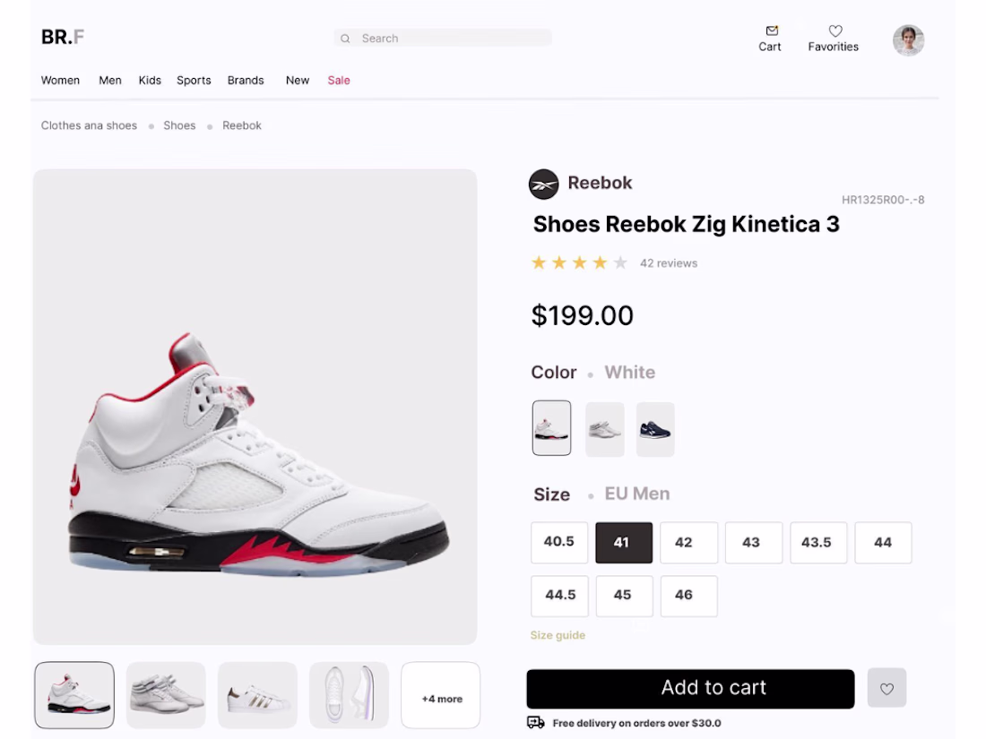
Modern E-commerce Product Experience
Online shopping should feel clear and effortless, not overwhelming. For this challenge, I designed a clean product page focused on helping users make faster, more confident buying decisions through strong visual hierarchy and intuitive interaction.
Design Focus
• Product first layout
• Clear size and color selection
• Minimal, conversion focused interface
• Clean spacing and usability driven design
Designed in Figma for the #FigmaMakeathon challenge.

Here's my entry for the Figma Makeathon.
A spatial social media platform called EchoSpace.
Instead of clicking into static rooms, you move through a living field of conversations. Walk closer to a group and their voices get louder. Step away and they fade.
Proximity shapes attention. Attention shapes experience.
Try it live: https://echospace.figma.site/
Built entirely in Figma Make for the Makeathon
Tech:
• Browser-native WebRTC
• Supabase Realtime presence + broadcast
• Spatial audio by avatar distance
• Toroidal world system
• Shared board with voting + TTL
• Voice memo threads
• Cinematic auto-tour
No external WebRTC library. No audio files.
Everything realtime in the browser.
It was to explore what happens when software makes attention physical.
EchoSpace turns conversation into a place.


I’ve been exploring a new concept for the Figma Makeathon ✨
AuraFM reimagines radio as something you can talk to, gesture with, and experience together.
🔗 Try the prototype:
https://ai-powered-social-radio.figma.site
What it includes:
🧠 Natural language commands (“Play chill jazz”)
🎤 Voice interaction
👆 Swipe, pinch, pull gestures
👥 Multiplayer listening rooms
🔐 Biometric unlock
▶ Smart autoplay transitions
Clean, minimal UI with bold typography and subtle red frequency accents.
Still exploring — would love your thoughts 🙌


Trending
maxearnings
The next frontier of payments is live on Contra. How are you maximizing revenue?
freelancerlife
Freelancer life is wins, pivots, and everything in between. What’s yours right now?
aidesignflow
AI tools are redefining how designer work. What does your workflow look like?
micrographics
Micrographics started as utility - barcodes, packaging, instruction labels. How would you use them?
aivideo
AI video tools are moving at warp speed. What tools are you using?