The network for creativity
Join 1.25M professional creatives like you
Connect with clients, get discovered, and run your business 100% commission-free
Creatives on Contra have earned over $150M and we are just getting started
Back to feedPost


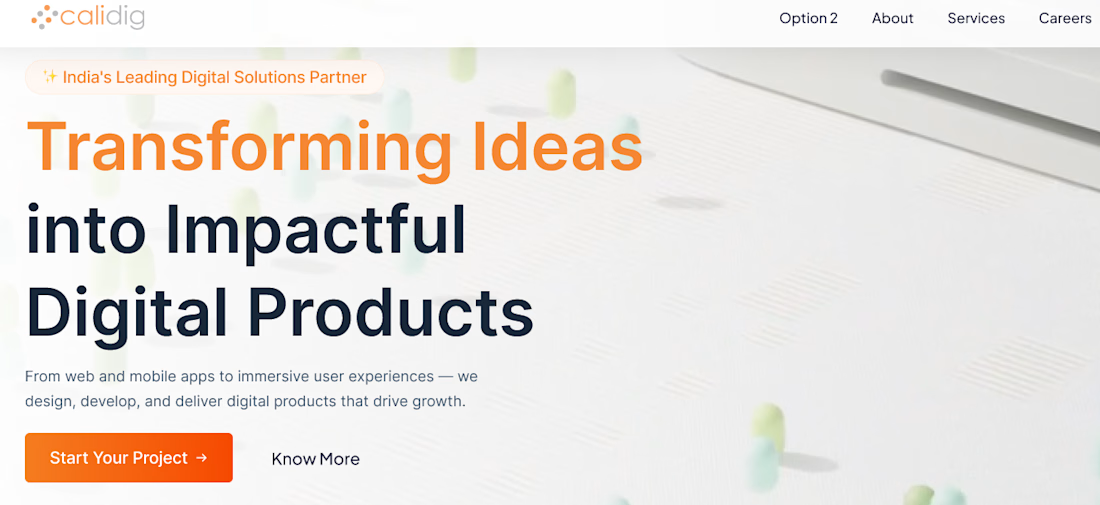
Calidig Website Design – Corporate & Digital Services Website
- Project Overview
Calidig is a digital transformation and software development company focused on helping businesses build innovative digital products and scalable technology solutions. The project involved designing a modern, conversion-focused corporate website that effectively communicates the company's expertise, services, portfolio, and client success stories while creating a strong first impression for potential clients.
Figma Prototype: https://www.figma.com/proto/6CNKPTEjUEo33sjjE3o2mL/Website_Calidig
- Design Goal
The objective was to create a professional online presence that establishes credibility, showcases the company's capabilities, and guides visitors toward meaningful actions such as exploring services, viewing portfolio projects, and initiating consultations.
- Design Process
The project began with information architecture planning, user journey mapping, and wireframing to define the optimal content structure. High-fidelity designs and interactive prototypes were then created to validate layouts, improve usability, and ensure consistency across all pages.
- Key Design Sections
Hero Section & Brand Positioning
Services Showcase
Company Value Proposition
Portfolio & Case Study Presentation
Client Testimonials & Social Proof
Company Milestones & Statistics
Contact & Consultation Flows
Responsive Navigation System
Lead Generation & Conversion Elements
Mobile & Desktop Responsive Experience
Tools & Skills
Figma, UI Design, UX Design, Wireframing, Prototyping, Information Architecture, User Flow Design, Responsive Web Design, Design Systems, Interaction Design, Visual Design, Website Design, Conversion Optimization.
Project Summary
The Calidig website showcases a modern digital agency experience focused on credibility, service discovery, and lead generation. Through thoughtful UX strategy, clean visual design, and conversion-focused user journeys, the platform effectively communicates the company's expertise while providing a seamless browsing experience across desktop, tablet, and mobile devices.


The network for creativity
Join 1.25M professional creatives like you
Connect with clients, get discovered, and run your business 100% commission-free
Creatives on Contra have earned over $150M and we are just getting started







Related posts


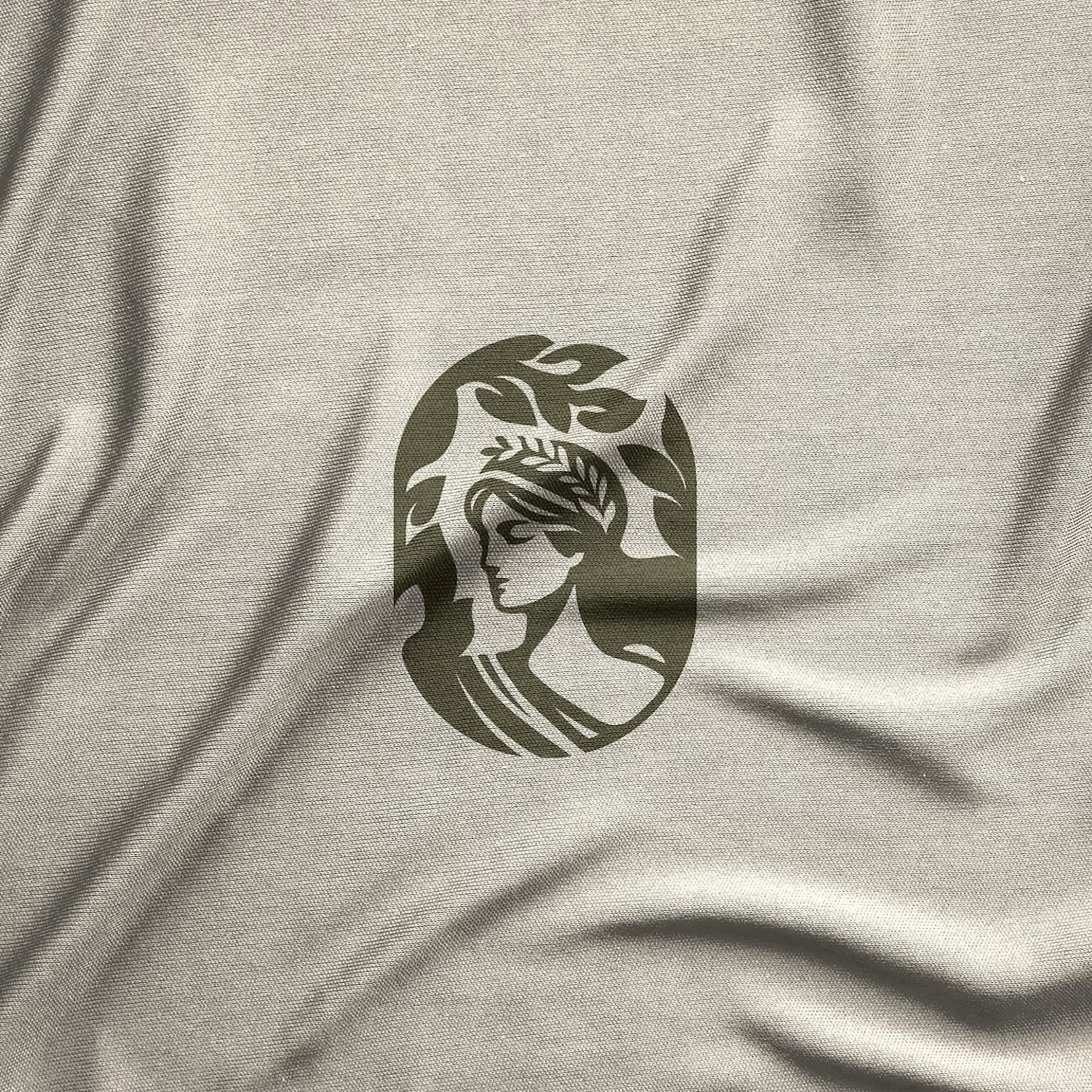
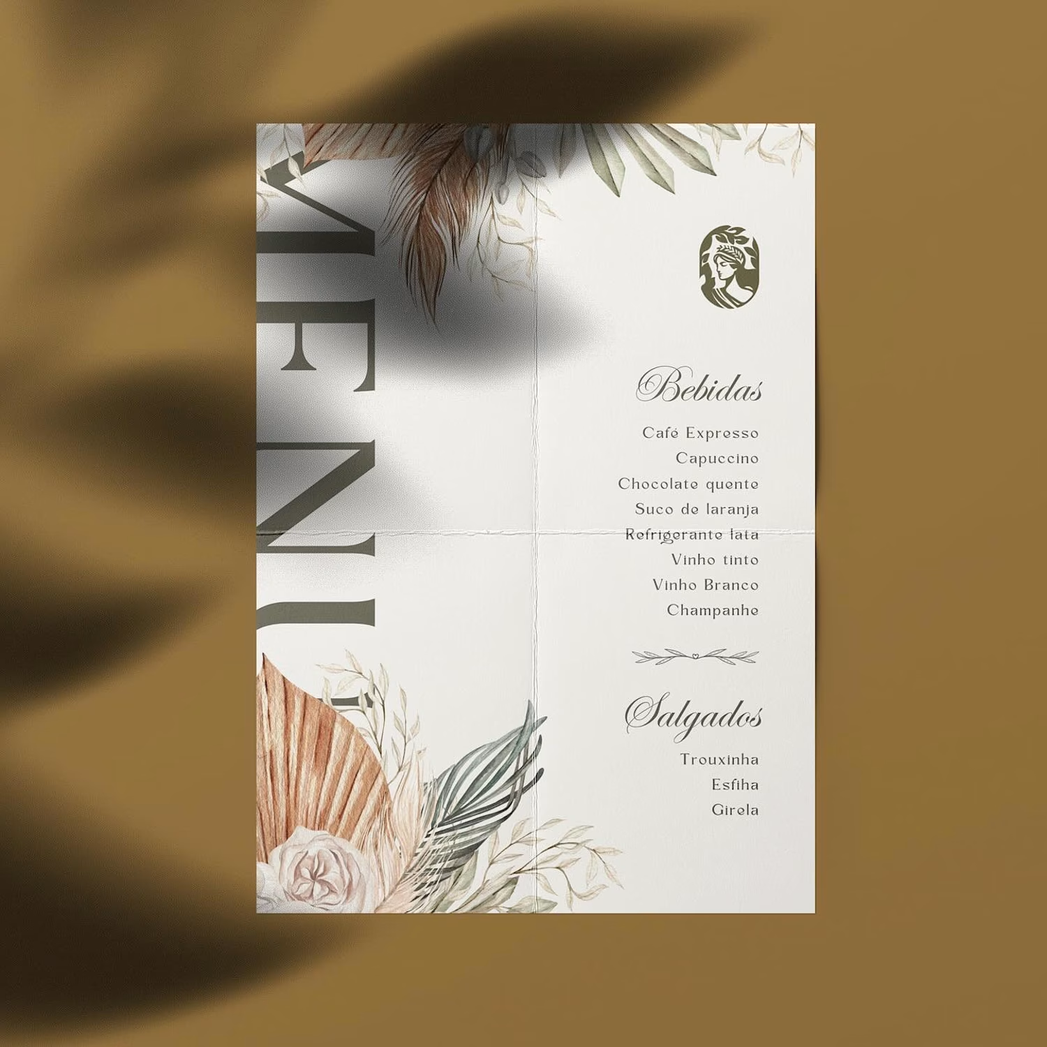
Hot take: aesthetics and clinical results should walk hand in hand.
Most brands in this space lean into cold, sterile whites or aggressive dark tones. It reads functional, but it also feels like something you'd hide in a medicine cabinet, not display on your vanity.
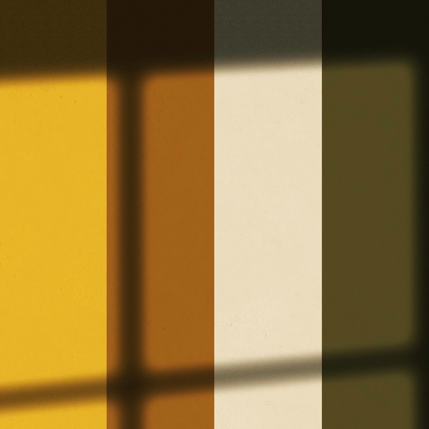
For this rebrand, we anchored the identity in classical beauty and organic sophistication. By combining warm earthy tones, botanical cues, and timeless iconography, we moved away from the "pharmacy product" feel into true high-end personal care.
It was a deliberate shift: positioning the brand not for someone who feels like they are treating a flaw, but for someone investing in a premium daily ritual.
Would a piece like this deserve a spot on your display shelf?



This is brilliant!

I designed and built this landing page for Atelier.
It was a fun exploration of shader-driven visuals, tactile textures, and motion. Using WebGL alongside GSAP opened up a lot of possibilities for creating interactions that feel more alive, immersive, and intentional, not just animated for the sake of it.
#GSAP #WebGL #Textures


Great work!!

New brand identity for Cadvel, a data analytics startup that sells real-time infrastructure to enterprise teams.
The idea was simple: data comes in raw and leaves structured. So the logo is a stack of bars in different lengths, stepped like a pipeline, and everything else grows from it. That includes one typeface (Suisse Intl), a deep green and ivory palette, a 28-icon set built on the same bar geometry, and signage, print and three social directions: 3D, ASCII pattern and gradient.
Result: a B2B data brand that looks as engineered as the product behind it.


