The network for creativity
Join 1.25M professional creatives like you
Connect with clients, get discovered, and run your business 100% commission-free
Creatives on Contra have earned over $150M and we are just getting started
Back to feedPost


The network for creativity
Join 1.25M professional creatives like you
Connect with clients, get discovered, and run your business 100% commission-free
Creatives on Contra have earned over $150M and we are just getting started

Challenges
View all


Related posts

Same landing page, two passes on the surface.
Which one feels more finished?

6 voted
23%
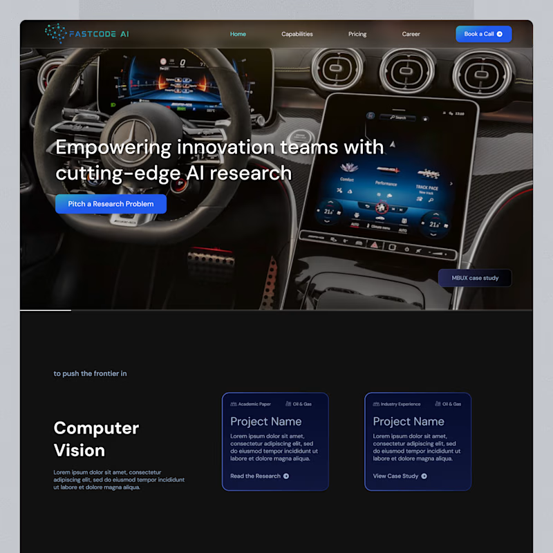
20 voted
77%
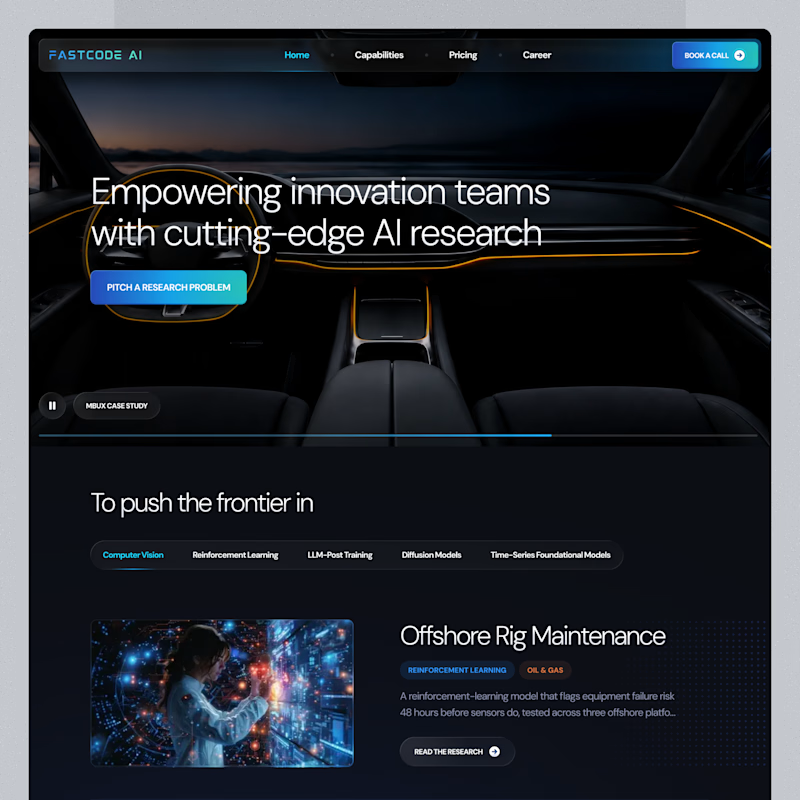
26 votes
Closed

B is has more professional image 👍❤️

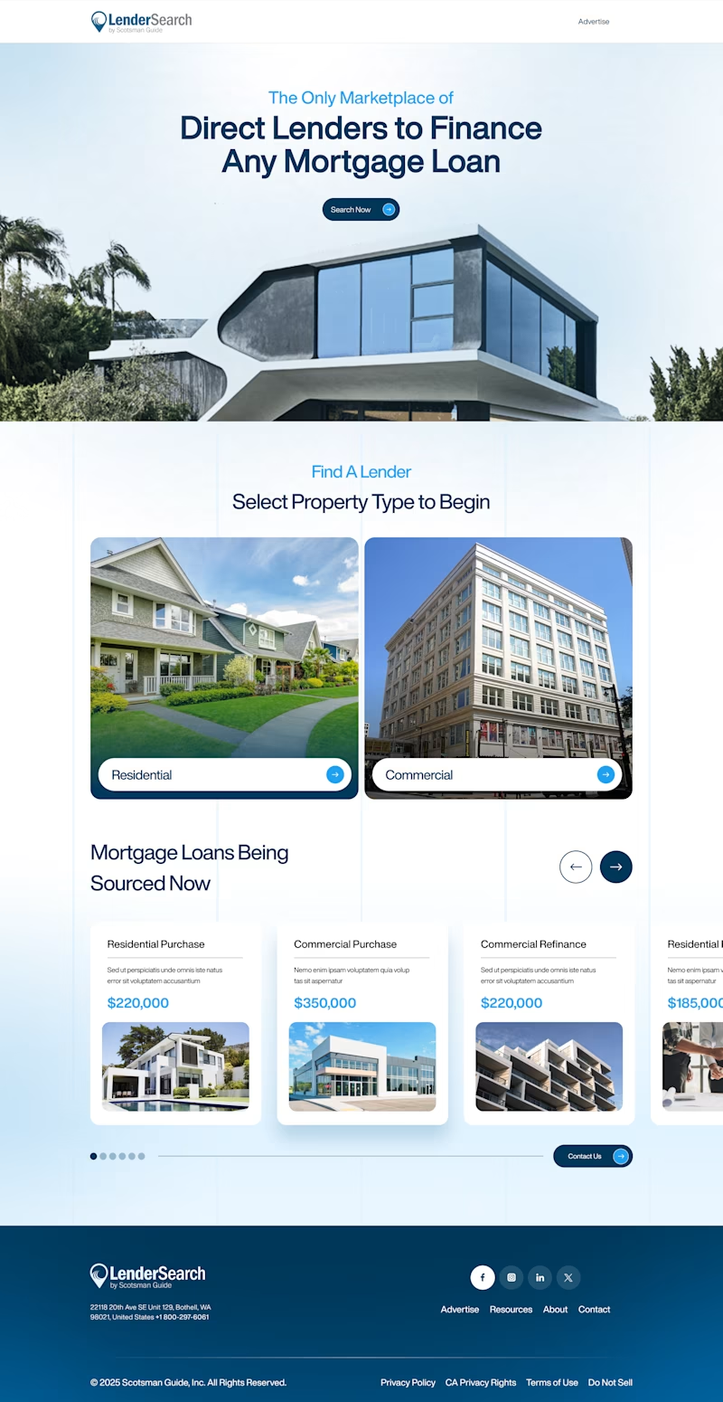
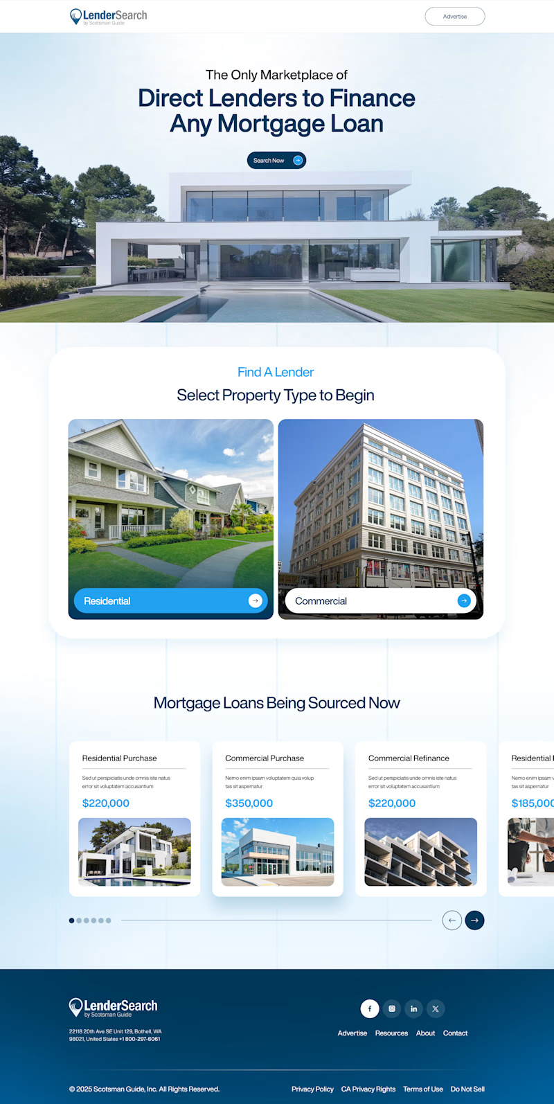
Two layout directions for LenderSearch, a mortgage marketplace by Scotsman Guide.
A: centered hero text, full-width property image, content sits in a lifted white card
B: hero image bleeds into the content section, layout feels more connected and continuous
Same product, different flow. Which one feels easier to trust with a mortgage decision? 👇
7 voted
47%
8 voted
53%
15 votes
Closed


Nice website