The network for creativity
Join 1.25M professional creatives like you
Connect with clients, get discovered, and run your business 100% commission-free
Creatives on Contra have earned over $150M and we are just getting started
Back to feedPost

What does your link say in the 2 seconds before anyone clicks?
The OG image is one of the most overlooked parts of a website I see with the businesses I work with. It's the picture, title and description that show up when someone shares your link.
It's often the first thing anyone sees of your work. They see the card before they see the page. It tells them the subject, the tone and how much care went in.
A vague or mismatched card can cost you more than the click. It can bring in the wrong reader with the wrong expectation. They bounce and the page takes the blame. A clear card helps the right people choose to click.
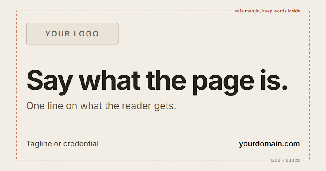
So here's a template you can use.
Logo top left. One line that says what the page is. One line on what the reader gets. A short tagline and your domain along the bottom. Make it 1200 x 630, and leave room around the edges so nothing gets cut off.
Before I publish, I check how the link renders where it'll actually be shared. LinkedIn, X, iMessage, Slack. Big and small.
Learn more: https://chrishornak.com/blog/og-image
The network for creativity
Join 1.25M professional creatives like you
Connect with clients, get discovered, and run your business 100% commission-free
Creatives on Contra have earned over $150M and we are just getting started








Related posts

Parallel, the fund site set like a quarterly journal, now has a @Framer edition.
Native sections, CMS letters and companies with their own pages, the inked essay and figures as code components, and five Framer Skills for Framer's agent. It's the fourth template on Framer, after Oda, Signal and Tender.


Amazing work


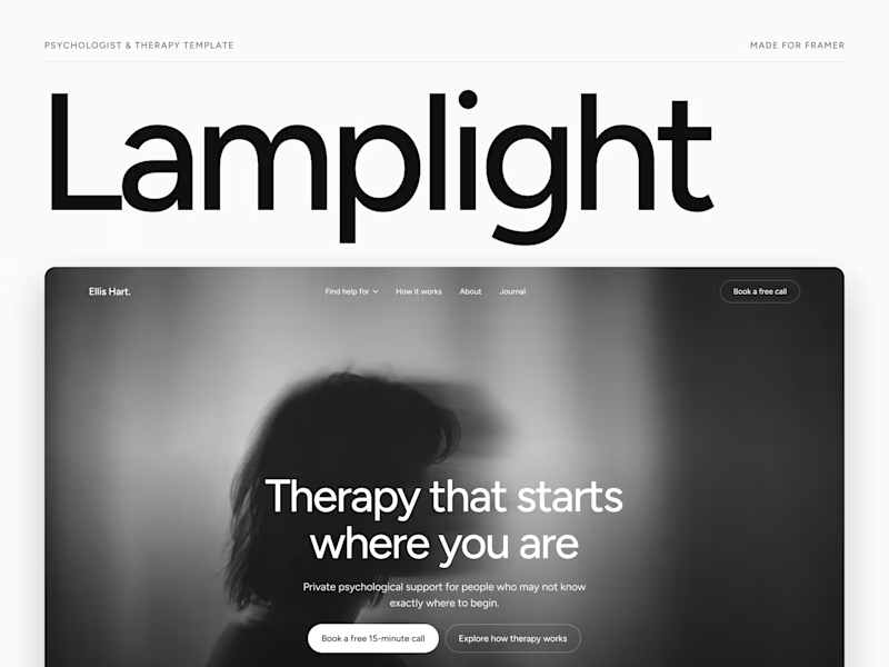
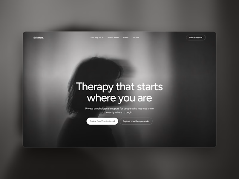
Which one grabs your attention and should be the main visual for a framer template thumbnail?
7 voted
50%
7 voted
50%
14 votes
Closed
Both works are great; it's hard to choose

Sneak peek! 👁️✨
Currently putting the final touches on my 11th Framer template. Dropping soon... Blue or Green? What do you think?
