The network for creativity
Join 1.25M professional creatives like you
Connect with clients, get discovered, and run your business 100% commission-free
Creatives on Contra have earned over $150M and we are just getting started
Back to feedPost

One of my posts was featured on Contra, and I just wanted to take a moment to say thank you.
Thank you to Contra for giving visibility to my work, and especially to everyone who took the time to share feedback, thoughts, and encouragement. It genuinely means a lot and makes me want to keep experimenting, learning, and creating.
I’m really grateful to be part of a community where people support each other’s work and creative process.
Thank you for being part of it 🤍




Wo! This in great.
Well done!
The network for creativity
Join 1.25M professional creatives like you
Connect with clients, get discovered, and run your business 100% commission-free
Creatives on Contra have earned over $150M and we are just getting started

Challenges
View all


Related posts

I just joined Contra and I’m still figuring out how things work around here, so I thought I’d introduce myself instead of quietly lurking.
I’m Mariya, founder, strategist and lead designer behind Mariya Design. I’ve worked internationally since 2015, and today I run a boutique branding studio focused on brand identity systems for premium and luxury-led brands.
Most of my work sits somewhere between identity, packaging and the wider system around them. I’m particularly interested in what happens after the logo: how typography, color, packaging, digital applications and brand rules actually hold together as the business grows.
One project I’ve been revisiting recently is SAE-REN, a premium beauty and wellness identity system. I’m currently rebuilding some of my case-study presentation system, so it felt like a good one to share here first.
And since I’m genuinely new to Contra, I’d love to hear from people who have been active here for a while:
What actually helped you become part of the community here?
Was it sharing work regularly, joining conversations, applying to opportunities, or something else entirely?
Any early mistakes worth avoiding are welcome too.


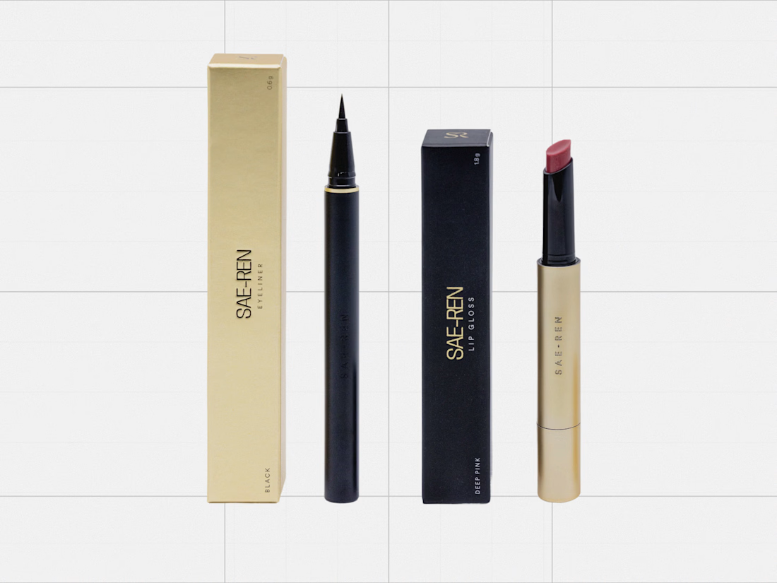
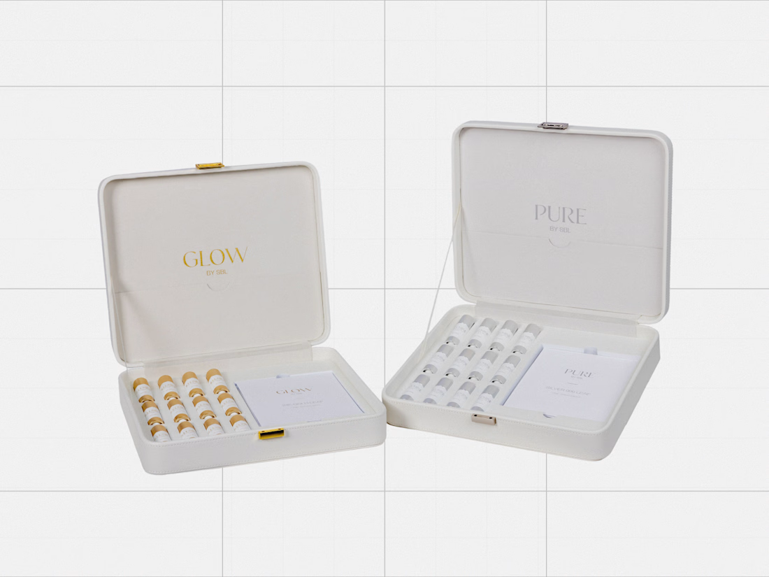
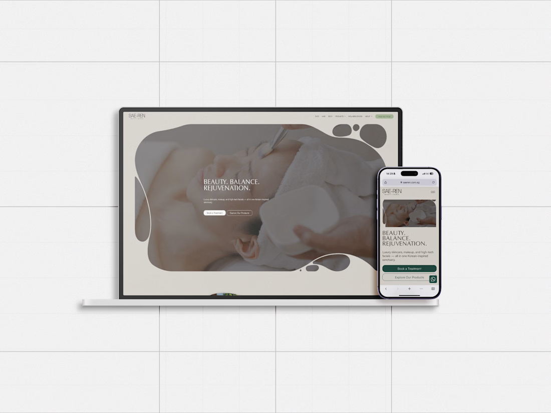

great designs..


Engaging website for a New York–based architecture and construction studio, balancing bold typography, immersive imagery and a minimal editorial layout.


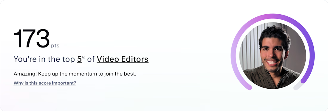
Just 2 weeks on Contra and top 5% 🤯 🇧🇷 WHAT??
In the last 14 days I've landed my first 2 clients with glowing reviews, got accepted into the exclusive Contra Labs for top-tier talent, and I'm currently negotiating high-ticket monthly retainers. ☕️
If you’re just getting started: your profile is your sales funnel. The Contra score follows clarity, proof of work, and real strategy.
Feel free to follow my profile, mirror the structure of my case studies, and use it as a framework to elevate your own positioning. Keep grinding! 👊

That’s fast! Did you use Contra Pro from day one or start with the free plan?


