The network for creativity
Join 1.25M professional creatives like you
Connect with clients, get discovered, and run your business 100% commission-free
Creatives on Contra have earned over $150M and we are just getting started
Back to feedPost

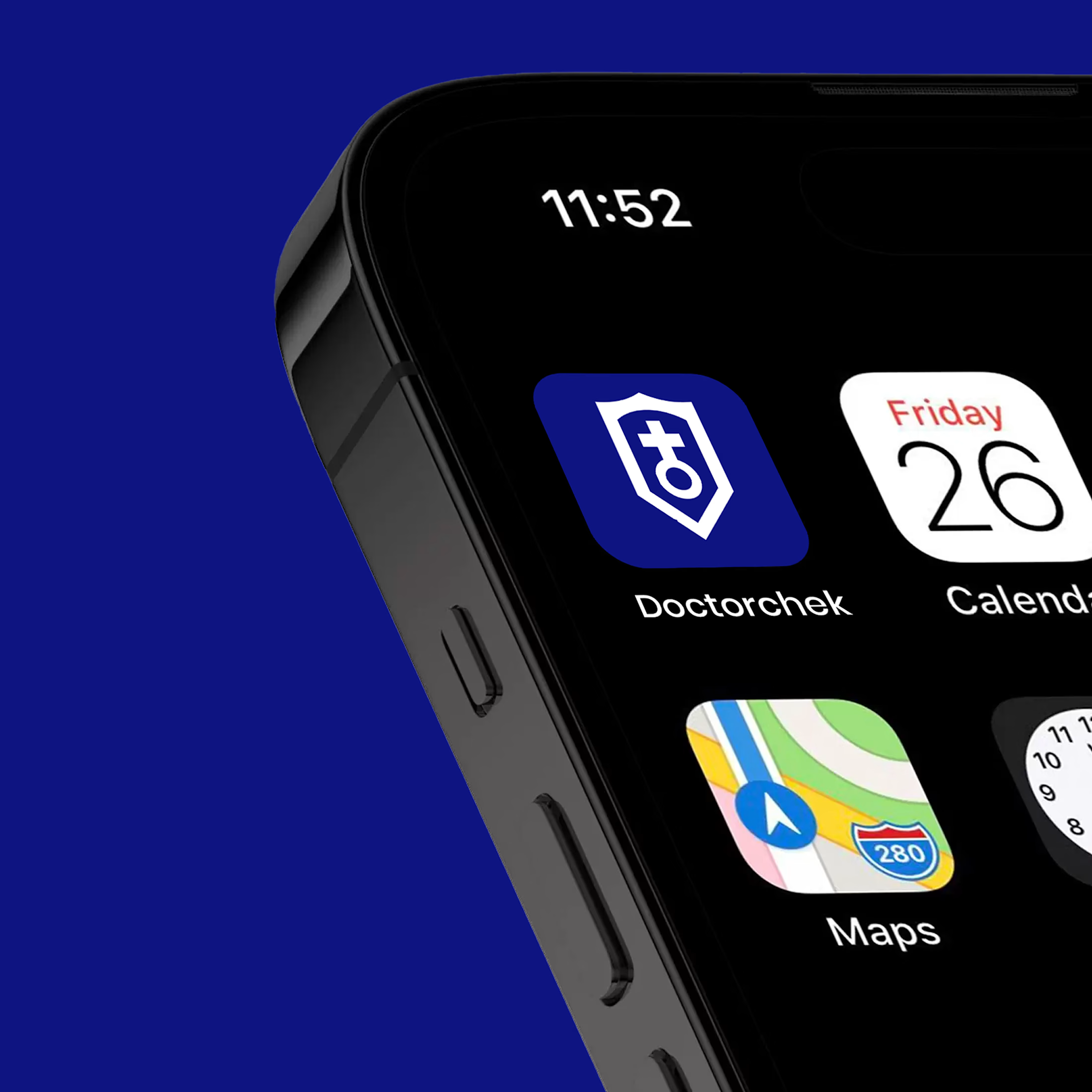
Aligning Doctorchek’s image with trust, accessibility, and modern telemedicine
Designed the brand identity and digital presence of Doctorchek, a growing telemedicine platform whose visual identity no longer reflected the quality, credibility, and scale of its healthcare services.
Doctorchek had evolved into a reliable platform connecting people with qualified healthcare professionals from the comfort of their homes.
Through a strategic design, I elevated the visual identity and online experience to clearly communicate trust, confidentiality, accessibility, and quality care, positioning the brand as a dependable and user-friendly healthcare partner.


The network for creativity
Join 1.25M professional creatives like you
Connect with clients, get discovered, and run your business 100% commission-free
Creatives on Contra have earned over $150M and we are just getting started






Related posts


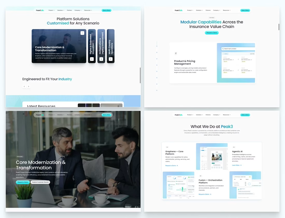
Our Peak3 website build covered 17 page templates and six CMS collections. At that scale, the questions about publishing deserve as much attention as the finished pages.
A blog post, a whitepaper and a careers entry need different information. Making them editable is only part of the design problem. The person adding the next entry also needs to understand what is missing and what happens when they publish it.
Here’s a hypothetical review I’d run before a CMS handoff: create a whitepaper entry, add the title and cover, then leave out the download file.
Does the editor flag the missing file? Can someone preview what the visitor will see? If the entry can still be published, does it create a download button that leads nowhere?
I’d use that test to decide which fields must be required and which incomplete states need an explanation.

Beautifully executed work

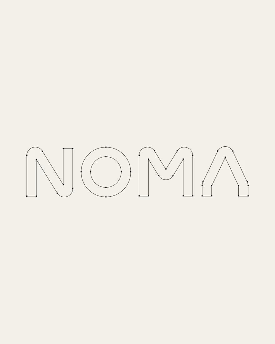
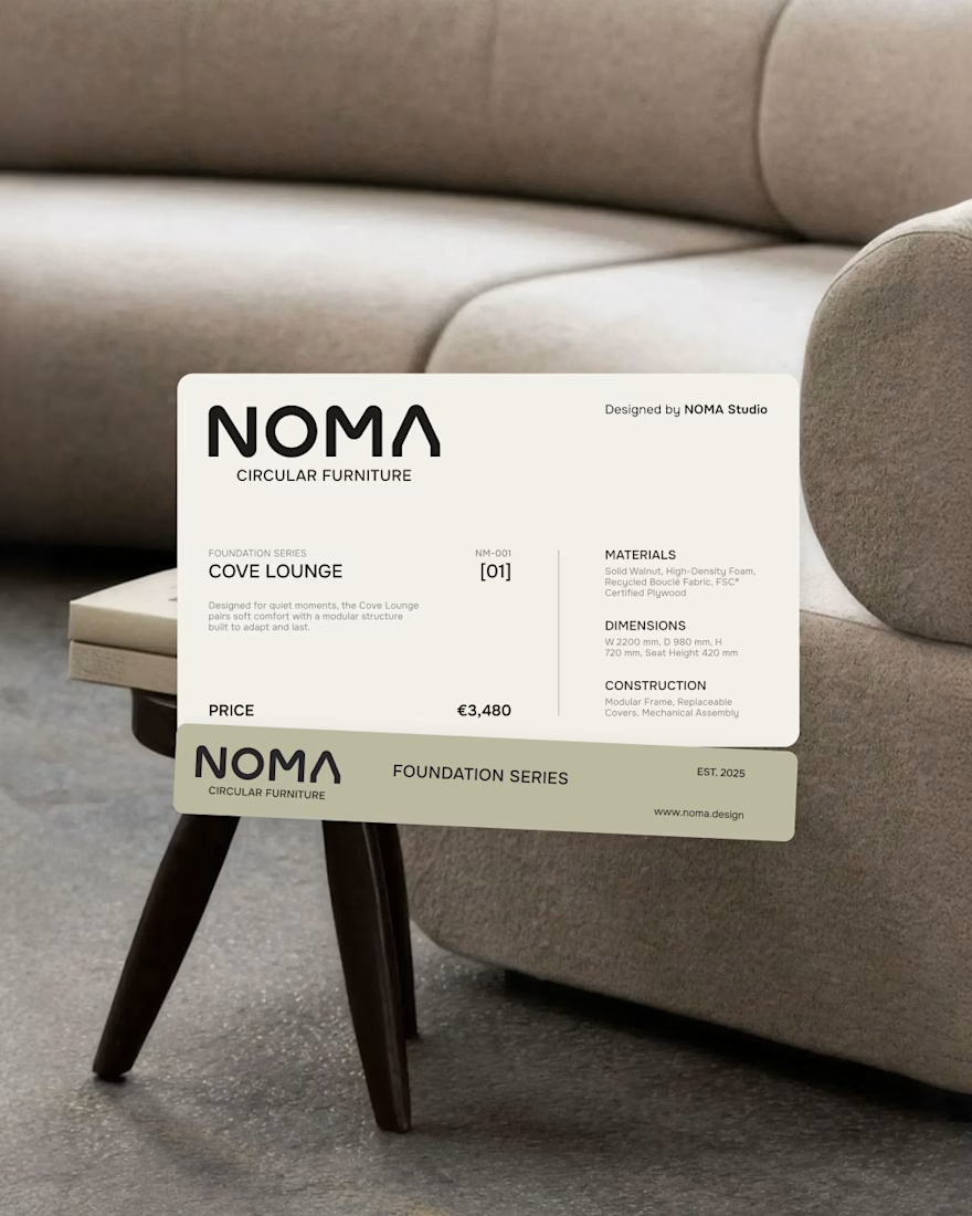
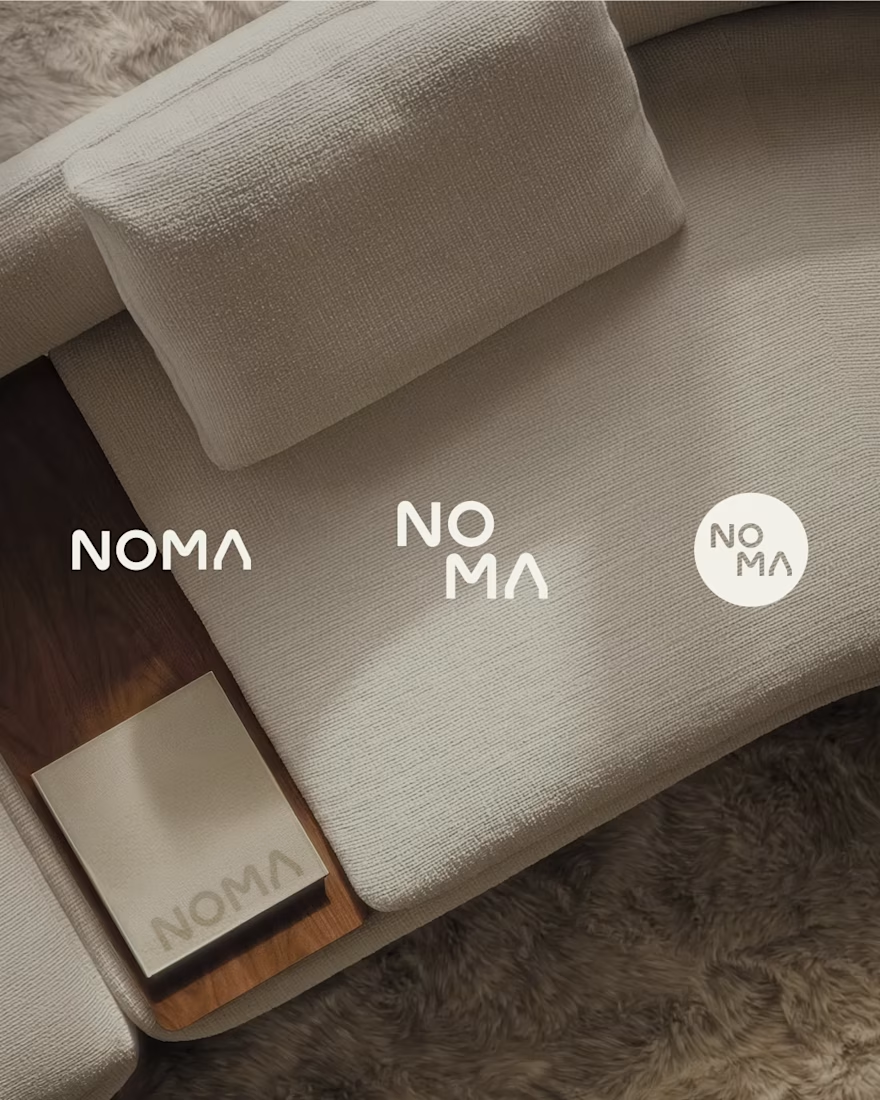
NOMA | Furniture Brand Identity
NOMA is a circular furniture brand creating adaptable objects for spaces that continuously change.


Pipely is an AI-powered sales platform designed to turn conversations into actionable outcomes. The experience brings together video calls, AI-generated insights, CRM updates, sales analytics, and follow-up drafts in one workspace.
View project on Dribble:
https://dribbble.com/shots/27795621-Dashboard-Sales-Call-Intelligence