The network for creativity
Join 1.25M professional creatives like you
Connect with clients, get discovered, and run your business 100% commission-free
Creatives on Contra have earned over $150M and we are just getting started
Back to feedPost

Thumbnail for Youtube video



The network for creativity
Join 1.25M professional creatives like you
Connect with clients, get discovered, and run your business 100% commission-free
Creatives on Contra have earned over $150M and we are just getting started





Related posts

Saas Management Landing Page Design


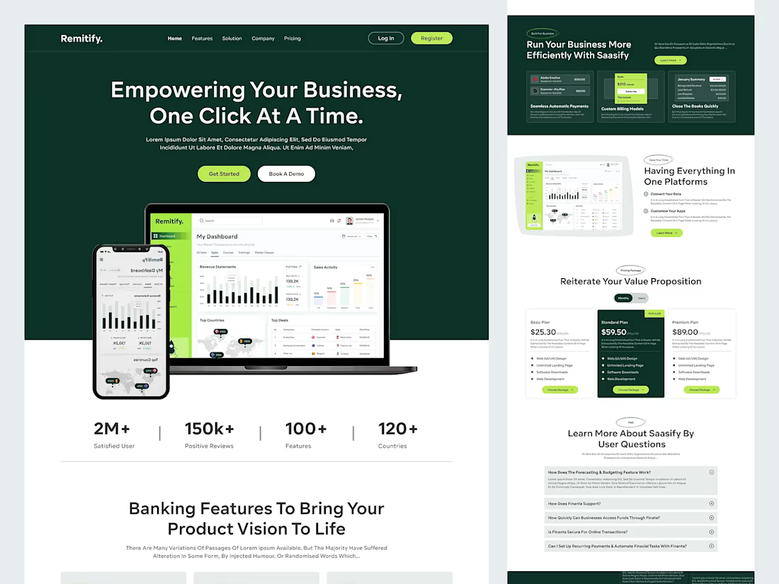
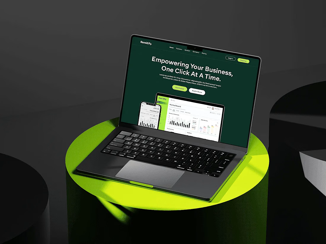

The deep green with lime accents reads "finance you can trust" without feeling like a bank, and the stats row right under the hero adds instant credibility. When pages like this get built, the dashboard in the hero is the part I'd make live: a lightweight animated version with...

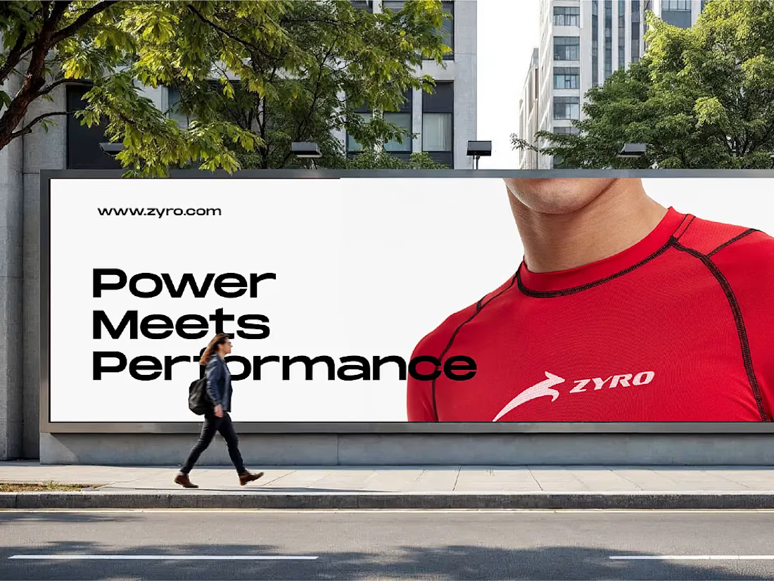
Zyro - Activewear and Fitness Brand



Flowlane 2.0, a launch video for a concept ops automation tool. Ops that run themselves.
The dashboard UI comes apart into layers to show each feature: live metrics, self-building reports and AI that drafts for you. It was built in Remotion and finished in After Effects.


Building the scenes in Remotion and hand-keying the light sweeps in After Effects is an interesting split. When a client asks for a late copy or colour change, which side ends up costing you more time?