The network for creativity
Join 1.25M professional creatives like you
Connect with clients, get discovered, and run your business 100% commission-free
Creatives on Contra have earned over $150M and we are just getting started
Back to feedPost

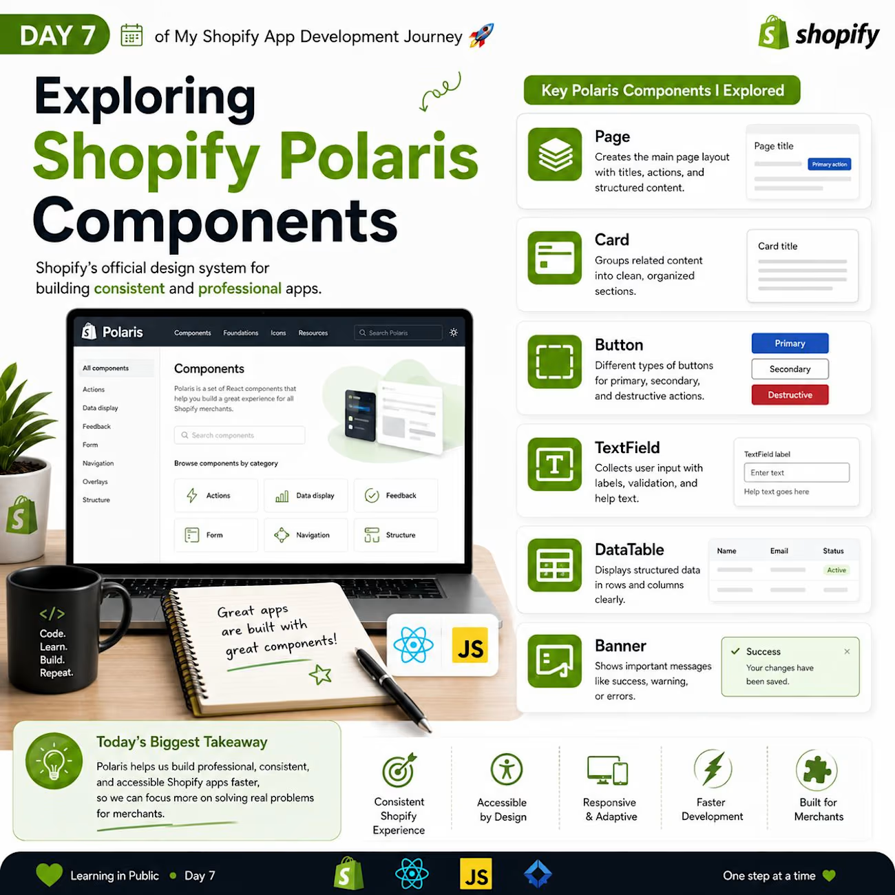
🚀 Day 7 of My Shopify App Development Journey | Exploring Shopify Polaris Components
Today, I explored one of the most important parts of Shopify App Development Polaris, Shopify's official design system for building consistent, accessible, and professional user interfaces.
I initially thought Polaris was just another UI library, but I quickly realized it's a complete design system for building consistent Shopify apps.
📚 What I Explored Today
🖥️ What is Polaris?
Polaris is Shopify's official UI framework that provides ready-to-use components for building embedded Shopify apps.
Its main goals are:
✅ Consistent user experience
✅ Accessibility
✅ Responsive design
✅ Faster development
🎨 Components I Learned
📄 Page
Creates a structured page with titles, actions, and layouts.
Perfect for building dashboards and settings pages.
📦 Card / Section
Displays related content inside a clean, organized container.
Used for dashboards, analytics, forms, and settings.
🔘 Button
Different button variants for different actions.
• Primary Button
• Secondary Button
• Plain Button
• Destructive Button
📝 TextField
Used to collect user input.
Supports:
• Labels
• Validation
• Help text
• Placeholder
📋 Form Layout
Helps organize multiple input fields with proper spacing and alignment.
☑️ Checkbox
Allows merchants to enable or disable specific settings.
📑 Tabs
Organizes related content into multiple sections without navigating to another page.
📊 Data Table
Displays structured data in rows and columns.
Useful for products, orders, customers, and reports.
💬 Banner
Shows important information, success messages, warnings, or errors.
🔔 Toast
Displays short notifications after actions like saving data or updating settings.
💡 What I Learned Today
✅ Polaris follows Shopify's design language.
✅ It provides reusable components that speed up development.
✅ Using Polaris creates a consistent experience for merchants.
✅ Accessibility and responsive design are built into the components.
✅ Building apps with Polaris lets developers focus more on functionality than UI design. :contentReference[oaicite:1]{index=1}
🎯 Today's Biggest Takeaway
Today's biggest lesson was that great apps are not only about functionality—they also need a clean, consistent, and user-friendly interface.
Polaris helps developers achieve that by providing production-ready UI components that integrate naturally with the Shopify Admin.
Tomorrow, I'm planning to build my first page using Polaris components and explore how they work together in a real Shopify app. 🚀
💬 Question for Shopify Developers:
Which Polaris component do you use the most in your Shopify apps, and why?
I'd love to hear your experience! 👇

The network for creativity
Join 1.25M professional creatives like you
Connect with clients, get discovered, and run your business 100% commission-free
Creatives on Contra have earned over $150M and we are just getting started
Related posts

Shopify eCommerce Website: Blog Page
Project Link: https://true-fresh.com/blogs/news
What do you think?


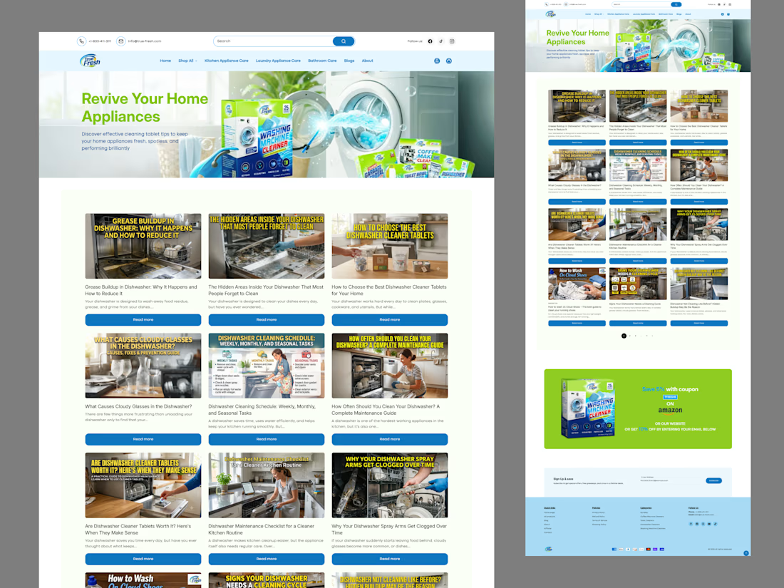

Clean Shopify blog layout. Liquid plus a bit of JS is usually the sweet spot for content pages that still need to feel part of the store.

Built a visually striking, high-converting Shopify product page designed to transform visitors into customers. By combining premium UI design, persuasive conversion psychology, and seamless user experience, I created a page that captures attention within seconds and keeps users engaged until checkout. Every detail—from the visual hierarchy and storytelling sections to trust signals, responsive layouts, and optimized call-to-actions—was intentionally crafted to deliver a luxurious brand experience while maximizing conversions. The final result is a fast, modern, and conversion-driven product page that perfectly balances aesthetics with performance.
:Crafted a premium, conversion-focused Shopify product page that blends high-end visual design with strategic user experience. Every section was thoughtfully designed to guide visitors through the buying journey—from capturing attention with compelling visuals to reinforcing trust with social proof, product highlights, and clear calls to action. The layout prioritizes speed, responsiveness, and mobile-first performance while maintaining a refined, on-brand aesthetic. The result is a polished shopping experience that not only elevates the brand's identity but also maximizes customer engagement and conversion potential.










Trending

Claude
Claude has entered the design space. How are you using Claude Design?

Contra University
Learn from expert creatives how to earn more using next-gen AI tools.
creativeaiflow
Creative AI workflows are evolving. What tools do you use, and what are their strengths and weaknesses?
freelancerlife
Freelancer life is wins, pivots, and everything in between. What’s yours right now?