The network for creativity
Join 1.25M professional creatives like you
Connect with clients, get discovered, and run your business 100% commission-free
Creatives on Contra have earned over $150M and we are just getting started
Back to feedPost


Hey Contra,
Remember the good old days when NFTs were all the rage? We definitely do - it was the perfect time to experiment with funky, bold UI designs for landing pages.
Here’s a snapshot of one of the landing pages we created a couple of years ago. What do you think? Do you have any NFT nostalgia to share?

The network for creativity
Join 1.25M professional creatives like you
Connect with clients, get discovered, and run your business 100% commission-free
Creatives on Contra have earned over $150M and we are just getting started











Related posts

🚀 Modern Landing Page Design & Development
Looking for a clean, modern landing page for your next project?
I've created a modern landing page using HTML and Tailwind CSS, with responsive layouts and clean, easy-to-customize code.
💻 Preview the live website:
https://5e592461-custom-ui-design-project.netlify.app/
🛒 Get the source code here:
https://contra.com/payment-link/lUv8g6E9-modern-landing-page-design-and-development
Perfect for developers, designers, and anyone looking for a starting point for their next website.
#WebDevelopment #HTML #TailwindCSS #LandingPage #WebDesign #FrontendDevelopment #Contra


The Smart And Simple Health Solutions hero is a great demo of the template, the big statement type over the runner photo reads instantly. Shipping a live preview plus the source code makes this a genuinely useful starting point for anyone building.


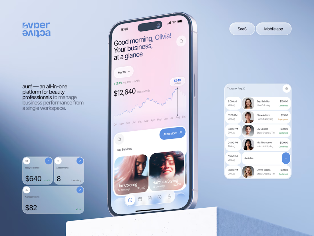
Finally wrapped up this project, and I’m excited to share the case study! 💅 A fresh product design concept for a beauty dashboard. Would love to hear your thoughts! ✨

A beauty dashboard is such a fun product design challenge, Oleksandra. The Good morning, Olivia! greeting in the header makes business metrics feel personal instead of clinical, which is exactly what a beauty professional would want.

A modern crypto dashboard concept focused on clarity, usability, and data visualization.
NoxFi is a web-based trading and portfolio interface designed to help users monitor crypto markets, manage digital assets, and track financial activity from one dashboard.
My Design Focus:
I worked on building a clean, structured interface where complex market information feels easier to understand.
The design uses dark surfaces, lime-green highlights, organized data cards, and clear typography to create a consistent experience across trading and portfolio sections.
Key Design Elements:
Crypto price charts and market statistics
Wallet balance and asset holdings
Portfolio performance indicators
Staking rewards and market sentiment
Transaction history and quick wallet actions
Responsive-friendly layout structure
Dark surfaces with lime-green highlights is a strong choice for a trading dashboard. The organized data cards and quick wallet actions show you are designing for clarity under pressure, which is exactly what crypto users need.