The network for creativity
Join 1.25M professional creatives like you
Connect with clients, get discovered, and run your business 100% commission-free
Creatives on Contra have earned over $150M and we are just getting started
Back to feedPost


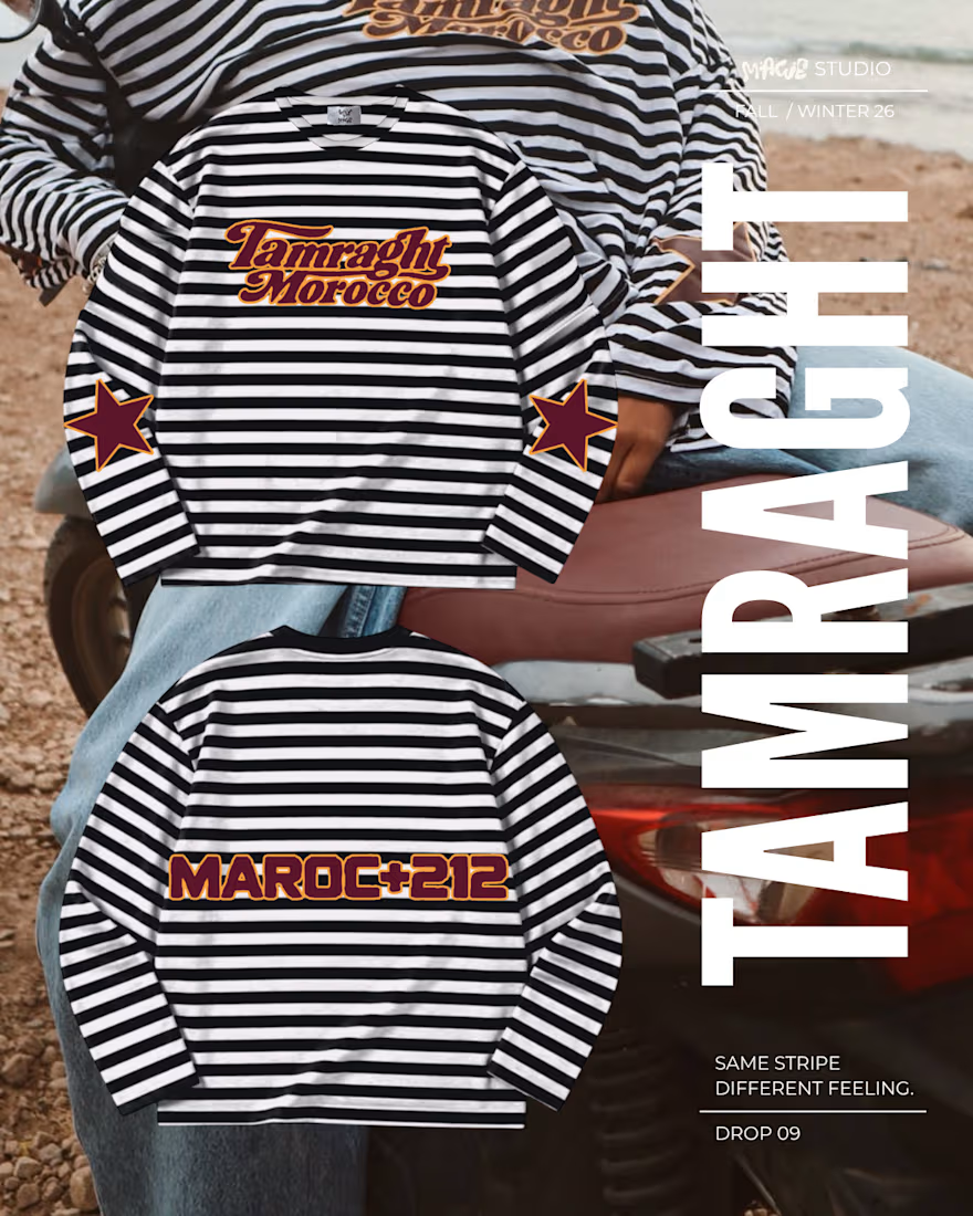
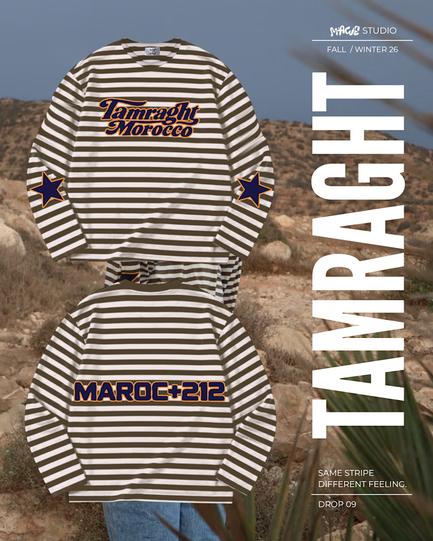

The tall condensed TAMRAGHT running down the edge frames the striped shirts without covering them, bold and clean. Is the vertical type the system for the whole MAWE drop?
The network for creativity
Join 1.25M professional creatives like you
Connect with clients, get discovered, and run your business 100% commission-free
Creatives on Contra have earned over $150M and we are just getting started



Related posts

Updated the Dreamy effect for Framer, now it’s faster, smoother and more flexible
Grab it here
Really like what I get. If you are web designer, or brand designer would love to hear your feedback


Nice update, Denis. Making it faster and smoother is what matters most when an effect like this ends up on real client sites.

🔥

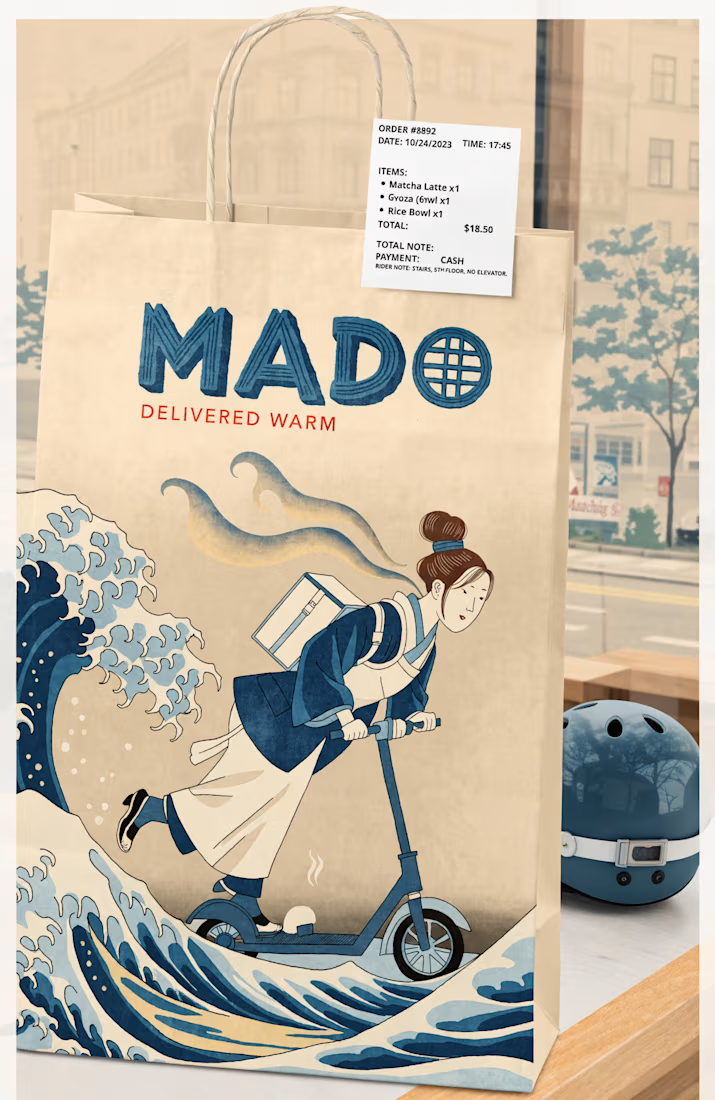
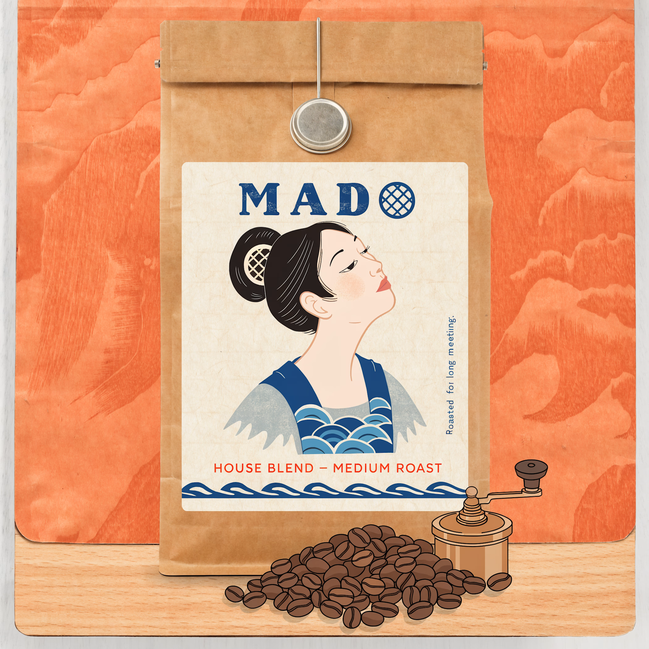
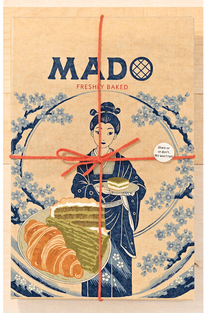
7:30 a.m. First coffee. Same ritual, every single day.
Some people have a sweet tooth. I have a coffee tooth. And while the kettle boils, I usually catch myself daydreaming about the same place: Japan, a trip I’ve wanted to take for years.
For this challenge, I brought the two...

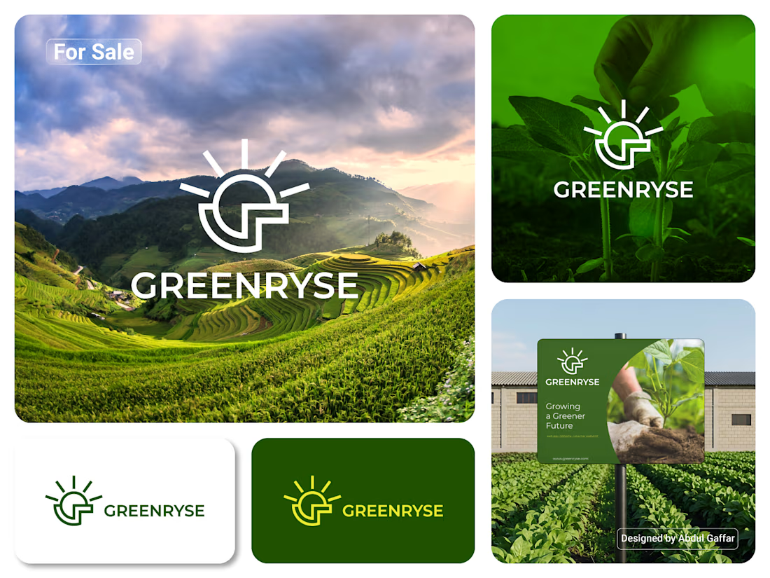
GREENRYSE – G Lettermark, Sun Logo Design, Sustainable Agriculture.
Introducing GREENRYSE, a modern logo concept inspired by nature, agriculture, and the power of growth. The symbol combines a geometric letter G with a rising sun, representing new beginnings, natural energy, and a brighter future for agriculture.
The presentation explores how the logo works across different backgrounds and applications, including agricultural landscapes, product imagery, and outdoor signage. Its clean geometric structure and fresh green color direction create a natural yet professional look.
Designed for agricultural companies, organic farming businesses, crop production, sustainable agriculture, and modern agritech ventures.



Stunning!