The network for creativity
Join 1.25M professional creatives like you
Connect with clients, get discovered, and run your business 100% commission-free
Creatives on Contra have earned over $150M and we are just getting started
Back to feedPost


The network for creativity
Join 1.25M professional creatives like you
Connect with clients, get discovered, and run your business 100% commission-free
Creatives on Contra have earned over $150M and we are just getting started







Related posts

𝗧𝗵𝗲 𝟱 𝗙𝗮𝘁𝗮𝗹 𝗦𝗘𝗢 𝗠𝗶𝘀𝘁𝗮𝗸𝗲𝘀 𝗕𝗲𝗴𝗶𝗻𝗻𝗲𝗿𝘀 𝗠𝗮𝗸𝗲 𝗶𝗻 𝗪𝗼𝗿𝗱𝗣𝗿𝗲𝘀𝘀 (𝗔𝗻𝗱 𝗛𝗼𝘄 𝘁𝗼 𝗙𝗶𝘅 𝗧𝗵𝗲𝗺)
Having a great WordPress site means nothing if nobody finds it on Google. 𝗧𝗵𝗲 𝟱 𝗺𝗼𝘀𝘁 𝗰𝗼𝗺𝗺𝗼𝗻 𝗦𝗘𝗢 𝗯𝗹𝘂𝗻𝗱𝗲𝗿𝘀:
Leaving default permalinks as plain IDs.
Ignoring Image Alt Tags and compression.
Missing XML Sitemaps in Google Search Console.
Having multiple H1 tags per page.
Not setting canonical URLs.
𝗕𝗼𝗼𝗸𝗺𝗮𝗿𝗸 𝘁𝗵𝗶𝘀 𝗰𝗵𝗲𝗰𝗸𝗹𝗶𝘀𝘁 𝘁𝗼 𝗮𝘂𝗱𝗶𝘁 𝘆𝗼𝘂𝗿 𝘀𝗶𝘁𝗲 𝗯𝗲𝗳𝗼𝗿𝗲 𝗹𝗮𝘂𝗻𝗰𝗵𝗶𝗻𝗴!


Good list. I'd add a 6th: the "Discourage search engines from indexing this site" box under Settings → Reading. It often stays ticked after a staging launch and adds noindex to every page. Small note on #4: multiple H1s aren't a problem on their own for Google; a clear heading structure matters more.

AI & Automation Academy Website Design
Designed a modern Kajabi, responsive website for an AI & Automation Academy focused on helping engineers, founders, and professionals develop practical AI skills. The goal was to create a structured learning experience that makes it easy for visitors to explore courses, understand learning pathways, and find the right training programs.
The website features a bold hero section, clear calls to action, featured course cards, structured learning tracks, and dedicated sections highlighting hands on projects, certifications, quizzes, and learning resources. A dark interface, vibrant purple and cyan accents, and AI-inspired visuals establish a technology-focused identity while maintaining readability and visual consistency.
The layout prioritizes intuitive navigation, clear content hierarchy, and responsive design to help users move from discovering the academy to exploring courses and considering enrollment.
Key features:
AI and automation education website design
Course catalog and featured course sections
Beginner, Builder, and Advanced learning pathways
Student dashboard and certification feature presentation
Resource library, quizzes, and project-based learning sections
Strategic CTAs for course exploration and enrollment
Responsive layout and modern UI/UX design
Dark theme with purple and cyan visual accents


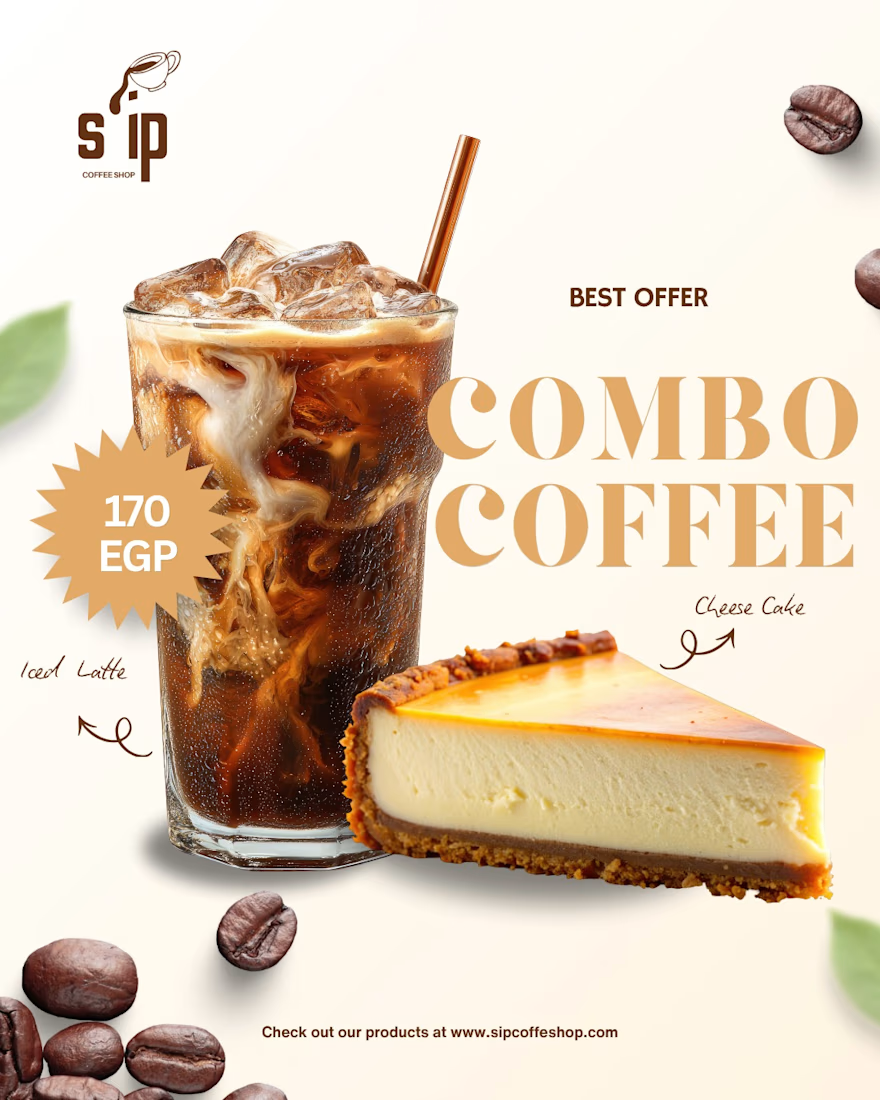
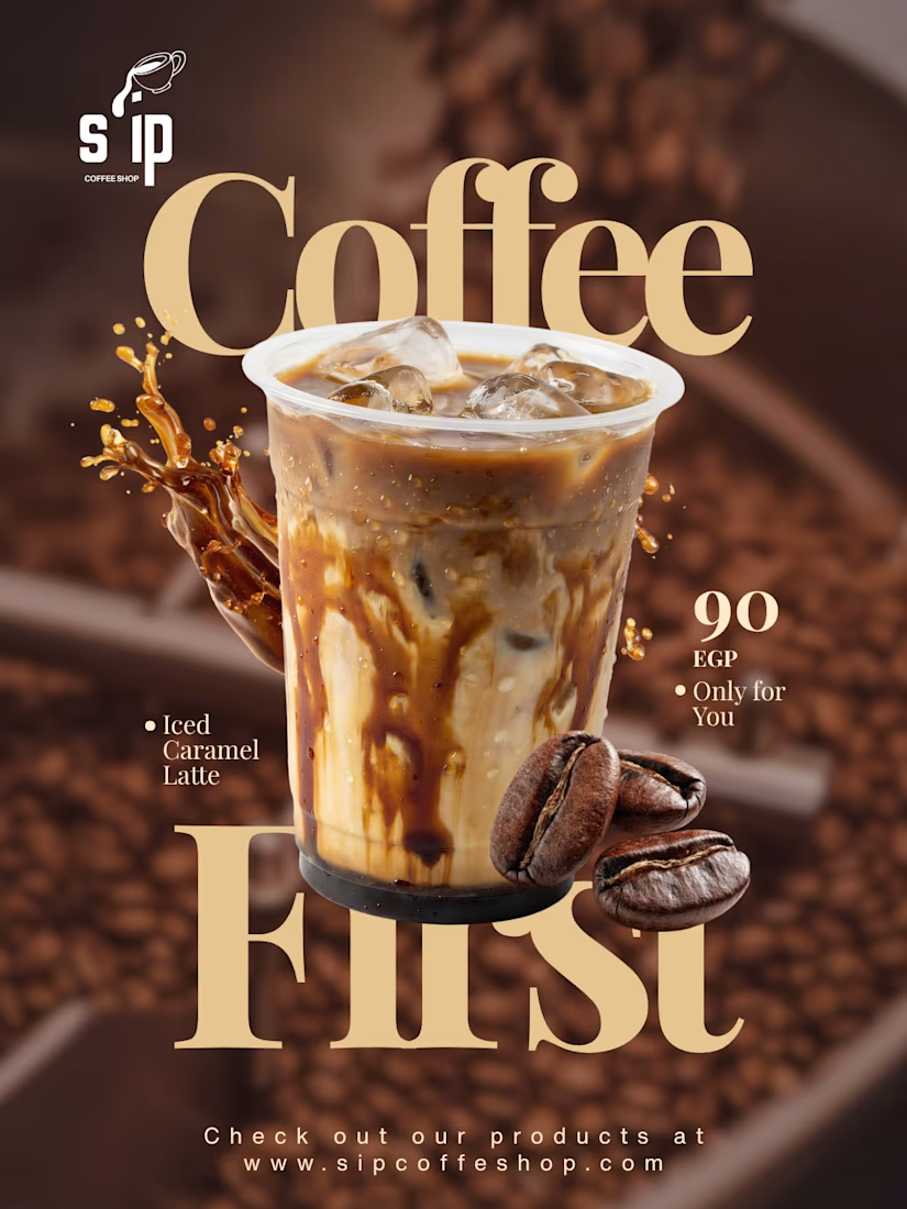
Product visuals created for S'IP Coffee Shop
Delicious designs engineered to turn scrollers into customers