The network for creativity
Join 1.25M professional creatives like you
Connect with clients, get discovered, and run your business 100% commission-free
Creatives on Contra have earned over $150M and we are just getting started
Back to feedPost
Taste Test
Which typography alignment holds the strongest emotional impact for this inspiring landscape layout? Does the crisp white color scheme draw your eye straight to the focal point? Drop your vote below!
1 voted
33%
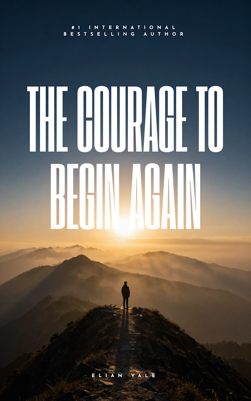
2 voted
67%
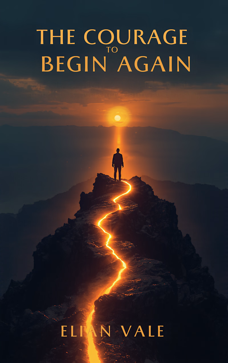
3 votes
Closed


Thank you 🙌
The network for creativity
Join 1.25M professional creatives like you
Connect with clients, get discovered, and run your business 100% commission-free
Creatives on Contra have earned over $150M and we are just getting started

Challenges
View all


Related posts

✨ Two styles. One campaign. Which Daymade design hits differently?
I explored two creative directions for Daymade, combining lifestyle storytelling with bold typography and fresh, energetic colors. ☀️🥤
💛 Option 1: Fresh & Minimal 💗 Option 2: Bold & Playful
Which one grabs your attention? 👀
Cast your vote! 🗳️👇
25 voted
26%
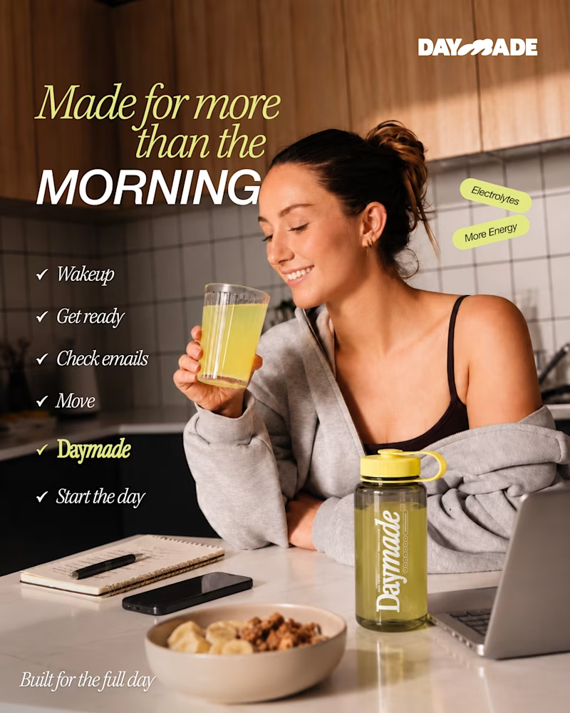
73 voted
74%
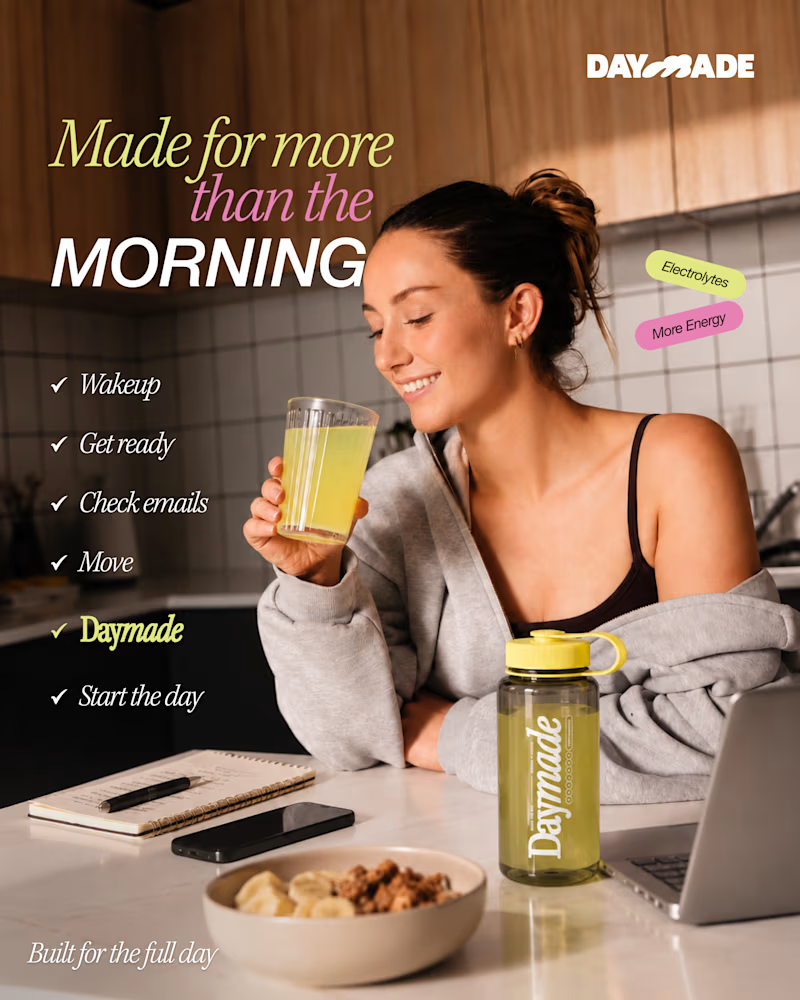
98 votes
Closed

Option 2 looks better

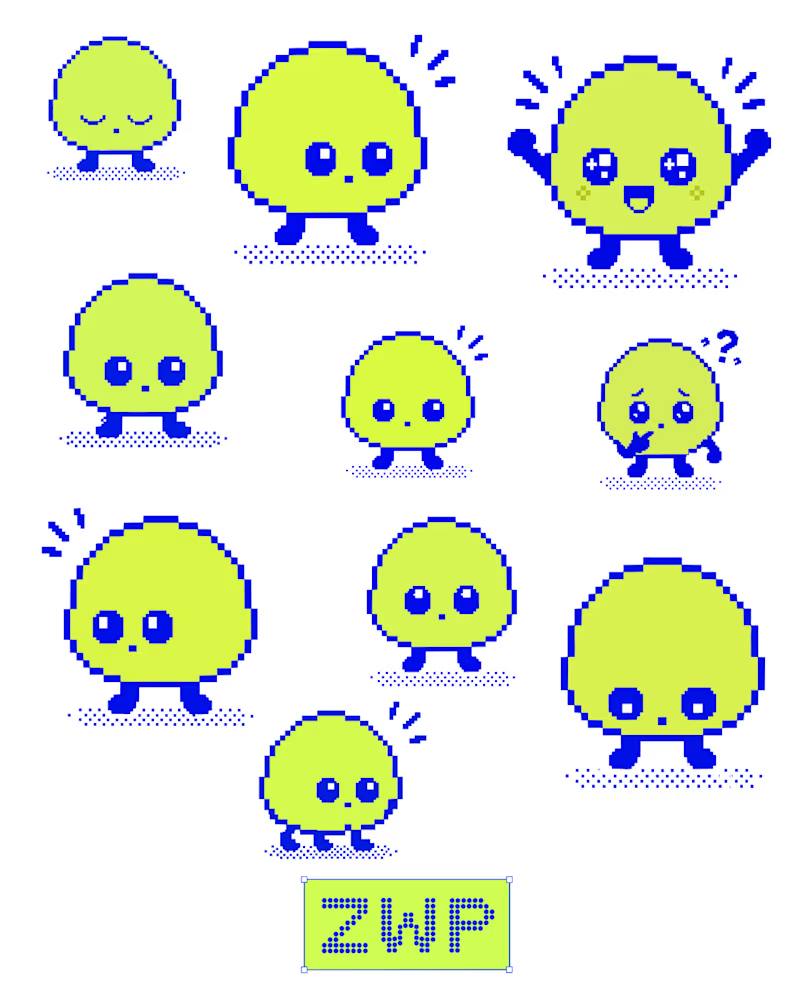
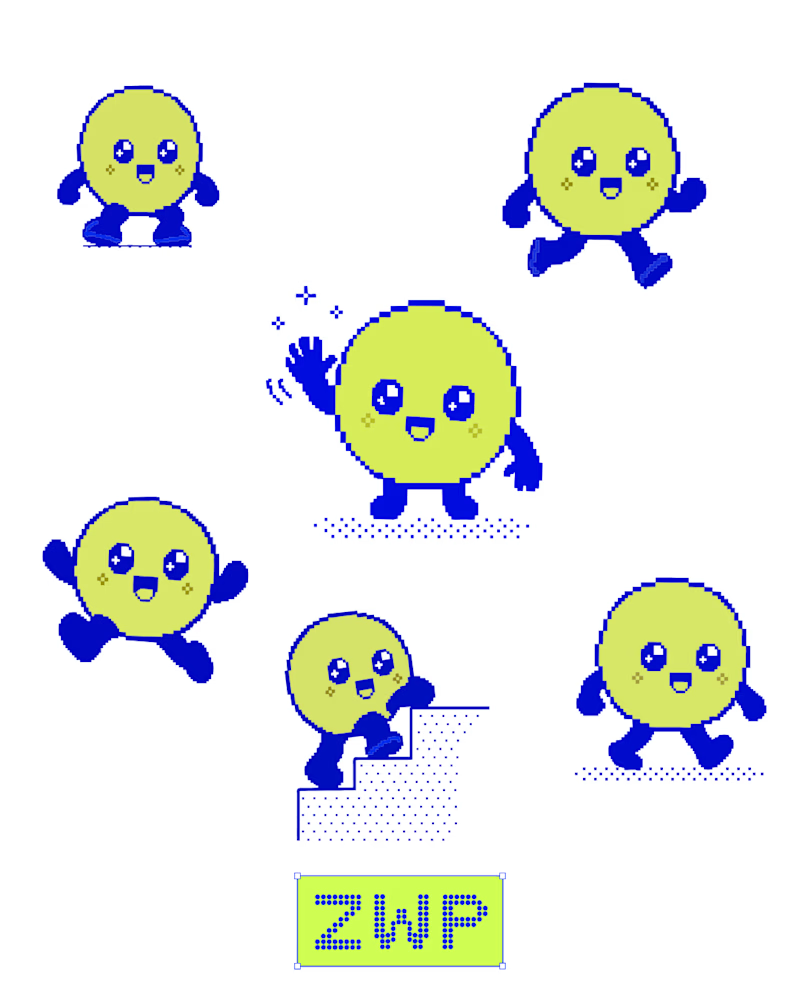
Been experimenting with pixel art and character design in Figma.
I explored different expressions, poses, and small details to give Zippy its own personality. Keeping the blue and neon-lime palette consistent helped bring the character set together.
Still experimenting, still refining. ⚡
What’s your favourite expression?
5 voted
42%
7 voted
58%
12 votes
Closed

Great character movement is better it feels alive ❤️


Which color do you think suits better the animation?
Navy Blue or Aubergine Gleam?
#aftereffects #motiondesign #videoedit
3 voted
60%
2 voted
40%
5 votes
Closed

OBSESSED with the boldness & unique feel to aubergine gleam! feels like such a standout.